It is time to get my hands dirty. As I work I keep beside me my “minders”- all the things that I have worked on up until this point to keep the paintings on track- sketches, intention statements, color studies, selected color harmony and notes from the photo session.
I am lucky enough to have the most wonderful drafting table given to me many, many years ago from my mother-in-law. It is quite huge and has a foot pedal that raises and lowers the table even while working vertically. I like to start my drawings on it rather than on my easel. I don’t know- it is a “comfort” thing, I guess. For many years I only painted on this table while creating work in our dining room or living room. I clamped paintings to it and rigged the boards with shoe boxes so the top of the works were slanted with the top coming forward at about a 15 degree angle. This keeps any dust from the pastels from falling down onto the painting so instead, the dust will fall in front of the working area. This took a while to get used to, since I used to paint in watercolor and was used to working in the opposite direction- with the table slanted back at the top so a watercolor wash could fall down the painting as fast or as slow as I needed. Of course, I have my trusty friend- aluminum foil- to catch the dust.
So the first thing I needed to think about with these works was making sure that the paper I was using all matched perfectly. This meant using 3 sheets from the exact same batch. For these I am using the Sennelier La Carte surface in Sienna Brown. It is a lovely surface for a pastellist and if you have never tried it, it is worth the price of $20 a sheet for the larger size. The surface feels like very soft sandpaper. It has a vegetable-based fine grit that is sprayed on archival cardstock so it is rather stiff, but I still mount it to a board. I have noticed that the color of the paper can vary slightly every time I order it and since they will be hanging together, they need to be all the exact same color. I then realized I only had 3 sheets in stock. Hmmmm…. I either take a chance on using the 3 sheets I have or order at least 4 more although if I make a mistake on any one of these images, I will have to throw out all 3 since the next batch will not match the current sheets. Since I am too impatient to wait for an order, I take my chances and start on these three sheets while ordering more.
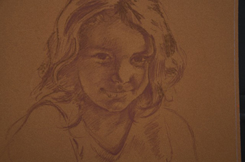
I start with the basic drawings while working on all three at the same time. I also deliberately tape the surfaces to a black board while using white tape. Having the 2 extreme values of black and white on the sides keep the images “registered”. Meaning everything I paint will be measured against the lightest and darkest value of black and white. Important stuff to plan for an artist. For me, I have to keep the paintings in the “midtones” for as long as possible.
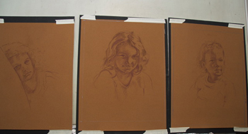
The photo on top is a bit distorted from the camera. They were are all lined up evenly on the table, but it looks “curved” due to the lens. (Those pesky lies photos tell! ) Unfortunately, this is the only photo I found from this stage with all three together.
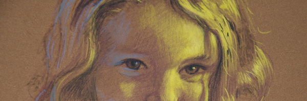
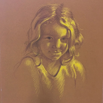
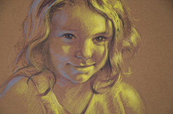
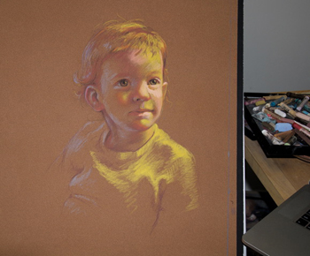
Next comes my yellow “Find the Light”. stage. If you have taken my workshop, you have been tortured with this law of physics. I won’t go into detail on how these painting are going to be built up since my work goes through 5 stages. (Sounds like another blog series) But everything from here on out will be based on this yellow stage. It is my blueprint.
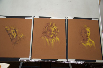
After I understand how the light is falling, I add reflected light in acidic blue.
Now I am ready to add color. Again, this is a painting and not a copy of the photos, so I carefully develop color contrasts, focus areas and slowly buid up the power of the pigments as I go along. Different pastels have different “powers” so I always ask myself about what power I need in every stroke.
The paintings get moved to my large easel and swap them out continually. I often stand back from them as I work. I keep the images on my computer or Ipad and work FAR AWAY from the photos trying to emulate how it would be to paint them if they were in front of me in real life. I am looking for the gesture and “personality sense” of the little souls here. I try not to blindly copy what I see. This lets me feel free to interpret and, as a result, all colors are fair game at this point. Pinks, greens, purples…. I look to exaggerate areas to make the image lively and rich. I love layering! I have a large mirror across the room from my easel so I can study the developing paintings in reverse. This is the best way to catch errors.
I keep building up the images until I feel like they are alive and could speak to me. It is an intangible thing. Like sensing the life in another person. Like sensing when someone is staring at you from across the room even though you are not looking toward them. Try it next time you are out driving. When at a red light, stare at someone in another car near you. In a short time they will turn to look at you!
I talk to my paintings quite a bit, I am not ashamed to say…(well….maybe a little bit)
“Where did your nose go? Hmmm? I know it was here a minute ago….Hmmm…How about this? Oh yes, ok….there you are…..”
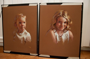
I bounced back and forth between all three images to and kept the same sticks throughout. Hopefully linking them all visually.
Next week- the finish and presentation to the client!
A very Happy Hanukkah!