If you paint portraits from photos, you instantly have a battle on your hands because those pesky photo references tell lies. Here’s why.
Last week I talked about how painting a nose can be tough if you have a bad photo reference. Well, painting the entire head from bad photos is nearly impossible because photos tell lies about reality. Here is a list of my top ten lies:
Lie #1 “Dinner plate portraits”
Too much general lighting coming from all over can flatten out the face in a photo. Think about those cute, blue-background school photos. Lovely as a photo, but never good to use as a reference for a painting. (never copy a photo like this!) There is too much lighting coming from everywhere. Everything is flattened out so there is no sense of convex and concave shapes and painting the head without that information will kill a portrait.
For that reason, this shot below is a terrible photo to use for a painting. It can lead to the “dinner plate portrait.” In other words, artists “serve up” features on a nice, flat, flesh-colored “plate.” Then they wonder why their portraits look off. Our brains are wired to see depth! Even in a painting.
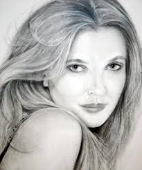
I found this drawing below on the internet and it is a perfect “dinner-plate” portrait. Lovingly and slowly drawn without any sense of depth except in the hair. (I hope the artist doesn’t find out I used this here- I don’t want anyone to feel badly) but it is a perfect example of features “served up” on a white plate. Squint- it is eyes and a mouth on a white oval. They spent more attention on the turning of the hair than on the face because they clearly copied this from a photo reference that didn’t give them adequate information on the face.
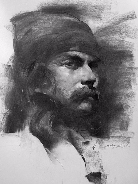
Look at how different this charcoal is below- it is carved out of space!!! Clear highlights. A clear sense of how the head dips and turns and curves in space. Lovely.
Lie #2 ”Blooming” highlights
Highlights in photos can get “blown out” and then “bloom” beyond where they would naturally be if you could see the person in reality. In this photo below, the lighting has washed out almost all of the info on the left side of the head. The tip of his nose, the side of the cheek and under the eye are not all the same in space- yet the photo tells us that is is all the same color and value. Not true in real life. The left eye appears to be floating, and the left side of his head is exactly that- the side of his head. Color changes are needed here to show the depth or look out!

This painting below is stylized, and that doesn’t bother me, but the forehead has a large white shape on it. If the law of light is to be followed, then this shape is saying that her head is receiving light evenly across this shape- basically saying that that area is flat. Foreheads are curved, check your own forehead right now- so this is breaking the law of light and a flaw in your photo (and painting) if you paint it this way.
#3 Missing the orange in hair….
This may seem like a weird one, but there is always some kind of orange “cast’ to the highlights in hair, no matter what color, no matter what lighting. For some reason, photos can leave this out. If you want proof, just go look closely at someone’s hair in either natural or indoor lighting. It is there. If you add just a bit of orange to the hair in a painting, not much, just a tad, then it will seem more alive…
#4 Darker eyebrows
This one especially affects blonde children. Their eyebrows are so soft and fine and almost invisible and photos will tend to make them much darker. Why? The light sources create a shadow from the hair of the eyebrows. It casts a shadow onto the skin and so cameras tend to read this shadow and make the eyebrows much darker than they really are. So, if you are painting a child and it seems off for some reason, check the eyebrows….
#5 Eye color
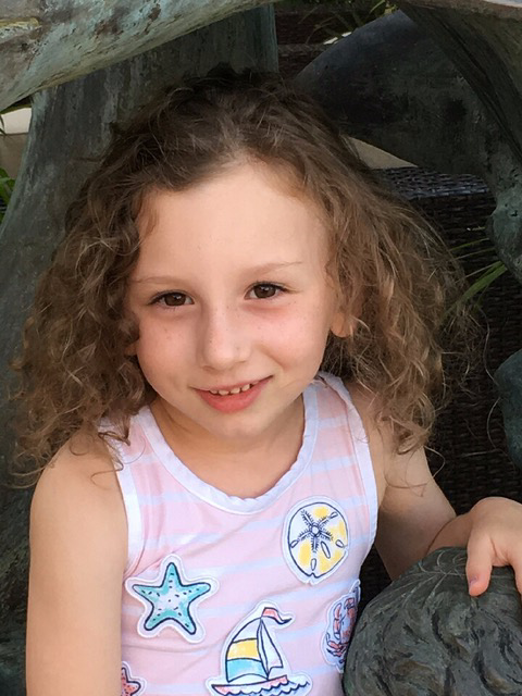
This one is pretty obvious. You can see it being “off” in most basic photos unless the person is very brightly lit in an outside setting. The eyes go darker in a photo because they are recessed in the head. The top lid catches light and the eyeball itself will catch light (hence the bright highlight in the eye) but for the most part, the eyes are underneath the brow bone. I suggest taking notes on eye color, and writing “blue” is not enough. Mid-blue, grey-blue, green-blue or very light or very dark are more descriptive. Then always check the painting at the presentation to the client make to make sure you are matched up with the eye color of the actual person. What color are this kids eyes below?
Yeah, I can’t tell either.

#6 Cupid Bow lips
Photos will tend to exaggerate the color of the lips forming the “cupids bow” shape we know. However, the lips go around the head. There are many muscles that support and shape the mouth. Just putting in the color of lips will flatten the head again. The center of the mouth is far forward from the corners. Check your own mouth. Mouths are not a separate piece from the rest of the face. So when I paint lips I run some of the color around the muscles there too. Unify!
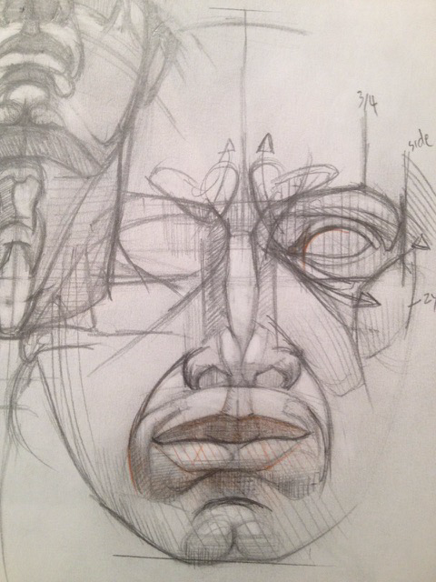
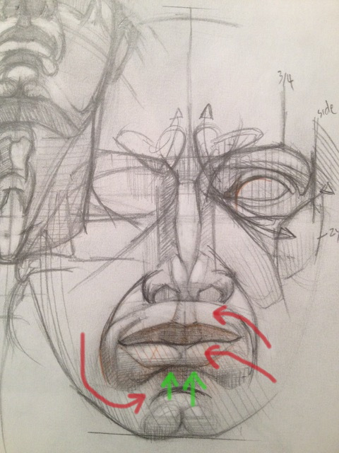
Typically I will paint the lips out into the side of the head. That seems to help. There is a definite under-cut plane under the mouth too. The lips are not flat, but roll outward and curve. Very sophisticated shapes. Make sure your photos show you that or… you get the idea.
#7 Wrong skin tones in shadows
I will use both dark and light photos to get at the truth of skintones. There are 2 types of skintones- orangey-yellow, and pinkish-grey. That’s it. There may be darker or lighter versions of this, but everyone falls into these two categories. If you find yourself always going for an “orange” color, ask yourself what color is in skin? Put your hand on the painting and look at your own skin in the same light. How can you get that color in your painting? Photos will tend to present skin tones as black- especially under the jaw- but look at a person near you right now… there is no black there.
#8 “Black” Creases
Most photos will show children with black creases above and around their eyes. NOPE. Artists paint them like that, and then wonder why the child looks so much older than in the photo. A four-year old with black around their eyes? Is it Alice Coopers’ child? No- but a photo will tell you it is this way. Eyes on kids are light, fresh and colorful. Creases above the lash line are not black, not even close. Not even chocolate brown, which seems to be a go-to. Put down the chocolate brown. Step away from it. Eyes are lighter and fresher in color than most photos show. Think pink, think red, think purple. Think anything but chocolate brown.
#9 Distortion
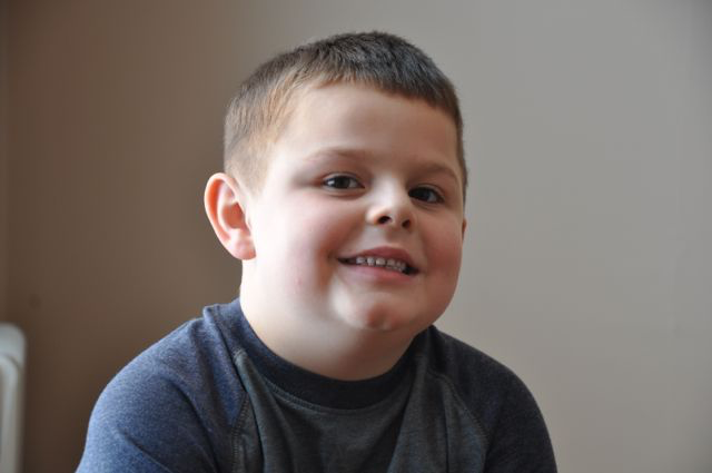
In some cases there is distortion- phone cameras are especially guilty of this… selfies are full of distorted lips and cheeks. Teens know to take photos of themselves with the camera/phone slightly higher than the center of their face- why? It “thins” them out- more “perfect-looking” I guess. Problem is, it can look downright barbie-like. Which is bad for a painting. The other way is true as well. A photo taken from a slightly lower position can have little Johnny looking like he has a large puffy jaw- like below. I have to watch this because I am short, so I have to be sure I am not shooting “up” at another adult otherwise I can get all nostrils and distorted, shortened noses. (Again, like below) Best thing to do is to back away from your subject. If you can use a zoom, lens, dead-on to the subject, it will preserve the proportions of the face better.
This kid is all black nostrils here…
#10 “sin of full disclosure”
Photos give us too much detail for a painting. Too much detail can lead to a painting that has no focus- everything is the same, so everything becomes chaos to the eye. You can find yourself focusing more on shirt details than on the subject of the painting! You must decide what’s dominant. Go back to your individual intentions with a piece. It will help you to see what to leave out. That can be more important than what to leave in. Where’s the artist? What’s the point? Do you really need to paint everything?
Plus, who has time for that?
So if you HAVE to paint from a reference, four things are needed in your photo references. Ignore them at your peril.
1- Clear and defined highlights. If you can’t see any clear shape to the highlights, then the forms are going to look flat as though you were not there looking directly at them – because you are not, you are only seeing the intermediary – the photo.
2- Clear lit area on the forms/face showing the temperature of the light
Lighting can be either cool or warm- look at shadows to tell what temperature the lighting is. The light temperature (or color of the light) is always the opposite. Light at noon is cool- yep, cool- even though it is the hottest time of the day. Look to the shadows to see it and at noon they will be very warm.
3- Shadow on face
Even a tiny bit can help to establish depth in the face. Question- How far away are your ears from your nose? At least 6- 8 inches, so painting all that terrain all the same color and all the same value flattens the face out on that flat canvas. You need to see changes in color and in value in order to create an illusion- a sense of space.
4. Reflected light
This shows the roundness of the forms and how the light is acting. Even a tiny bit can help show the depth of the face.
And if someone tells you your painting looks just like a photo, tell them “goodness!!! I sure hope not.”
Scary. Have a Happy Halloween!
Right on! One of your best posts, and art lessons.
The shame of it is, from the artist’s standpoint,
the worse the photo the MORE WORK is involved,
and the result is NOT AS STRONG as it would
be with good reference. The better the photo, the stronger
the result with LESS EFFORT. It’s backwards: More work
and lesser result; less work and better result. Oh well.
This is a wonderful newsletter ! So very informative and helpful. Thank you so much!
Very informative! Thanks!
🙂
Where is your studio located?or do you do onsite portraits?
I am near Pittsburgh and I can work with clients from far away. Last summer I had clients in Singapore.
Terrific article, very helpful!
Christine,
I always enjoy your articles, and I had to print this one to keep. Brilliant and such helpful reminders. Thank you.
Great post Christine!
Great contribution! Thank you for the helpful info for portrait painting.
-Lily Beard
Thanks for this information!
Really helpful information. Thank you!