
One of the best things I have found about teaching workshops and working with artists is that it has honed my ability to zero in quickly on the essence of an image, finding what a painting is saying whether the creator is aware of the conversation or not …
I was teaching a workshop about five years ago when one of the artists said they would love feedback from me monthly about their work in progress. Time is the most precious commodity, so I was reluctant at first (3 kids, commissions, ambitions….. time is precious! ) but she wore me down and my mentorship program began. Over the years I take on a few artists each month and try to help them work on areas that they have been struggling with. I set up “lessons” or assignments and we work on those concepts over the month. It has given me a new source of income, but more importantly, it has sharpened my ability to critique images and find ways to strengthen them. I can quickly get to the heart of what a painting needs to become more polished. I thought I would take the next few months and share some paintings that have come my way over the years and the feedback and corrections that have been made to the images. I will say why I made the suggestions I did and how the image got stronger through the changes.
So through the rest of this summer instead of talking only about my own artwork, I will talk about artwork I have encountered and the artists I have helped to see their own artwork in a different light. I think when artists get juried by another artist for a show and get rejected, they think- what did I do wrong? Why did I not get into this show, etc??….this series of blogs may provide some insight. I believe artwork has to become more than what it is. In other words, what is painted is always secondary to how it is painted. This will give you an insight into my mind as well (scary, I know) and what I find important in a work of art. Although I will not be using anyones’ name with regards to the paintings being shown, each artist has given me permission to reproduce the images here.
One of the best tools I have found to help artists is to adjust their paintings according to whatever we are studying at the time. Since we typically go back and forth through emails, it is easiest to show right on the painting what I am talking about. This makes any artwork through this program ineligible for any shows, regional or national. I specifically say this up front. Once a work is adjusted through my eyes with my feedback, the work is now a collaboration, and makes it not the sole creation of a single artist. That’s ok. The goal through mentorship is to teach and learn.
So Let’s begin!
One of the first things I typically do when working with someone new is to go through their body of work and find 3 things that the artist could work on to strengthen the works overall. I have found there is typically at least one thing that the artist just doesn’t see regarding their own work. After all, we are so close to what we create. It takes guts to ask for help and to submit one’s work to a critique. So, a big thanks and a round of applause to those who have been brave enough to ask for how to improve their art, you have helped me too!
One thing that seems to be a common issue with paintings that I see is that the focus of the work is being thwarted by some other element in the painting. And in the artist’s mind, the focus of their painting is so evident. And yet when a closer look is taken, something else may be “stealing the show. Good paintings can be SO complex! So much to think about! So it is easy to see how one can get off track. So these next few weeks will be dealing with the focus of a work and how to better channel the intentions of the artist.
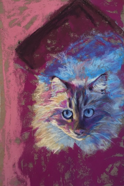
Up first… This artist has a lovely sense of color. Lively strokes and a great interpretation of a cat.
Below is her original reference. Now I LOVE the fact that this piece is interpretive. I see the artist behind this image. But painting from photos can lead one to paint areas more importantly than they need to be treated.
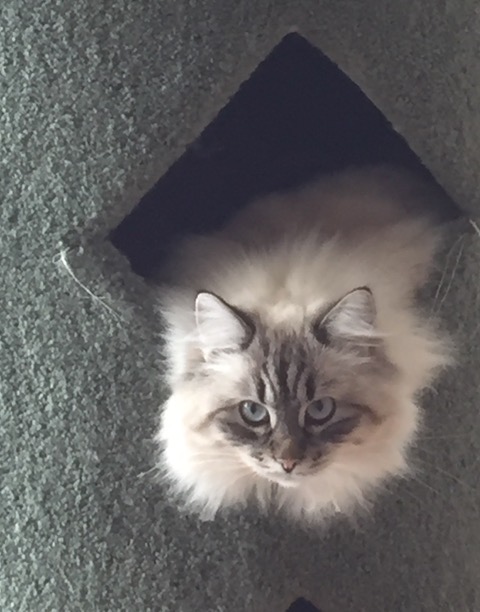
Original photo reference
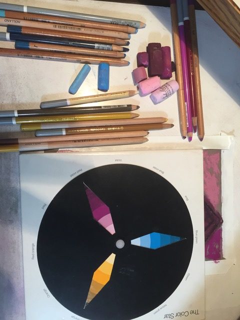
She even picked out a great color harmony and found one color to be dominant- which is a great way to unify a piece.
So when I first got this painting, I asked the following questions…”What you do notice composition-wise?” And always… “What is your focus?”
And her response was to focus on showing the intensity of the gaze plus the light. Composition-wise, she wasn’t sure. She tried to position the eyes on a third (of the painting vertically). But otherwise, hadn’t thought of it much.
I put the image into black and white.
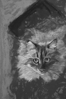
In black and white it is easier to see that the thick, black “line” at the top-left of the image is pulling a lot of attention. It is the darkest shape and feels very “heavy” over the cat. As a viewer, I look there first. If this area was knocked back in value even a little bit, the face would take more of the center-stage, which is what she was aiming for. Right now that black area is competing with the cat. At first glance, I was not sure what this shape was supposed to be, but it doesn’t matter- anyone seeing the painting would not have the photo for reference anyway, so it acts only like a shape here.
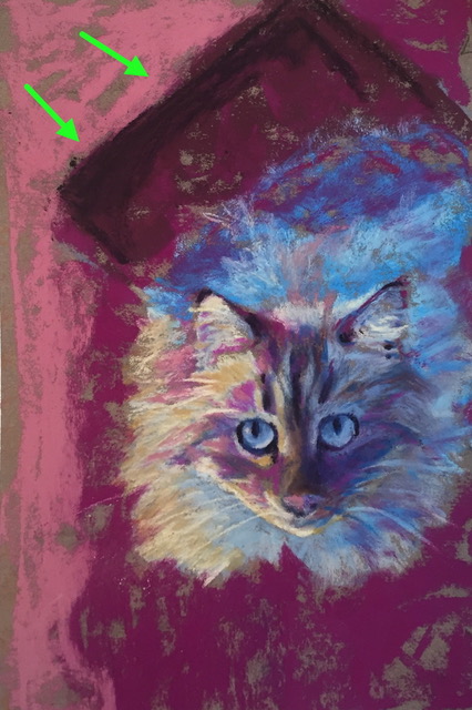
Back in color, the green arrows show the darkest-dark shape and the heavy, sharp edge – it pulls the attention of the viewer there even more so than to the face. Lines tend to pull attention anyway, so softening this area through a lighter value can get the piece back on track.
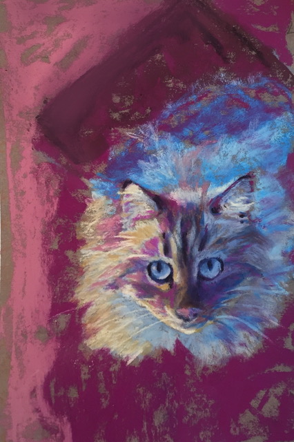
Above the area has been lightened, and now the face is more prevalent. And what if some of that very dark value was put into the face? That would help channel the focus even more.
Chroma-wise, my question was geared toward the fact that all the colors have the same chroma treatment. It is all pretty high-chroma color across the painting. (For high chroma, think of the colors as a “straight from the tube” feeling.) If a few areas near the gaze were in a lower-chroma, (think very “dirtied” colors like “greys”) then the painting would have more variety, yet would be more harmonious, show that the artist has control over her colors, feel more “lit” on the left side of the head and again, push more focus to the face.
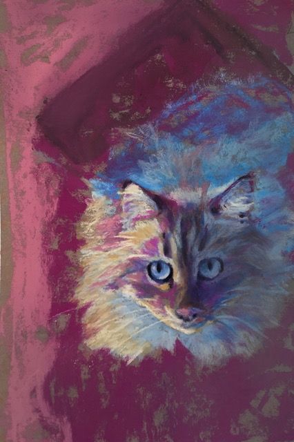
By adding darks into the face and lowering the chroma on the shadowed side of the face (but not darkening it, just lowering the intensity of the color) the piece now has more focus- the gaze- and feels very psychological. This painting is now more about how you feel when a cat looks at you and not just about how they look. The changes are very subtle because I never want to change what the artist is doing, just tweak it to work better. You can see the differences in the original and the adjusted version here together.
So I hope you enjoy this little trip into mentoring. More about focus of a work next week!

So glad your blog address came up and I clicked. ! I want to follow it.
You are GOOD. ☺️
thanks! welcome aboard the crazy-train!
Really enjoyed reading this!
sure! Happy to help!
Wow! That was really helpful, Christine!
sure!!!
Thanks so much as this helps me to see the focus.
I would love to see more of this type of demo.
I will be doing one of these every week for the next few months!
Thank you for this series! I know it will be helpful to all of us! I loved her palette and the addition of darks into the face made such a difference.
🙂
Christine,
This looks like a fantastic series. I’ll definitely be tuning in from the “other coast.” Thank you!
Cathy
Christine,
This looks like a fantastic series. I’ll definitely be tuning in from the “other coast.” Thank you!
Cathy
🙂
Very Interesting! You made small adjustments and got a ‘wow!’ factor with them. Love your small tweaks and why. Thank you for sharing!
thanks!
Hej jestem z Polski. Hi i am from Poland. binsger
🙂