So the textures in Patrick Lee’s paintings are unsurpassed. Yet it is the composition that makes you look twice…
Let’s take a look at the one that is in my kitchen again…

In Greyscale and upside down, the painting looks like this…
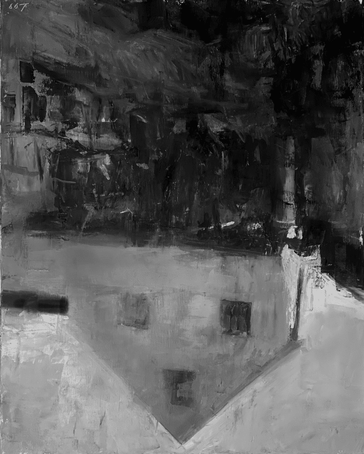
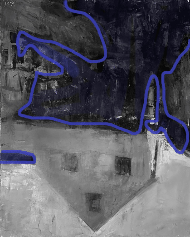
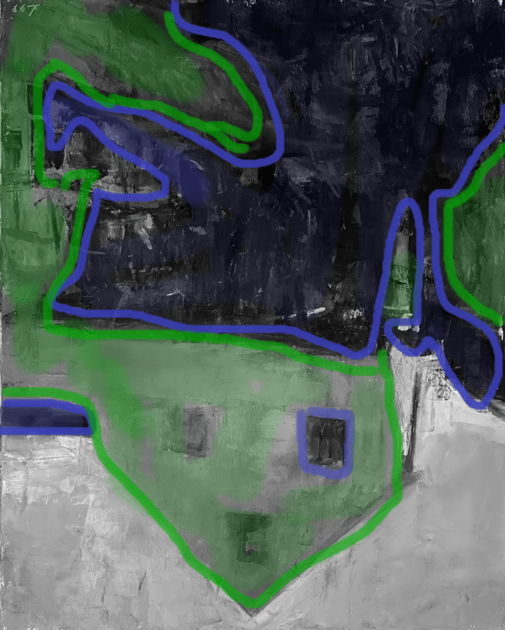
Broken down in to three values, it looks like this….
Blue for the darkest shape…
Green for the midtone values…
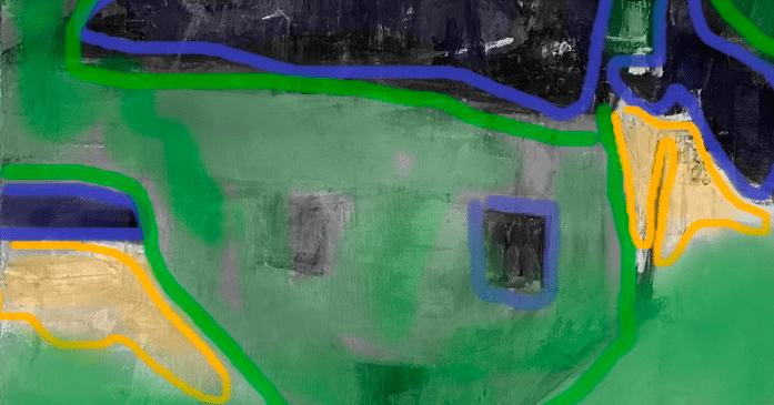
… and orange for the two lightest spots.
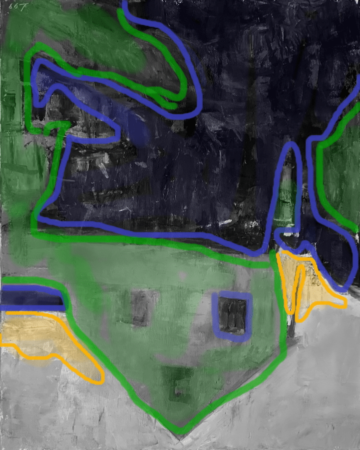
This is the “puzzle block” of the image… and guess what? This is what the image is built on… not a house, not things all rendered pretty. This construction is what holds the image together and gives it strength and makes you walk across the room to then check out the textures, color, etc, after one gets drawn into this puzzle. Our brains love these interlocked, clear patterns.
And you would think that such big shapes would be easy to pull off- to keep the values so tight that they don’t disrupt the overall shape. It is not. It is one of the toughest things to do in painting. It is painting with restraint, control and yet abandon.
Wanna see something cool? If this little dark shape right here…
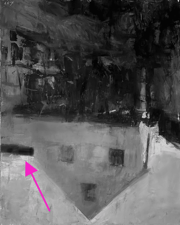
was taken away…
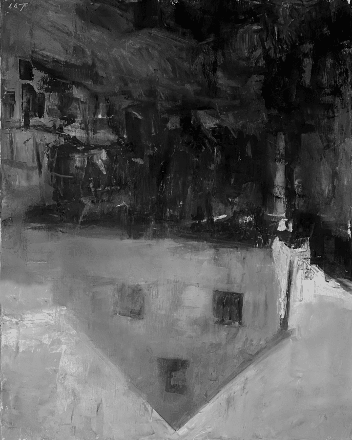
The image falls apart.
See? It feels unbalanced now. Man- it literally feels tangible to me. That huge dark shape is “heavy” on one side of the image now.
Here it is again in color.
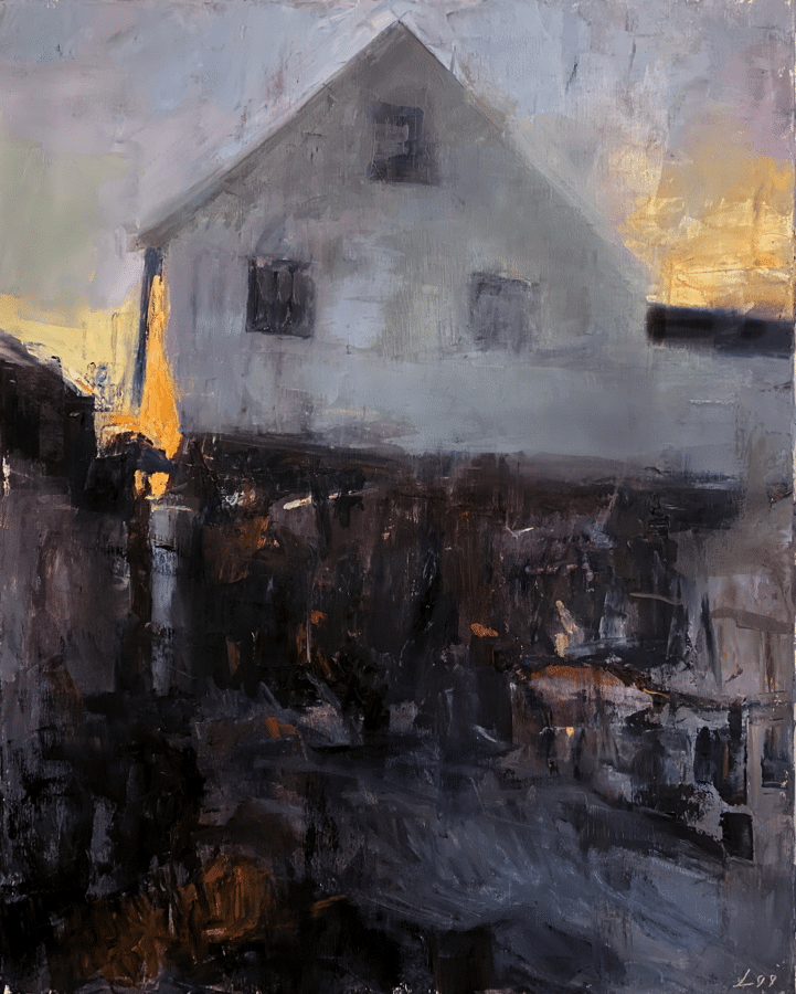
Put a finger over that strong rectangle and see what I mean? The image feels weaker. Why is that?
That shape acts as a “balance” as well as a way to “point” to the left window and then the brightest and highest chroma area of the painting- the sky to the left. The darkest-dark shape is near this area up against the lightest area. Not accidental. This is always a good thing for a focal point. That rectangle is extremely important and brings balance to all the shapes.
And what makes a painting “balanced” you may ask. Good question. And there is no easy answer, although most teachers that don’t know how to answer that typically “cop out” and say… “oh! it is a gut reaction” Hmm. I have been trying to get clear answers to that question for many years, and you know what? It is more than “gut reactions” that create balance. Although that is a good place to start.
One more thing of note on these shapes…
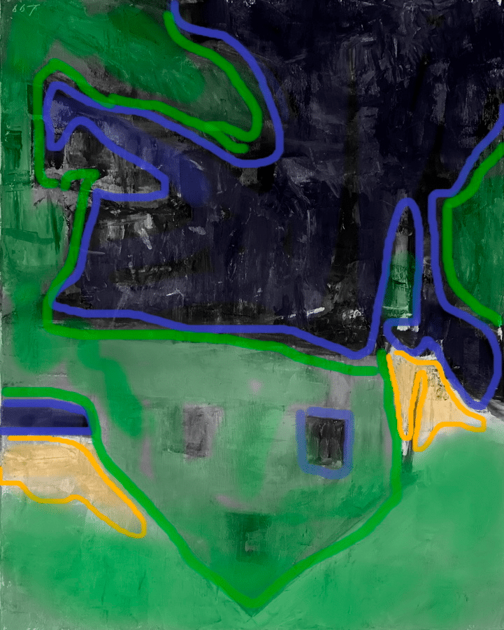
The green midtones have the biggest “percentage” of the painting. The blue darks are the next biggest and then two lightest values have the smallest percentage. What I call a “daddy, momma and baby” hierarchy of shapes. Again, very deliberate. If you didn’t notice this at first, don’t worry. The more you study good paintings the more you can become attuned to this kind of deliberate planning and then the more you can think about constructing these kinds of hierarchies in your own works.
Yeah… so good right?
Next week I will deconstruct a few more of Pat’s images and then Pat and I chat about our approaches to composition. (Pray I can get the zoom recording to work.) We are both very different in our approaches and yet composition is at the forefront of both of our minds with each image.
Till next week…

Thank you for sharing and showing incite to his work.
😁
Really really interesting and I love both of your styles!!! Can’t wait for the next post . . .
Thank you! Always interested in anything speaking of color and “composition “!
😁
This blog was so timely for me! I was taking a break from my painting today to try to figure out what was wrong it. Something in the composition just wasn’t clicking. I am a huge fan of Patrick Lee! You did a super job discussing what makes the composition work in Patrick’s painting. When I went back to my painting I did all the things you talked about in the blog with my painting. I was able to solve the problem. Thank you!
yay! knowledge is power!!!!
Such great instruction, thank you. I’ve never seen composition discussed anywhere else as succinctly as you do!
thanks!
This was very helpful Christine. You make it so clear.
Thanks !