Composing simple shapes in a painting is one of the most important things you can do compositionally. And the hardest……
Having variety in shapes leads to a more interesting painting and to a more sophisticated-looking design.
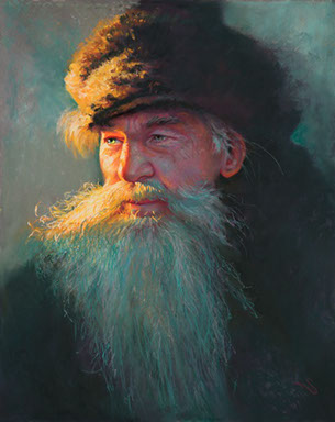
Here is a painting I did a while ago…
Below is the thumbnail sketch I used to compose the piece.
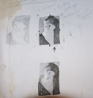
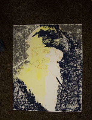
This is where I started, in the design of the thumbnail, if it reads solid here, you then have a shot in the actual work. When I started the painting, I even blocked out these main shapes……
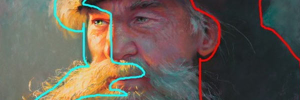
2 dark shapes in red, one light shape in light blue, and everything else is in the mid-value range. I call it having tight values in these areas. The details in these areas are close to each other in value, supporting the overall shapes. Simplified shapes and details follow and support the whole. Could I have painted all the details on the hat? Sure, but it reads stronger as a shape. There is enough info in the outline and in the lit area to tell what is going on. It now supports the face. When an artist goes away from reproducing everything they see, they go beyond being a “copiest” and become an artist.
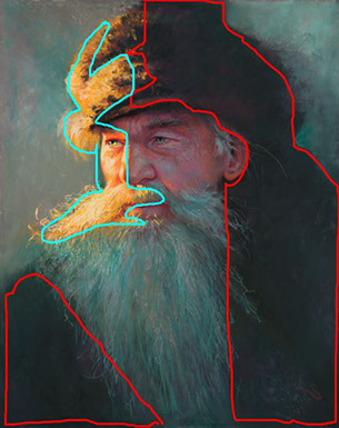
So when someone tells me my work looks like a photo, I say “I hope not” because there is so much more manipulation and thought put into a piece than what a photo can show.
Try it! Paintings with tight tolerances yell for attention from across the room. It’s better than hot pink sequin pants…..
