Kids are fun. Their personalities are so apparent even at an early age, so when I go to take photos of young children, it is best to get to know them a bit first….
When painting small children, good photo references are crucial. They will not sit still for a painting and so we must rely on what photos can tell us. Good references are needed and this doesn’t necessarily mean good photos, but photos with lots of information. Ever notice how the same child can look totally different in 2 separate photos? Angles of the head, changes in light or different expressions can make kids look like 2 separare souls (see the photos of the youngest little guy below) when I get back to my studio, how do I know which ones are correct? I never use photos from anyone else. Not any more. When I first started out I did, but this put me at a severe disadvantage in relying only on only lying photos to tell me about people I had never met. Now I only take my own refernces. So for this commission I am working with 3 children. A little boy of one, a blonde girl of three, and a nine year old. I typically set up a time for a photo session either early in the morning or late afternoon where the lighting will be best and it doesn’t interfere with naptimes. Crabby kids want nothing to do with me, so the first rule is to make sure they are happy and awake. I once had a photo shoot a few years ago with a 4-year-old little boy and he just wasn’t having anything to do with me. He would hardly look at me. My “mommy vibe” went off and I knew the child was getting sick. I left and we rescheduled for another day. Later that night, the dad called me and said the child was running a 102 degree temperature. No wonder he wanted nothing to do with me! The next session went smoothly.
Often when the camera first comes out I have them take photos of me or we take silly ones with a parent. We have a lot of “playtime timeouts” between taking photos. Kids will feel self-conscious, so they make funny faces (much to the annoyance of the parents. ) It’s ok- I have 3 kids of my own, so I know this is not what they want to be doing, so if I can make it as fun as possible hopefully I can get what I need. The 3-year old showed me her toys. We played with dolls. Then took a few more photos. One child a few years ago even timed our “photo sessions” with his Ipad. He played in between. His timer was set for only 2 minutes…..and it loudly counted down……tick…. tick….tick…. while I tried to get a bunch of photos….. sweating here……
I recommend working with each child individually, “Your turn!” and at some point putting them all together. Not to take a great photo of them all, but to get the sizing of each other “registered” against each other. You would be surprised at how different the size of a girl’s head is against a boy’s head sometimes. Painting them all the same “head size” when putting the individual photo references together will make them seem “off.”
Natural light is my friend for painting children. I rarely use a flood light because with young children they want to move around and making them sit in a perfect circle of light will not keep them happy. Indirect lighting from a window, door or under a covered porch will give soft lighting and yet enhance all of their very sublte and delicate features. ( and let them move around) This is what makes children so hard to capture in a painting. Not much to paint, and what forms are there are so soft. Their skin is translucent and squishable. (art term) Old people are easier to paint- more topography! I see a lot of children’s portraits that are just so harsh, basically because the photos have presented them this way….
So when working with the little boy, we put him in a chair which had great cascading light from a tall window and let him play. I scout out areas like this and will shoot photos in different areas with the child while testing the light. So what do I have in the 2 photos below? His eyes on the left are nice and big- not squinty from too much light and I can see into the dark side of the head and feel some reflected light happening on the left side. I need to see the form of his head in the round. The photo on the right does that too, but the eyes are very squinty and teeth are nearly impossible to paint without looking stiff, (don’t paint this kind of photo!!!!)…. ( I mean it) but I get more accurate skin color and detailed information in the light area in photo on the right. Their noses look completely different in each one…..Hmmmm…..
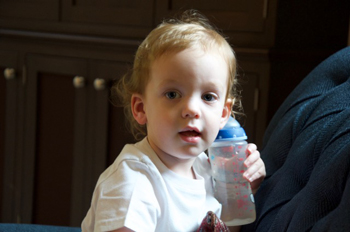
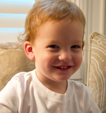
Mom talked to him, I tickled him and basically anywhere he moved, it would be ok, because the the lighting was just light enough to see into the dark side and yet soft enough that it didn’t blow out or overexpose the lit side too much. Never use a flash!!!! It is not about a pretty, perfect shot. The eyes are dark on both of these, but I frequently overexpose and underexpose photos to get what I need from them. More about that below.
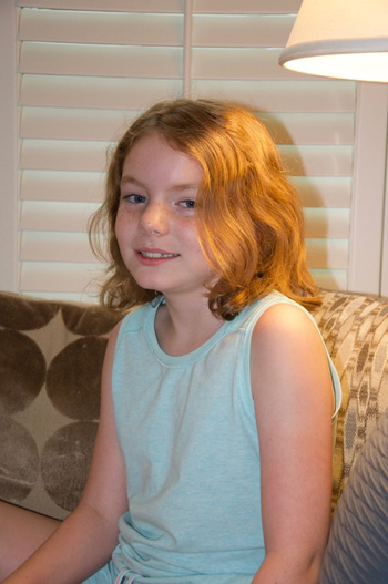
Here are 2 more photos from the exact same shoot probably minutes apart, yet they each have different information in them and most of all, a different feel to them. (side note- I shoot RAW images which are very large – normally 10 MB per photo- and can give a lot of detail when enlarged. In this blog they are smaller and the details are harder to see). On the left, her hair is bright orange from a lamp, on the left, her hair is more neutral. On the left her face is full of freckles, and yet on the right they are lost in the “overblown” lighting on her face that makes everything in the lit area disappear, including her freckles. Which to believe? Well, you have to believe both and find the lies. I frequently take notes on eye and hair color. I note which photos (while still with the model ) are more accurate to the hair color. And while with this young lady, I noted that her freckles are a bit part of her. So I can’t leave them out like in the photo. I just must have enough photos to get at the truth.
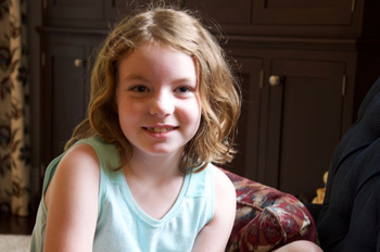
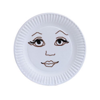
This gets us into the “Lies That Photos Tell”. In my workshops, I show how photos typically lie about the person they are capturing and discuss how to get around these lies. We gotta be smarter than the photo. There are too many to list here, but two of the biggest lies are how color and form get distorted. Using a flash straight into the face is the biggest culprit here. You can wind up with a “dinner plate” portrait. You know the ones- paintings where the features are “served up” on a flat, white head. Even if the features are all in the right spot and painted very lovingly, the portrait will look just plain “off” because we are used to seeing people with depth to their faces. If you don’t have that in your painting, or your references, you are in trouble.
So if you didn’t know, 3-year olds are can be very challenging. She kept saying “This is weird” and throwing herself on the couch about my quest to take so many photos…mom was a bit appalled and thought she must have just learned this word……so stinking cute. I love my job.
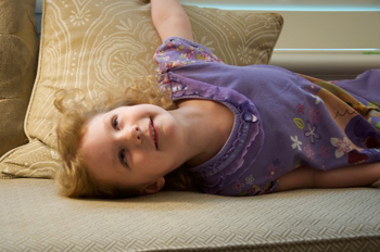
Here is one of the more serious shots…
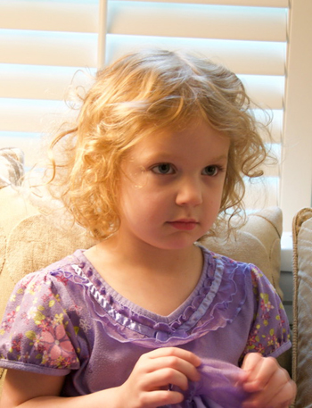
Below are lighter and darker versions so I can see the details better. I always do this so I can see all the information. Roundness, roundness…… no dinner plates!
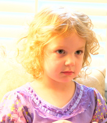
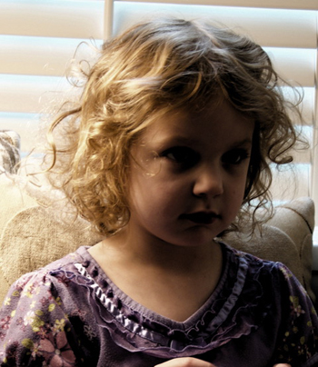
On the left, I over-exposed the photo- easy to do digitally- so I can see the edges of the lids, pupils and creases above her eyes better. Kids do not have dark rings around their eyes like eyeliner, yet photos will typically show that they do, and artists will paint them like that. Yuk. Take a close look at a child- the rims around the eyes are soft and very light. Don’t believe everything photos tell ya. In the dark version, I can clearly see how the light falls on the hair which is so valuable. The exaggerated roundness and shapes of the head, cheek and nose- I go after that. Accurate shapes will tell the story better than a “right” copy of the photo.
Here’s a little trick if you take photos of kids. Remember the old regular Kodak film? (if you don’t, and are too young, don’t tell me). I used to spend a fortune on it in different ISOs – 100, 400, 1000, etc…. Different film registered lighting differently so it could adjust to the lighting situation. For example, 100 ISO film let you take great photos in sitations where there was a ton of light, like outside in the sun. But it wasn’t so good for lower-light photos. Well, your digital camera does the same thing. You just have to tell it which type of “film” you want it to be. If you are shooting outside in lots of flooded light, you can set it for 100 ISO. If you are shooting inside in less light, you can then set it for 600 or 800 ISO which will be a bit grainier, but will pick up more of the very subtle lighting shifts on little faces. Ever see photos that have a great lit side and the dark side of the person is all in black? That is the camera not being able to read into the darkness like our eyes do, so it just throws everything into black. (paintings created only from photos like this really bug me). It looks so wrong because this doesn’t happen in real ife. Our eyes can see into the darkness and adjusts. Cameras struggle.
So for that reason, I shoot photos darker then you would think you would need because I don’t need glamour shots. I need clear planes of the forms. Depth! Again, a painting is a different breed from a photo. If you just copy a bad photo, you get a bad painting. Period.
There are 4 elements that you need to have in photo refs to prevent the “dinner plate portrait”- 1- Clear and defined highlights. If you can’t see any clear shape to the highlights, then the forms are going to look flat as though you were not there looking directly at them – because you are not, you are only seeing the intermediary – the photo. 2- Clear lit area on the forms/face showing the temperature of the light- lighting can be either cool or warm- look at shadows to tell what temperature the lighting is. The light temperature is always the opposite. Light at noon is cool- yep, cool- even though it is the hottest time of the day. Look to the shadows to see it and at noon they will be very warm. 3- Shadow on face- even a tiny bit can help to establish the depth of the face. How far away are your ears from you nose? At least 4-6 inches and painting all that terrain all the same color and value flattens the face out on that flat canvas. You need to see changes….. 4. Reflected light- this shows the roundness of the forms and how the light is acting. Even a tiny bit can help show the depth of the face.
Usually I bring my laptop with me so I can load the images onto the computer and then go through them with the client. I can then see what they like about certain ones and also show them why I don’t like others. A commission is a compromise! I have to respect what they like and I have gotten better at standing up to things that will not work well. Some images can seem very cute – like big smiley photos- but they don’t make for good references for a painting and I can then explain why at this stage. Bringing a laptop to go over pics with a client before leaving their home narrows down the best shots and makes sure I have enough to start the designs. At this particular photo shoot, I shot over 350 images. We flagged the ones that we both liked – probably about 6-8 of each child, and then I went home and seriously went through them all.
Now it is time to start designing…..
