So while in quarantine I have been doing critiques for artists…
For the last six years I have been doing a mentorship program for artists. It started rather simply. A few artist friends kept begging me to help them by setting up a monthly mentorship with them. At first I was reluctant. There is only so much time, ya know? And my typing skills are not the best. But then I thought it could give me a little steady income (and they kept telling me that) so I dived in. Over that time I have worked with artists from literally everywhere. Sometimes for a few months, sometimes for a few years. Artists from Russia, South Africa, and across the United States. All with basically the same question- “How can I improve?”
And I found something really cool. It helped me to improve. By being able to quickly hone in on an area that can be changed or strengthened, or by looking at a body of work as a whole and seeing what can be addressed, it made me become very specific about how to express in words about visual changes.
So in the mentorship program I can only take on a handful of artists each month and still feel like I can do a good job without overextending myself. Then I start a waiting list. (I am looking at ways now to ramp up the exposure to more people. Hence the videos). But I have been recently offering artists a chance to get an in-depth critique of an image. Below is one of the critiques. I have gotten the permission of the artist and I am grateful she is willing to share her image and my feedback. I hope you enjoy!
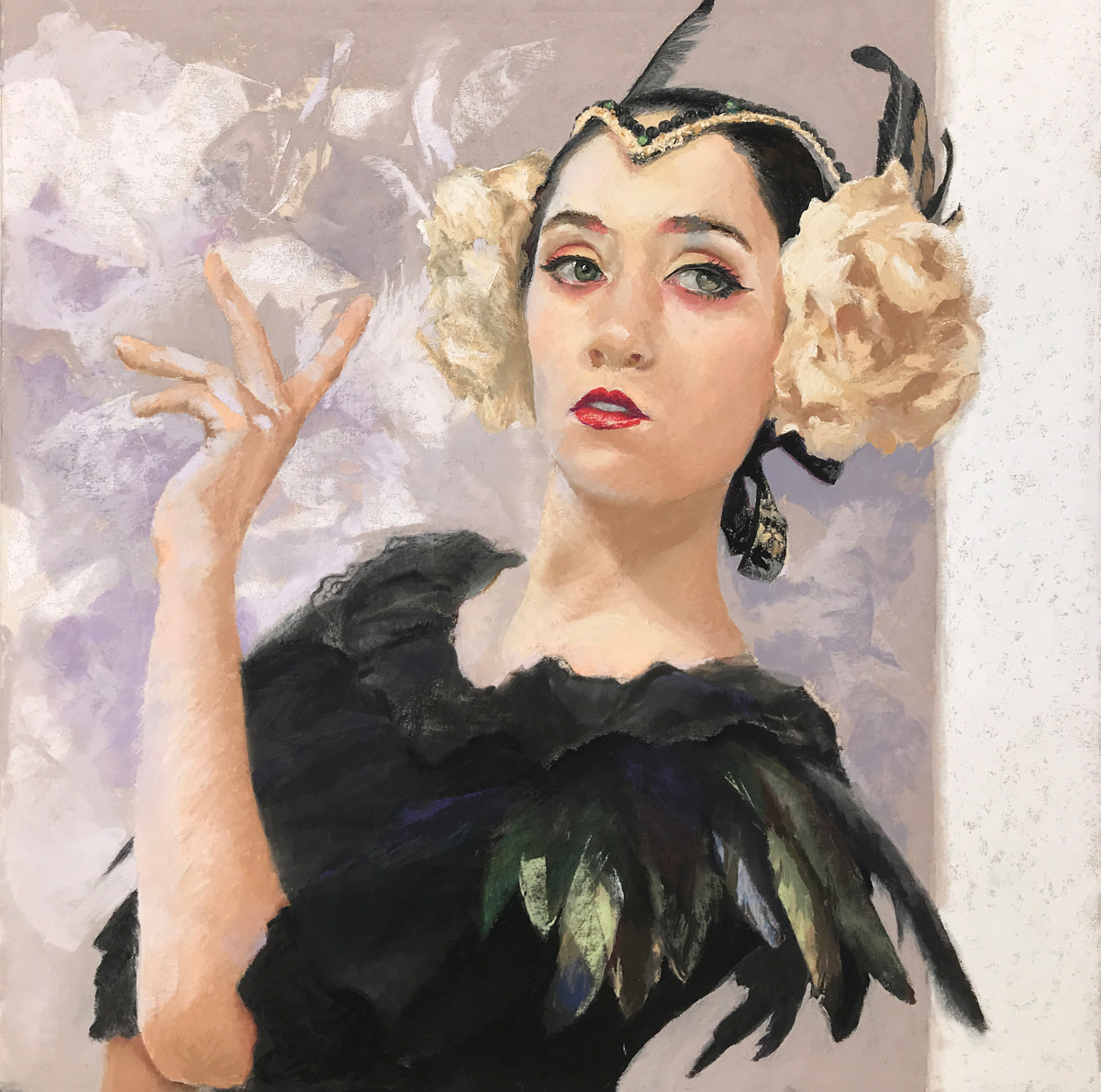
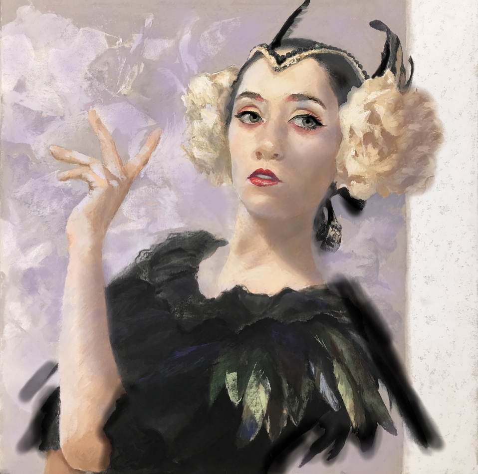
Below is the original painting. And there are so many good things here! Her hand is lovely and not overpainted and feels very life-like. She kept a nice and lively expression. But a few things will kick this out of the park.
Original
Edges/ Black
The first thing I notice is the hard edges in the image that could be adjusted to bring more focus to her face. Our eyes like to seek out hard edges, so by softening those up, the image is more controlled to showcase her face. Here are the hardest and harshest black areas in the image.
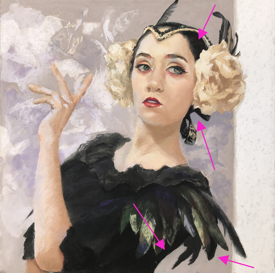
The best thing to do in any painting is to control these edges and to always control your blacks. Most here are in areas that are not really important. Especially that sharp line at the bottom at her back. My eye goes there first. Such a large black shape and the hard edge makes my eye look for what is important there, so by softening it that it will let me look at her face.
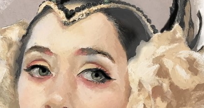
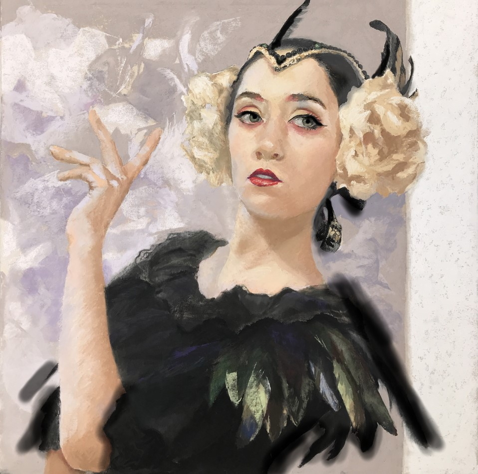
In this adjusted image below those black edges are softened. On her shoulder I moved the feather out, softened the edge and rotated it a bit to point up at her eyes. Using elements to direct a viewer around a painting shows that the artist has control. Then I put harder edges on the blacks back into the feathers on her head. They now point down to her eyes. Putting them to work as it were. The black shape on her head of her hair near the hat is so black and harsh. Not needed. Lightening it will give more focus to her face. When working from photos, it is so tempting to paint the ribbon and the feathers with tight detail, but it doesn’t help the image overall. Typically, in any kind of portrait, the eyes are where you want your truest blacks to be. I put pure black into the eyes and made the pupils larger. In fact, it looks better if they are larger. The model may have had the pupils closed down more like that in the original refernce, but it feels unnatural since she is in a more diffused light. Pure black in her eyes and at the lash line brings focus there.
Tangents
I also moved the flower and that black feather more onto the white background bar on the right. It is a nice artistic statement with those areas crossing over into that area, but they are not far over enough. Too close to the line creates a “tangent” which visually creates tension and makes the viewer want to look away. Clearly crossing over that line a bit more gives a better sense of space and feels more visually comfortable.
Color
There is a clear color harmony set up. Limiting color choices is a good way to make an image richer but setting up hierarchies are just as important. Here is what the colors are in the painting:
Red – bright and in lips and a clear accent. Tiny hints of that in her skin.
True Green, but only a few hints in the feathers at the bottom and in her eyes which conflicts with the red as the accent. Adding more of that green color into her skintones and into the feathers will make the painting richer. Let the red be the only accent and move that pretty green color around.
True Violet – But only in the background and on the left. More of this everywhere will again help the colors to enrich each other.
Yellow-Orange. The yellows and ochers in her skin and in the flowers do not fall into the yellow family, but rather into the yellow-orange family.
The best thing about color is to think of it like cooking- get your spices mixed around and make sure you have a clear hierarchy. One color dominating the image is best.
For example, in the background on the left is the only place where there is that bit of violet. If it was “brought around” the image including introduced into her skintones from the shadows, then she is linked with the background and the yellowish and warm tones in her skin are now “pushed forward” more and her face will feel fresher. I adjusted this below. This serves to make the violet and yellow tones vibrate and work together better. I even added it into the flower as it crosses over into that white bar more- now we have a clear lit and non-lit feel of roundness to that flower. The violet added to the darker side of her arm helps to make it rounder and sets up the more lit side as warm and the darker side as cooler.
The whitish textured marks behind her in the background feel like she has something in between her fingers and it makes me confused as to what that is… feathers? If that texture was pushed back with the purple a bit (to conserve the lightest areas in her face) then it becomes not as important and that violet color adds more to its overall percentage of the image. Adding violet into her skin, and more all over the background now makes this a violet-dominant painting and having a color dominance is one of the best things you can do to set a mood. I would also add more green into and around the image- her skin, the background etc… even tiny, tiny bits can help that color bounce around and be part of the party.
And if the violet was kicked more to more blue- violet, then it would be a clear 4-color quad color harmony chord. But it is not necessary.

Darker Shadows.
Adding more of the violet into the shadows on her face in a slightly darker value also helps to show form better. Since there is a clear shadow falling from the left side of her chin across her neck, then the rest of her head has to have the same lighting. Right? The lighting on her face is too even and so it doesn’t match her neck. The shadow on the right side of her head needs to go a bit darker to stay consistent. Otherwise, the face is flattened out. Below I adjusted that a bit to make the roundness of her head more accurate. Look at her hands for comparison. The values are correct there. There is a jump in value, so her face has to do the same.
So these adjustments overall are subtle, but little tweaks can make a painting richer and have more focus. Go back and compare this version with the original. The skin tones “sing” more, the blacks are being put to work and she comes forward from the background. Color is controlled and little details and edges are not derailing the overall image. A painting is more than “things” or “people.” It is a dance. A controlled story from the artist. This is a very beautiful painting! Good job and thanks again for letting us share in it.
So if you would like a critique on one of your images the cost is $25 dollars through Paypal. I would be helping you and you would be helping me get through the pandemic.
I wish all of you a safe and happy week!
Christine