So I am not an expert on abstract paintings. In fact, when I go to a museum or show, they don’t tend to capture my attention. The only clear exception for me has been Franz Kline.
I had seen his works in books and really didn’t appreciate them much. However, the first time I saw one in person it was about 15 feet tall. Powerful and impressive. It truly made me stop and gawk. Why?
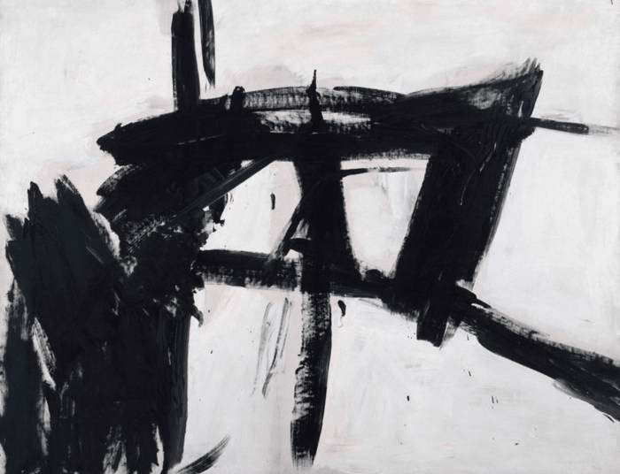
Well, the scale helped. His lines became huge personalities, so instead of a line representing something else like in most drawings, these huge, powerful lines become its own importance. Like large robots or insects explained through line. Not rendered by them.
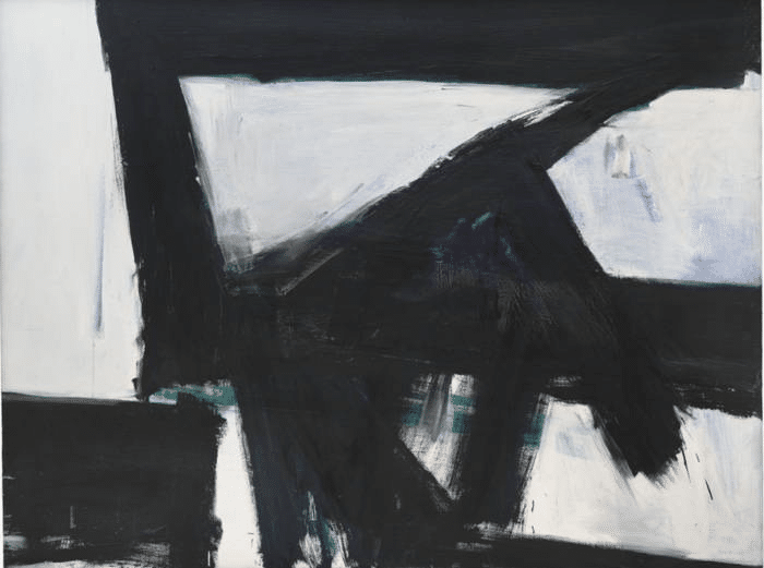
Stripped of color or even meaning, I imagine every viewer has a different take on these. I point them out mainly because of composition balance and placement. Try removing bits of the paintings- cover with a finger or crop it- the balance changes.
But this kind of shape placement is used all of the time. Here is a Waterhouse who is known for his figures. The beauty here is in the dominance of the shapes. Not her. Almost feels like the middle Kline above. Again, take away the doorframe or the dark shape at the bottom, and it loses its power.
I also appreciate these because of the edgework. Always a tough consideration for any artist and yet so important. No line/shape is exactly the same as another. Follow the edges around the shapes with your eyes in the black and whites above and the slight changes actually seem quite radical when you really slow down and look. And painting realistically can benefit from this kind of treatment.
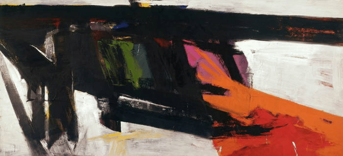
Then adding color seems to change things. Still bold, but not so harsh and icy cold like the pure black and white?
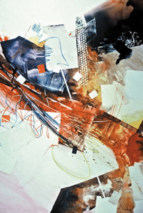
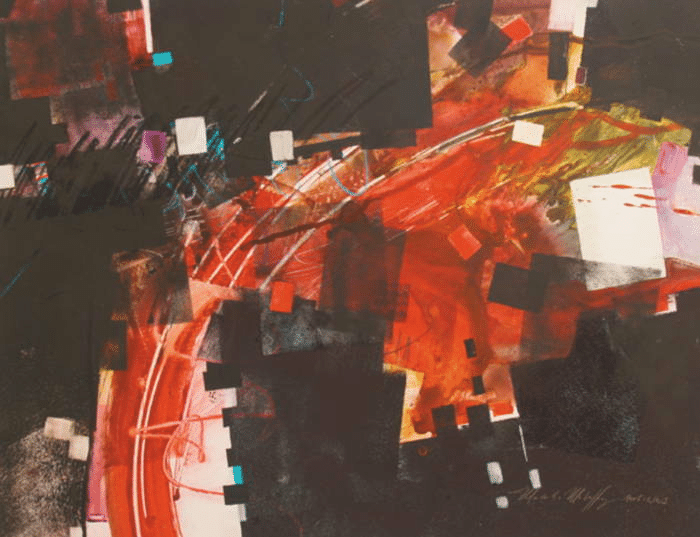
Most abstracts that seem to engage the viewer and work well rely on simple compositional designs. This one below has an “s” or “z” overall design. No one area is dominant except for the overall shape.
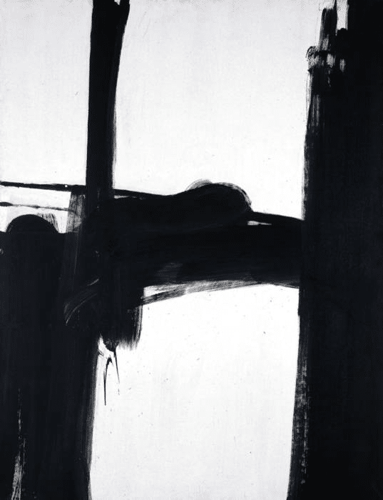
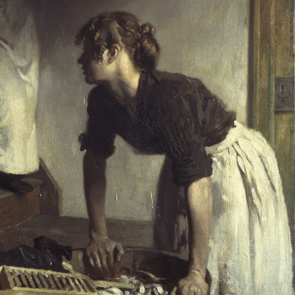
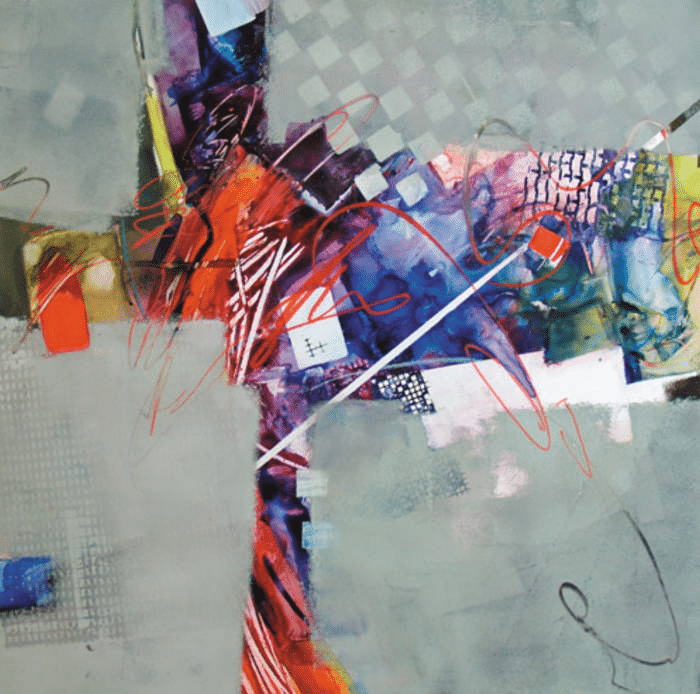
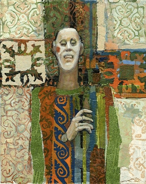
This one below has the same idea, but has a “cross” or “Cruciform” shape running through it. A dominant cross shape touching all four sides in varying widths. This is actually used a lot in realistic paintings. The cross shape gives overall strength to a piece, especially a figure or portrait like below. Background and figure all coalesce into a solid shape.
Look hard- this one below has a nice swing of a curve to it, but it is still a cruciform shape…
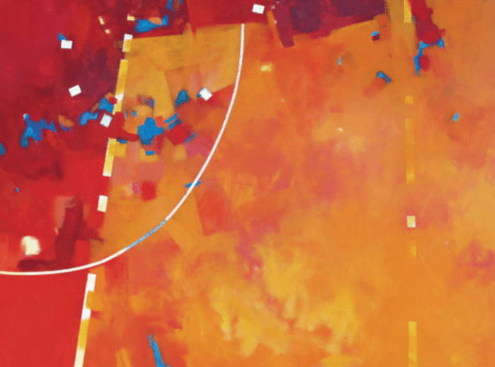
Another typical compositional shape is the “L” shape. This can be turned in any direction or used in any thickness. Actually a good thing to use in a landscape. Below this is an inverted “L” with the red shape and orange shape working together … think how this can be used for landscapes…
So I hope this gives you something to think about. Maybe take a current painting and see how one of these compositional designs could give it strength or think about the power of a heavy, super-thick line.
I’m not a fan either, but there are some that grasp and hold my attention. Some for the color use. Some for the Line work. Thanks
😁
Very good article Christine, and interesting perspective about abstract composition. Name is FRANZ Kline btw.
yeah- autocorrect thwarts me…..
I’m no abstraction junkie either, but I to am a big fan of Frank Kline too.
😁
Great post! Thank you.
😁
I enjoyed this article about abstract design shapes. It will help me with my compositions . Thank you so much Christine.
🙂
I have to say I really enjoyed this article. Franz Kline is one of my favorites along with most of the New York School.
😁