In the very beginning of designing this painting I asked myself- “What is most important?”
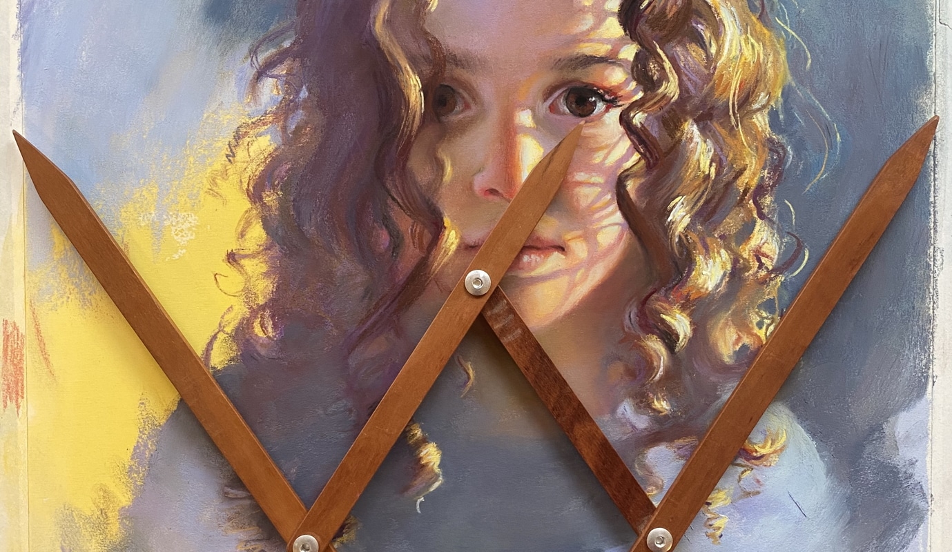
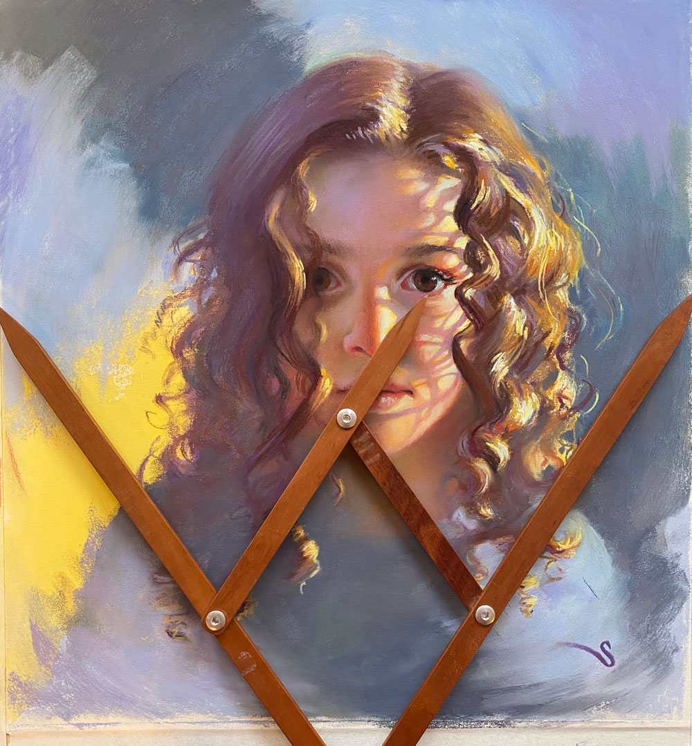
And was easy to pick her eye. In most portraits the eyes can easily be seen as the most important element and quite often I set up a “dominant” eye. With the left eye partially blocked, it was easy to pick the right eye as the focus. So positioning that eye on the picture plane is critical. I have these great Phi calipers that represent the relationship of Phi or the Golden Ratio. If you are not familiar with that, then now is the best time to do some research. This relationship is all over the universe, our bodies and throughout great art. With the calipers it was easy to pick a spot for her eye on both the vertical and horizontal divisions. That is where the drawing started. Unfortunately, I don’t have photos from that stage, but you can see how the eye clearly sits on that division.
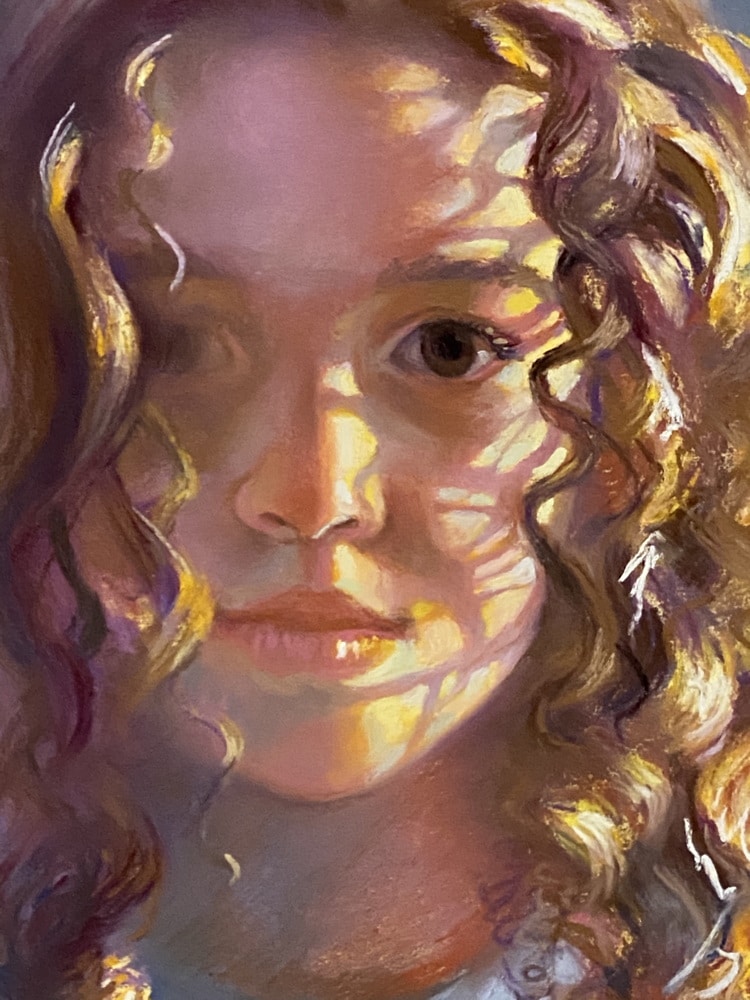
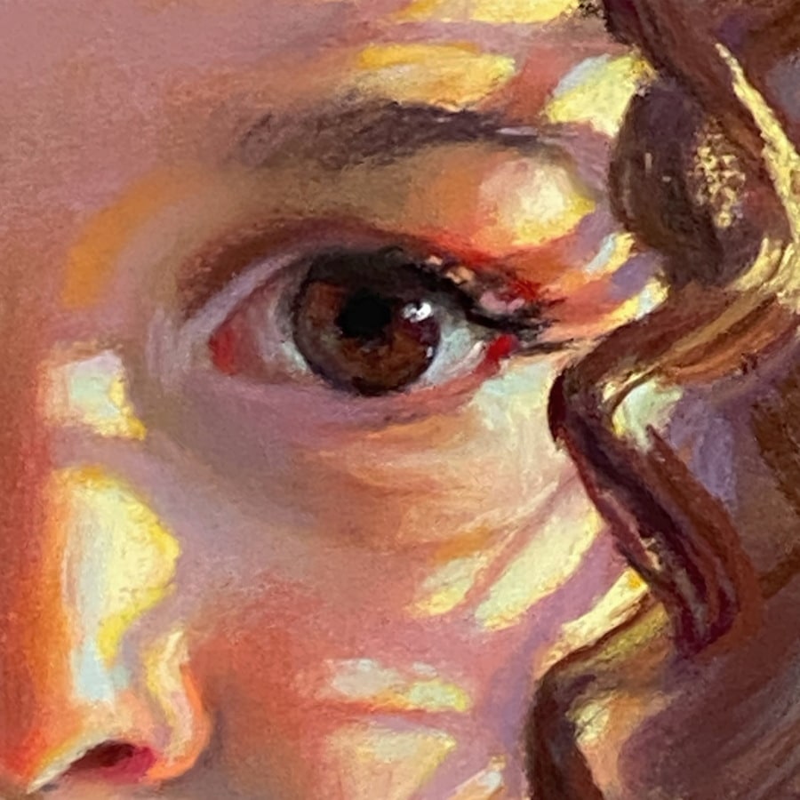
As the painting progressed, it went though some wonky stages, and that’s ok. I wiped the left eye out a few times to get it softer and set back. (and in the right position) The colors got layered over and over until they felt right. I am not a slave to photos. I hope you are not as well. In this photo up close you can see the colors moving around, blending into each other and not by smearing, but by repeated layering. Then strong, harsh strokes up against softer areas.
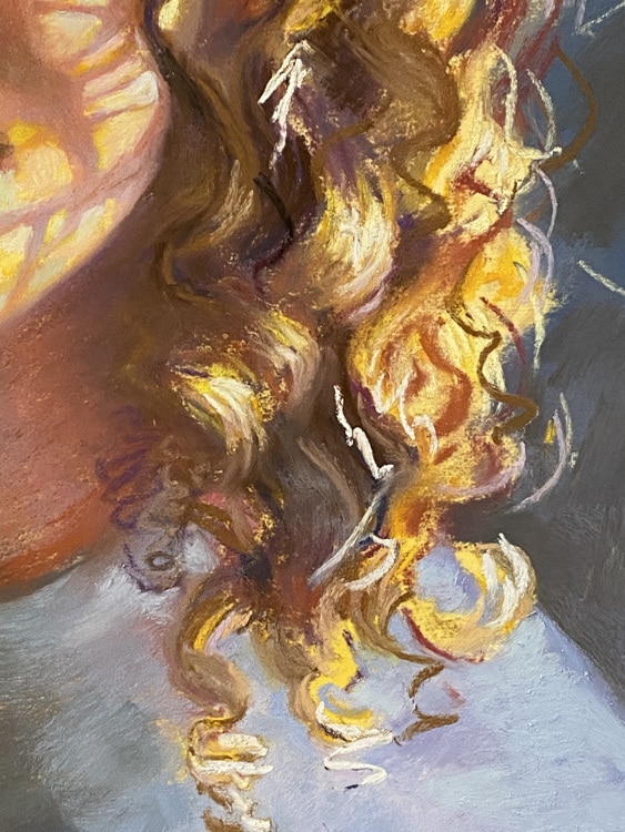
The hair got “struck in” in a lot of places rather than “rendered”. I think a lot of artists get into trouble with hair since it is easy to feel like we have to paint every hair. Smack it in. Go for the feel of it. Then soften it and do it again. Below looks like a jumble of textures and color… and that is art.
A big part of painting is controlling yourself. Now that I am in quarantine I really want to eat the entire gallon of ice cream. A good idea? No… so control how you use your darkest values in your painting. My darkest darks are in her eye and that front lock of hair and the the darkest marks point to her eye. That’s it. Remember in the beginning that I set that up as my focus? Well, throwing blacks into her hair or along a shoulder will not help that focus.
Don’t eat the entire container.
Below there are so many colors floating around. Everything is secondary in darkness to that black in the eye. And look at the reds in the crease above her lash line. Reds and violets. It looks brownish here in this photo, but if you have ever been in one of my classes you know I warn of the dire consequences of the “chocolate brown” everywhere in a portrait. Give your “browns” some personality- lean them toward green, orange or red-violet. In fact, I suggest you hide the “brown sticks” from yourself on your next portrait painting. What colors are available to you now?
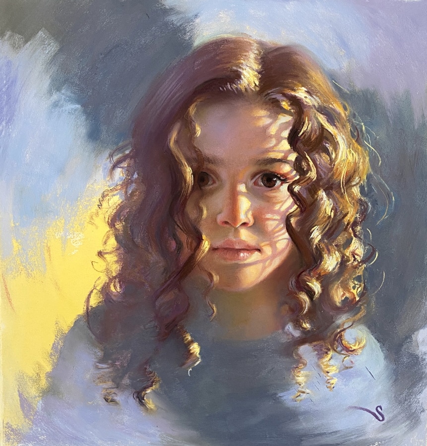
The final painting looks like this…
“Arrested Momentum” pastel, 15 x 15″
Here is a mini video so you can see the painting overall. Note that in the lit areas they are still getting colors like blue- there are always cool and warm colors in both the lit and non-lit areas.
And speaking of videos, I am starting to shoot videos now of portrait demonstrations and lessons. I will be posting them very soon. In the meantime, Gail Sibley from “How to Pastel” had asked me to be the guest blogger for this month. I had mentioned that last week. In all the craziness the site was not uploaded but it will be available this Friday, so be sure to check it out.
And remember – I do commissions! (This is not a time for me to be shy.)
So I would be happy to do one for you. Yes, I can do them from long distance. I recently had clients in Singapore and I taught them how to video their children so I could paint them from the videos. You would be supporting me (a single mom) and her children.
It is a crazy time. I wish you and your families health and peace. See you soon online.
– Christine
Beautiful! Thank you, Christine!
thanks!
Excellent “talk”, Christine. I just finished Walter Isaacson’s biography of Da Vinci, so my brain really tuned into the spacial relationships found in nature. Intelligent design? Who knows. But it’s clear that, through intense and thorough observation, some great design discoveries are made. Your point about having patience is critical. I’m on a long commission now and we always want to “rush to the light.” But that backfires. When playing golf, people begin to hurry, thinking they’ll play faster. But then then the make more mistakes, that then call for an additional shot. The fastest way to play is by hitting the fewest number of shots (strokes). Lastly, you main point of knowing what it is that you are painting this time, or the “most important” thing, was a huge leap forward for me in the beginning. Yes, you make discoveries along the way and there are “happy accidents.” When I started, and was gaining some skill, I would get inside of the feeling of painting itself, and loose track of what turned me on in the first place about the subject, which is what made me want to do it in the first place. Once I realized that I am painting what I saw in my mind’s eye, and staying with that and subordinate to it, everything changed. In effect, the photo can eventually harness you and hold you hostage. Even when painting on site, the clouds and sun are moving, so one has to hold on to that original plan. I learned to try to have the drawing in by 11am or so, and try to bang the bulk of it out by 1pm. During this time, the sun moved the least in Pittsburgh. Thanks for the usual great insight. You’re a good teacher.
thanks! you are going to love the video that comes up tomorrow…. 🙂
You are brilliant. I am in total awe.
thanks! love your work!
🙂
What a fabulous demo.
Your students are fortunate!
thanks!
Beautiful. Thanks for sharing. I lover watching another artist work.