So when is a color not a color???
A proper color wheel looks like this… it has12 hue families.
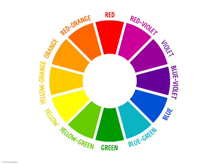
So no, we were taught incorrectly in school about R O Y G B I V– the so-called seven colors of the “rainbow.” No, there are actually 12 color families. Some colors on some versions of color wheels get left out. (like poor blue-violet) This one above is accurate.
There are 3 “purples.” (I don’t like that word) For me, three sub-divided violets are a better way to think of them, and yes, they are all different from each other. Yellow-Green is a very different animal from “True” green. Yellow-Green is yellow-based, and True-Green is blue-based.
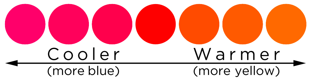
Red-Orange tends can get left out too. Which to me is weird. We think in terms of “orange” or “red” as all-encompassing terms, but Orange-Red is a separate color from Red or Orange. This scale below shows how these hues transition, and although people tend to think of red as a “hot” color or as a very “warm temperature,” what you are typically observing is really Orange-Red… in the middle below. True Red actually starts to lose its “warmness” when it loses its yellow base, and so it starts to become cool.
So take a good look below- is this a “red” car or an “orange-red” car???
But I digress…. “Grey” or “brown” are only LOW-CHROMA versions of every color on the wheel. Low-Chroma can be thought of as the “dirtiest” or most desaturated version of a color. “Browns” are only those dirty versions of one of the 12 colors. Mostly when you grab or mix a brown, it will fall into one of the orange families. A chocolate bar? At its heart, it is orange… look again at the candy bar pic above… Again, good to know when putting a particular “brown” mixture against other colors in a painting because that orange will “speak” and affect the other colors around it….
Once again I grabbed some “brown” sticks…

And here they are below with the color families that they fall into…
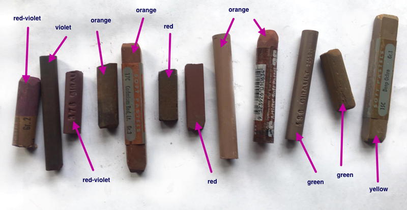
For me, it is cool to be able to start to see INTO color. I bet in this lineup above it is easier to discern the colors than the “grey” sticks from last week.
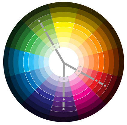
This may be a good way to see it below too… and those outside edges of “brown” will have different personalities based on its parent hue family.
If you feel tired after reading this, I understand. Color is complex. It is a brain-bender and it is worth studying. I think I need to teach a class not only on color harmonies and how they work, which I have done several times, but also on the dynamics of color and color shifts and color “sensitivity”… who would be interested in that???
Until next week… I hope until then you look at your brown sticks in a new way.
…give me time. Too busy to Say WHAT?
Love your blogs (is your daughter your editor?
I’m serious).
ha- no- she is too busy for me…..
I would be interested in an in depth color workshop. I haven’t thought of colors in the same way since I took your workshop.
wonderful! I have taught color harmony and why it works, but this would be a bit different…I think I will be teaching new classes on color and composition in the near future at Sweetwater Center for the Arts. I am heading up a new Education Committee on the Board there and we are reviewing and thinking about new top-notch instructors and new types of classes. So if anyone in the Pittsburgh area has a wish to teach in Sewickley, reach out to me and let me know. Or, if you would like to see a particular type of class, I would be happy to hear about it….
Complex is an understatement, but its been fun. You are forcing me to look at color a different way. For a long time, I’ve worked with the knowledge that all colors have a warm and cool side. And may change as you progress into the painting. Exciting stuff. But just recently, I was asked to review some Terry Ludwigs I purchased. I was able to give a good one including the “leanings”. I never thought about color like that before. Thank you for that.
perfect!!!
I’d be interested in that! Color sensitivity
Am really enjoying this on color .
great! 🙂
If I lived in Pittsburg, I would attend your color class in a heartbeat!
I enjoy every one of your blogs. Thank you so much.
🙂 you are quite welcome!!!