
“Good teaching is more a giving of right questions than a giving of right answers.”
– Josef Albers
This is a statement I have heard more or less from masterful artists over the years. Clyde Aspervig comes to mind. (if you are not familiar with his work, he is worth looking up as he is one of the best artists to ever come out of the American West.) I had read an interview with him many years ago and I remember him saying that he did not teach very often, but when he did his goal was to get his students to think, otherwise what was the point of taking a class? Technique can only get ya so far.
When I was younger, I was always looking for a way to understand and implement good composition in my paintings. Once I started to understand that painting “things” (insert any noun here) can only get you so far and that a painting can and needs to be a delicate dance of arrangement, I came across teachers and books that stated that good composition was when something “felt” right in the picture plane. Or was “balanced.” Sure… sure… but that still left me with why.
I found myself always asking “why?” a lot. Why not put the house in the center of the painting? Why use the Golden Mean? Why is an “L shape” a good design? Why do I have to do these things to satisfy a “good” composition? And I would get answers, but not clear solutions. So I went on a quest to find not only answers, but what questions I needed to ask.
Question: Does composition have to be so arbitrary?
Couldn’t I compose something and KNOW it was good compositionally? Couldn’t I move things around on the picture plane in a way so that everyone that saw it knew it was strong too? Or at least felt it?
The Golden Mean… bleah… I hated being locked into the “third divisions” of a painting. Do we all have to do that to be good at composition? Will an entire room in a gallery full of focus points on the “thirds” of the “golden mean” all mean we created “good” art? The Golden Mean always felt icky and restricting to me.
“What if I don’t wanna?” My little child- artist says… the child-adult in me now knows I don’t have to.
So just like I mentioned last week, decisions about color can create harmony. (think of the piano chords again) Composition is the same. There are many systems out there that can help an artist construct a sound composition. And artists including Caravaggio, Velasquez, Degas, Sargent, Titian, as well as many contemporary masters use these systems.
For me it has been refreshing to not have to guess anymore. Will my “focus tree” in my landscape be in a good spot? Is here better… or… here? Now I know. I will show you how you can know too.
In June I will be teaching the one system that has affected me the most. The Pythagorean Theory of Harmonic Divisions of the Rectangle. It sounds intimidating I know, but it has affected me greatly. And once I started implementing it into my work, I felt even more in control of my images.
Control = Peace, remember?
This is a painting I did a few years ago of my youngest daughter. This was in high school when she was very sick and could barely get to school each day. (If you don’t know what CRPS, RND or Ehler Danlos Syndrome are, you may want to look them up)

Anyway, it is actually one of my favorite paintings and I’ll tell you why.
This painting is called “Invisible.” She was first diagnosed with RND- Reflex Neurovascular Dystrophy- also known as the “invisible disease” since people with this affliction look perfectly normal on the outside. It is a type of permanent nerve damage. Pain is a fact of life. (lucky me, both of my daughters have this)
She would take a shower at night and try to get some sleep. One night I walked into her room, and she was sitting on the bed, her hair wet, and she said she just wanted to disappear into the wall. She was tired of being singled out with missing tests and with missing so much school- she just wanted to blend in with everyone else. Become invisible. Like her disease.
So this painting to me is of a young warrior. Because sometimes just getting a shower and/or getting to school or out of bed in the morning is a major battle. (yes, this is my daughter the journalist, who is doing much better now.)
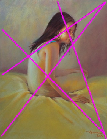
That’s the story behind it. Always Part One in planning. Now below is the construction. These are the “supporting lines” or diagonals in the piece that at first glance one may not have realized were there, so beyond a figure sitting on a bed, this below is also what the painting is about. Her eye is directly on the intersect of two of the diagonals. Called a “harmonic” or a “sweetspot” I located the eye there by choice- and yes, it was very intentional. The blue strap and the edge of her hair rest along one of those diagonals too. See it running along it?
Her arm from elbow to hand also run along a diagonal and the wrinkle in the sheet picks up that line to the bottom right corner of the painting. The background also changes along either side of this line. A subtle shift in hue dominance.
A wrinkle in the sheet running from the front left bottom corner to the top right where the edge of her shadow runs along this line is also intentional. These lines act as a solid structure. Like a wire form under a sculpture. And if you want to see how the “math” plays into this you will have to take the class… (tease) .
Color and composition go hand in hand, so now let’s talk about the color decisions in this piece
I even found the original color study…
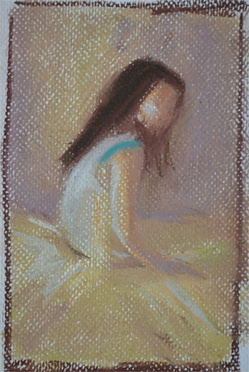
Even this tiny I was thinking about that accent of blue on her shoulder. Here is the chord used for this painting.
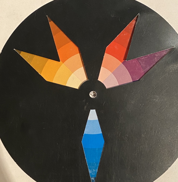
I made blue the accent in the piece. I put that blue on the bra strap….there is a hint of that hue also in her body and in the background, because no color can exist in a void, but this is clearly the accent (the smallest percentage of this color in the image.) The dominant color is yellow. Not a vivid, Crayola-yellow, it is rotated to something more low-chroma. This, again, is a decision. Her room and sheets were not yellow, but I made them that way to make the yellow the dominant hue. Additionally, yellow is supposedly a “happy color” yet to me this image was a serious commentary, but it didn’t mean she had to be painted in a melancholy or drab or depressed way. The yellow elevated it, I thought, to something more hopeful.
Color is powerful.
Color has meaning. Ask the people over at Pixar. Every movie is carefully controlled through color. There are color palettes that are set up specifically for each movie and certain scenes use color chords to enhance the mood.
Watch what happens when I take away the blue accent on her shoulder below…
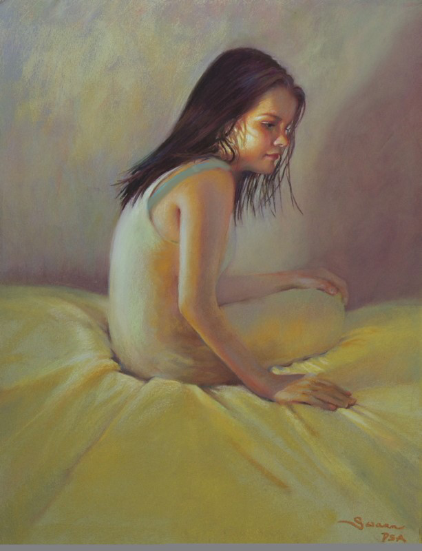
The image now feels flat. It is now missing a “note” from its “color chord”… can you feel it?
Interestingly, and back to composition, the same thing happens when I take away a supportive diagonal… below eliminating the shadow “edge” on the right of her head and also taking out the long wrinkle in the sheet from the bottom left that led up to and along the edge of her shadow… the dynamics in the image are different now. Can you feel the difference?
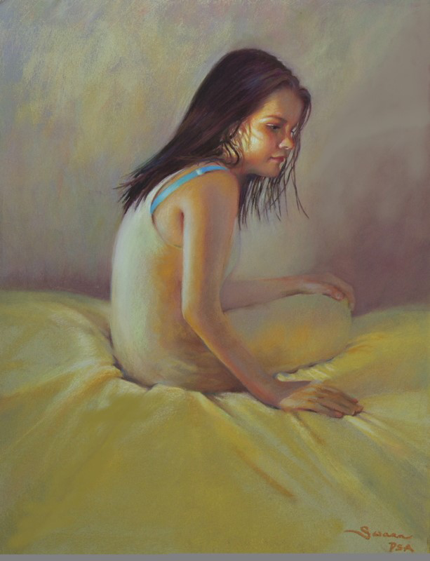
Same thing happens- it feels less structured. She is a bit more “floaty” in the space. Like something is missing. Compare this version above to the original again below…to me it is almost a tangible feel I can sink my teeth into.
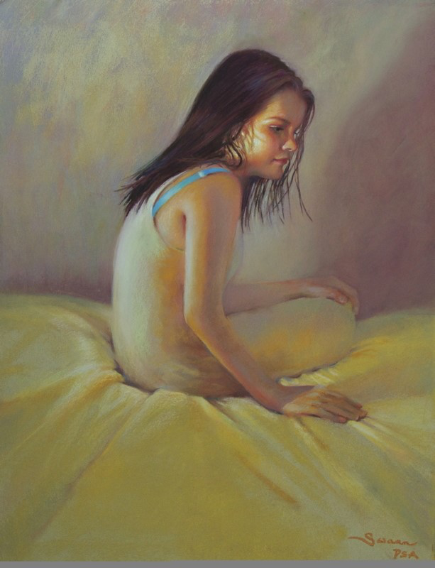
I find this stuff so freakn’ cool.
So this painting has a story, an intention- my intention. It has a color harmony, (a dominant and an accent color) It has strength in the placement of the figure and its relationship to the elements, (composition) like the wrinkles in the sheet and the color shifts in the background. ( background? I think about it early on. It is all the image and all important) All put to good use. This image to me is a song- composed deliberately and with care and intention. Yes, it is a girl sitting on a bed. But to me, and hopefully to the viewer- it is so much more.
That is art.
On June 23rd I will be teaching this method of composition. Again, this is not a portrait or pastel class, but rather a study of composition using this particular system. Yes, there are other systems and no, you don’t have to learn this to be a competent artist. Many wonderful artists refuse to use systems like these, (Richard Schmid comes to mind) but for me, it has been a comfort. A jumping-off point to understand (and control) the construction of my picture planes.
And don’t forget! The color class will be 2 days later on June 25th. I am amazed at how the “good math” of composition also plays out in color arrangements. I will show you why they are related.
Color + Composition + Control = happy artist.
I hope you can join in. More info is on the workshop page on my site. Send me an email to lock in a spot! [email protected]
Then bring a ruler and an open mind and be prepared to find some questions along with me.

Thank you, Christine. You have given me much to think about. And inspiring me to get back to painting which I have done in many weeks.
😊😊😊
How cool is this? This is amazing. I may have to spend some time wrapping my head around it, but I am excited.
I am sorry your daughters have had to deal with this “invisible disease”. Thank you for sharing this human condition in a beautiful way.
I know right? Art and life and can be so cool….