Commissions of animals can be complex. So much to think about!
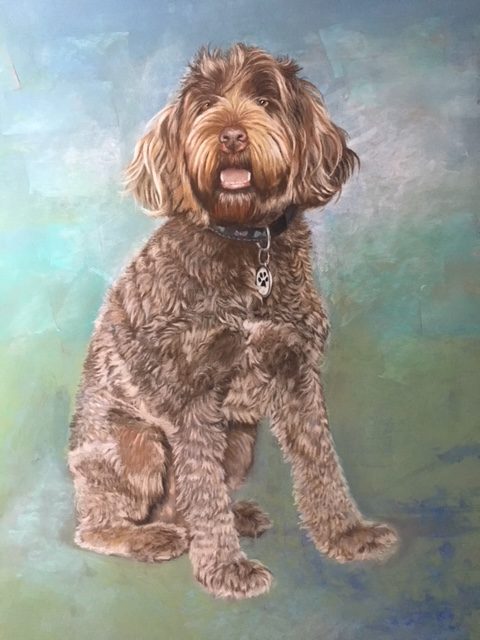
This is Phin. A commission from a mentoree and it is quite spectacular. Look at all that texture! But maybe too much texture?
Phin is named after the Miami Dolphins and so the artist wanted to know if it would work to add the Miami Dolphin Logo in the background. He also wanted to know how to enliven the fur with more color. So this is what we discussed.

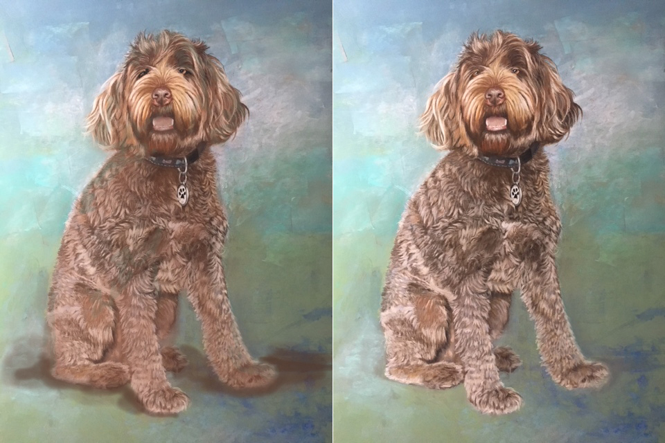
I suggested incorporating a bit of the background colors into the figure. Adding greens (like in my version below) will actually enhance the warmth of him all over and keep all that “brown” from becoming boring or appearing “cut out” from the background. In my workshops I talk about “putting the peanut butter into the chocolate.” In other words, integrate the colors!
Also, his head is very warm and has a lot more orange and yellow ochre in it. Bouncing a bit of that mixture onto his chest and front legs will make those areas appear to come forward more in space. Warmth in color tends to comes forward.
What is the darkest spot in the entire painting? His collar – so I shifted the purest black (a precious value) to his eyes and now they pop out more and make them more important than the collar.
As for the fur, the texture is taking over a bit. Such lovely detail, but it is “flattening” everything out everywhere. He seems “lit” from all over. Remember the lesson from my blog last year saying, “when everyone is special, no one will be?” For example, is all that light detail in the back leg necessary? “Washing it out” pushes it back in space. Even a tiny bit means a lot. And then I added the reverse – darkened and warmed up the fur around the his tag so it will stand out. I suggested a dolphin could be added there to subtly add the connection to the Dolphin team. I took down the lightest highlights in the fur around the tag and especially on the left side of his back and now he “rounds out” more in space.
Lastly, he needed a “grounding” shadow underneath him since he was appearing to float a bit. This makes him “sitting” in space. I used his dark brown coat color, but anything low-chroma and not too dark will work.
The original is on the right. This stuff is subtle, but it makes a big difference!

