A focal point in an image is key.
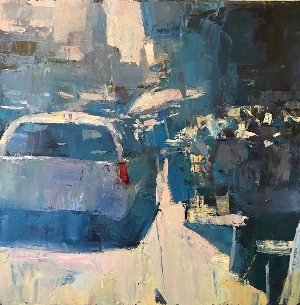
You have heard me say that again and again. Let’s see how Patrick channels a focal point in this painting with color and through composition.

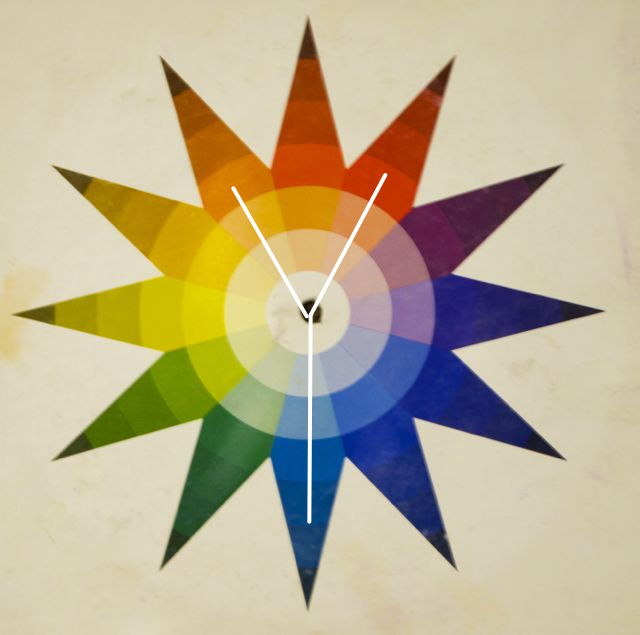
Paintings are not made up of “things.” Good paintings are made up of good decisions. As you can see this painting is a split triad of red, blue-green and orange.

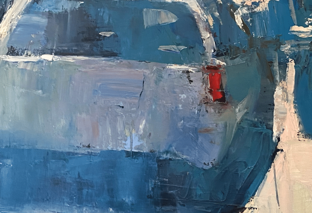
If you didn’t see that at first, don’t worry- the more you look, the more you will see in art. Clearly there is a dominance of color in the blue-green. The orange acts as a “support” color and the accent? Oh yeah. That screaming red taillight. Try to NOT look at it. You can’t. Yes, there is washed-out low-chroma pink (red) spread around too for unity, but nowhere else has that high-chroma screaming focus in the hue.
This is controlling color in a very personal and effective way. He could have painted every little thing “accurately” in this scene right? How many times have we done that? This is more poetic.
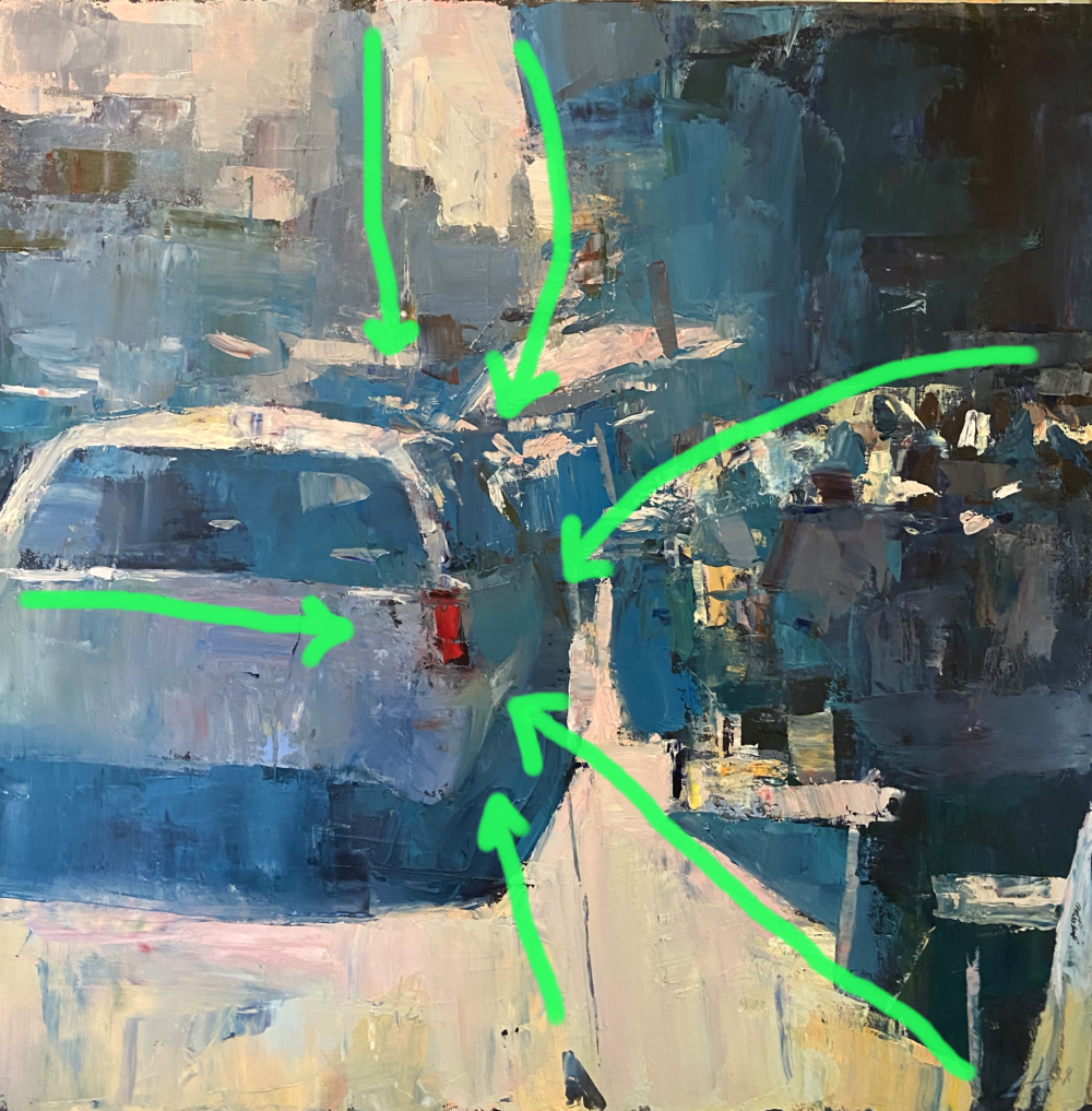
And how does that red taillight get channeled through composition? Like this…

Edges of objects and marks themselves become paths to the stopping point. Again, if you didn’t pick up on this, I can assure you your brain did. It LOVES paths and focus areas. It is always seeking them out. Adding them to your own work makes it more engaging. Try it.
This original painting is also currently at the Sewickley Gallery and Frame Shop in my hometown. I highly recommend stopping by and checking out the originals he has there. You can check out mine too.
Till next week.

Thank you!
thanks!!
Love it! I painted on site a lot years back (I miss it!) and Pittsburgh is filled with duller tones that ALWAYS have great bursts of color. Many of my on-site stuff had me purposely pushing the envelope between objective and non-objective paintings, through very graphic composition. Keep the great blogs coming!
Thanks for that refresher!