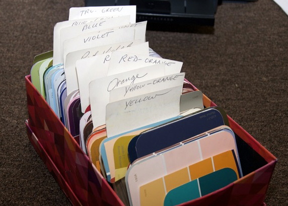
I am a big believer in picking out a color harmony for a painting. Planned color can unify a piece and beyond that, colors that “sing” together nicely can create a specific mood. Enter my color chip box….
Finding a way to begin to pick out colors for a painting can be a tough though. This is why I count my many art books as my many “friends” in the studio. I have a bunch. If you are an artist, you probably do too. Sometimes just sitting with a nice cup of tea and flipping through images of great paintings can give me ideas on color harmonies.

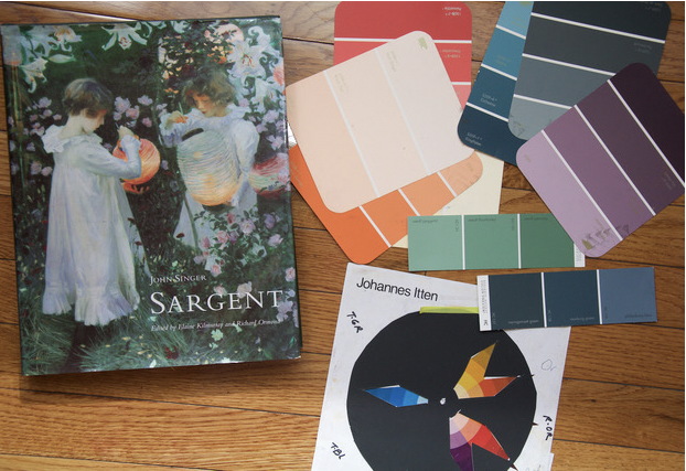
This is a painting by Sargent on the left on the cover of one of my favorite books. I like the feel of these 5 colors that he used in his famous painting and how well they work together. So, on the right I have pulled out paint color chips to represent not only the colors he used, but the tints, values and chroma of the colors as well. I have hundreds of “paint chips” that I have gotten from the hardware store. These chips help to remind me to use the variations of the colors. Not just the brightest version of the color, but the neutralized and subtle versions of the hues as well. For example, there is orange-yellow in the painting and as seen in the chord. But I don’t need that bright color for my painting, but I do need that color to stay on that color chord. So I picked out a very light, soft version of the that yellow (see the chip in the very center at the bottom of the pile) to use for my painting and to still keep me on that particular color chord.
If you put together your own box, be sure to slowly take chips over time or else you will get yelled at by someone in the paint department at Home Depot (don’t ask me why I know that ) and I am not 100% sure, but I think there is always a “run” on the nearest hardware store when I am teaching a workshop in a new town.
So back to the chord used by Sargent. His grasses and the shadows cast onto the dresses is not “green” and they are not “blue.” They are a blend of blue-green variations. In the 5-color chord seen above, the “blue” color on the wheel is actually blue-green, so I chose some chips to help me remember to stay in the blue-green family and to not rotate to true “green” or true “blue.” This will keep me to stay on track as I build my own image and work on which pastel sticks to grab. This has been very helpful over the years.
This is my color box that I take to my workshops so attendees can set up color chord selections. It is set up by the 12 colors of the color wheel and the chips are categorized into the 12 color families. These chips then become one of my many “Minders”- What I refer to as my many “reminders” to stay on track for the image I am building. It also serves to make me remember to use my “mind” and to not get distracted by all those pretty colors….. I am packaging it up now to take to my next workshop in Cleveland next week!

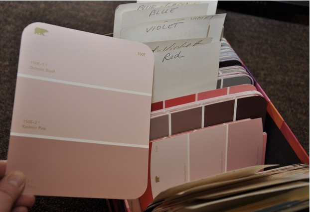
And if I am trying to use a chord that has “red” as one of the colors, I don’t have to use screaming red to use that color harmony. I can choose from the box a soft grayish-pink which will still fall under the red hue family. Make sense? It has really opened up my eyes to the many color options we have as artists.

So don’t get “boxed in” by your color choices! Grab a box and a bunch of chips and your paintings will reflect a wider variety of color choices.

Thanks for these tips. I think it is a great way to guide the choices we have to make.
Have you written about luminosity yet??
I have not- good idea….
Brilliant! Thank you so much for sharing this!
🙂
WOW; excellent tool for the studio or for teaching workshops. I’ve been focusing on color theory this year, and have many paint chips collected over the years for home projects. Now I can put them to another use. Thank you for this tip. Even though you may think about this topic, it’s always great to have a physical representation to which you can refer and see with your eyes and not just your mind. Thank you!
you bet! And so many subtle nuances of the chips too- helps so much.