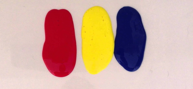
So last week I touched on how to use color harmonies in a painting. Since then I have had requests asking to talk about color harmonies some more, so this week I thought I would take a break from mentorship pieces to show how a true color master, Sorolla, used color harmonies.
The best way to get a grip on using color harmonies is to recognize them when you see them in paintings. This awareness will help when deciding on how to implement them in your own work. You have heard me say that it is not WHAT you paint, but HOW you paint. Controlling and planning out relationships with color can give you the “wow” factor.
Color harmonies work because the colors in a chord help each other to work together harmoniously, but if all the colors used in a chord were all the same chroma, (think intensity – like think straight out of a tube or bright crayons) and if the colors were all in the same percentage across the painting, they can cancel each other out. (Too much yelling for attention…) I tell attendees in my workshop to at least make a decision to make one color dominant (as in the biggest percentage across the painting- the “Papa” color) and one color as an accent (smallest percentage of the painting, or the “baby” color). Other colors will fall into the “Mama” percentage. And there are different ways to make that work.
The 3-Color Chords
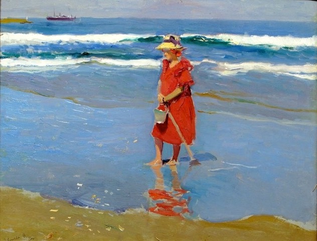
This is a very easy chord to spot. And what most people think of when it comes to the color wheel. This painting by Sorolla below is in a limited, 3-color primary chord. It is a very limited palette, but very effective. The red is the strongest accent (the strongest chroma) and the blues and low-chroma yellow support that red. This is what makes a painting stand out in a gallery up against lots of other paintings. Cover up the yellow-ochre strip of beach at the bottom and her hat, and you are left with a rather boring image with only blue and red. The yellow completes the chord. Why do they go well together? The colors bounce every fourth color around the wheel. Remember how fourths are important to music? Here too. The visual musicality of it shines through. And the red is used as a high intensity on purpose. The artist is saying. “Look here!” If the blue in the water was just as bright and saturated in chroma, the red and blue would cancel each other out. (And the painting would be harder to look at) The blue is knocked back just a bit along with touches of the yellow in the water in order to make that red pop. At first glance it may seem as though the yellow used here is in the yellow-orange family, but no, it is in the true-yellow family, just a very dirty and low-chroma version of yellow. Almost green. (Notice the hat- it is true yellow).
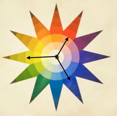
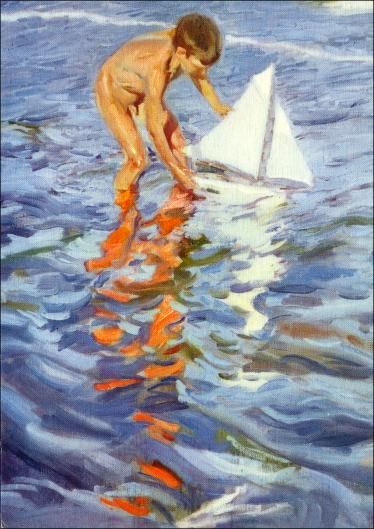
This painting below also uses only 3 colors but in a slightly different way. There is still a 3-color chord, but it is a split-triad. The high chroma dashes of red-orange are deliberately “popped” against the lush blues. Yum. Not true orange like in the fruit, but warmer. Even in the skin tones, the color has more red in it so they belong in the red-orange family. Then see the very muted, tiny dashes of true-green in the water and on the child? The accent color here is green and is instead muted and in a supporting role. Blue is the dominant color of the painting. (biggest percentage and “Papa” color) So an accent color does not have to be bright.
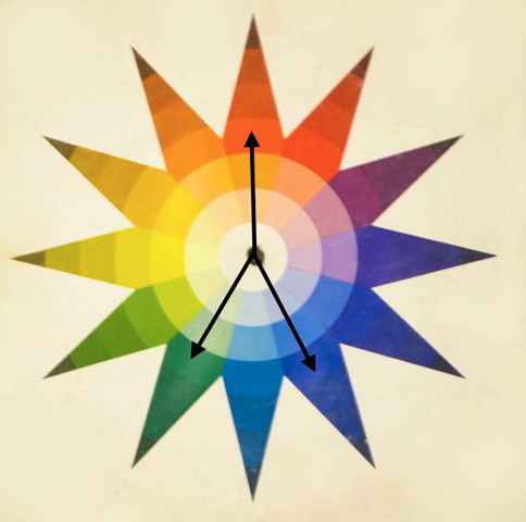
So if you rotate the colors to get the same 3-color chords above to get different colors they will work well together too.
Next week I will talk about 4-color chords…

Very nice analysis, Christine. I can still recall being stunned when I first realized what I thought was a “full” color painting was merely a few “limited” colors, used well. You may recall Dan Greene’s color lecture when, as a young artist, he figured out that the Dutch Masters used yellow-red-BLACK, and not blue…and so on. I did a color show for BPTV and emphasized going back to the “good old color wheel.” Amazing how using a few colors alongside each other, and then one across as a BURST in the painting is all you really need. There is so much garish, glitzy schlocky stuff around now that it’s clear those folks don’t have any idea how to use color. And all of these photoshopped-to-death Pittsburgh photos that are popping up are starting to make me puke…! HA! Pittsburgh doesn’t look like that..! Anyway, nice job. You write well. Ciao!
Thanks Vince. Good to hear from you. I agree, some artists may think “more is better” and then wonder why the artwork has a rather garish feel to it. A true master, like Greene, understands that control of the subtle nuances of color leads to a very sophisticated feel to a piece. And black paint is made up from a blue base so……
Thanks
🙂
Please do an article on tertiary color. I find all of this overwhelming and end up with the blahs. At pastel society someone said to use warm next to cool. Does that apply here?
hi — There are six tertiary colors; red-orange, yellow-orange, yellow-green, blue-green, blue-violet, and red-violet. They are called “tertiary” because they are slightly different and theoretically more “diluted” colors from the “true hues” such as blue or red. I guess I don’t think of tertiary colors as any different than any other color, since to me there are 12 color “families” and as the wheel turns with any chord, it shows different combinations. One of my absolute favorite triads (the second chord I talked about) is turning the chord to true-green, red-orange and red-violet. I have done many paintings based on these 3 colors. They go together because of how they bounce around the wheel – again, the math of it- so I don’t think of them as anything other than a great color combination. As for warm and cool colors and using contrasts, there are lots of rules and theories as to how to get color to work best, but it all depends on what you are painting, the lighting situation and what intentions you have. Typically, a warm lighting situation will have a cool shadow and vis-versa, but there are always warm and cool colors on both sides. Depending on what colors surround a certain color, you can get a color to literally change its hue. Ever pick up a stick that looks green and when you place the stroke onto paper and it looks pink? That is called color sensitivity and is a difficult concept in art, but one worth studying. If you can go back to my blog from early last year with the title “Grey is Not a Color” I talk about that concept a bit. Hope that helps!
You teach well, it is really easy to follow you! Simply stated profound ideas! Thanks s lot,
thanks! happy to help!
I can’t thank you enough for giving us this information. I’m always excited to see an email from you and wait to read it when I have the time to savor every bit of information you so freely give. All I can say is thank you, but thank you is not enough.
you are quite welcome!
I agree with Diann as I too love to see your name in my “in box” and can’t wait to read what you have to tell us. Thank you for these blogs, especially the ones on colour. I was beginning to think I had a form of colour blindness but you are explaining things so clearly that I am picking up on some of my problems. Between you and an Aussie friend, I am finally starting to “see” colour. Bliss
Color is complicated so I am glad to help! 🙂
Thanks, Christine! That was a very clear description of color harmonies. It’s great reference.
more to come!