Just because an object looks a certain way, it doesn’t mean it has to be painted that way…
Here is another painting that I think has so much going for it. His face is beautifully done. There are so many subtle shifts in color showing clear form and structure and he has a great expression. There is a richness to the colors and a very lush paint application.
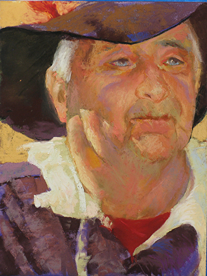
But when you look at the painting in greyscale, what do you notice?
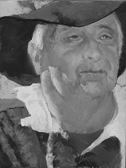
The colors here are not what pulls the most attention in the painting. Again, the darkest “blacks” of the value shapes will always have the biggest impact on an image especially if you do this….
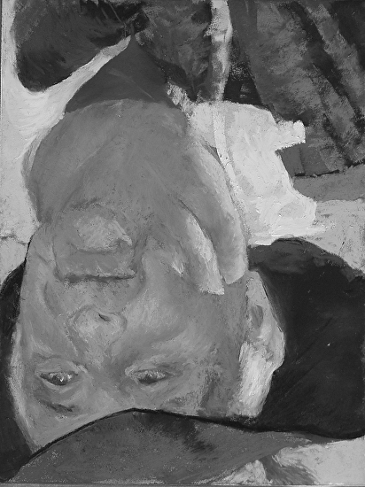
Here it is upside down so the shapes of the composition can truly be seen. That is all “composition” is anyway – placement of shapes. I think this painting comes down to weight and balances. Then there is that “edge thing” again too. I have no doubt that this hat was that black and hard-edged in the photo reference that the artist used as a basis for the painting. However, it does not have to take over an image. The darkest and the heaviest shapes are the three “hat shapes” surrounding his face …
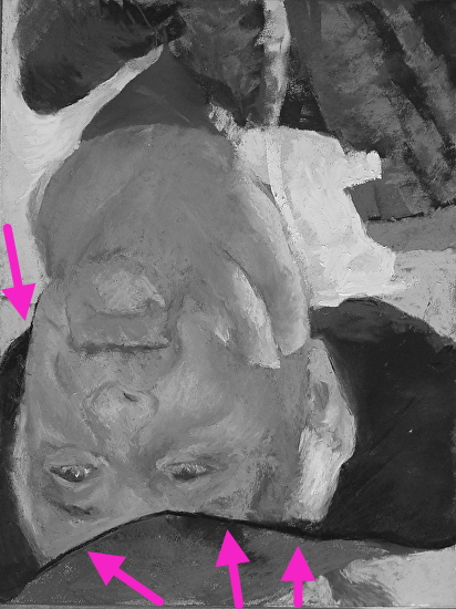
and the sharpest, knife-bladed edges are along the pink arrows above. The narrow, dark shape against the side of his face pulls so much tension at the side of the painting. It makes his face feel almost claustrophobic to me because of the placement. The sharpest (and blackest) edge of the hat near his mouth is one of the strongest edges, so it screams “look at me” and there is really nothing going on there and is not in a very important place. If he had a bit more “breathing room” around his head, and the hard edges were subdued, then the viewer can go in and really appreciate all the beauty in the painting of the face and would also be drawn even more into his eyes. Furthermore, because the edge of the hat above the eyes is a line, and not a shape (like everything else represented in the image) it really jumps out.
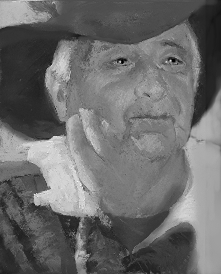
Above I’ve added more space onto the right side of the painting to give him a bit more room around his head and if the distracting hard edges are softened, then his eyes start to pop once pure black is added into them. Remember how the eye is a lazy organ? Now my eyes track back to his eyes again and again and I really notice him and his expression.

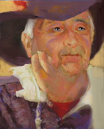
Here he is back in color. Ahhh…so lovely. Focus. Control of blacks. Control of edges. Breathing space. He just needed a few tweaks!
Yee Haw!

This process of contrast really makes sense. You are a very talented artist. a
🙂
You are so amazing and talented and I’m so proud of your blog and success!! Xoxoxox
🙂
Excellent!
🙂
can I use one of your pieces?
thanks once again, Christine…always enjoy your shared bits of technique/observation…
RK
🙂
Another great critique…
🙂
The last two posts have been especially brilliant. I love how you show rather than just tell. Very helpful.
thank you!
This is an excellent portrait. The colors are wonderful. I agree with you about the thin dark shadow of the hat above his eyes and adding black to the eyes made a big difference.
However I think you missed the biggest compositional problem and that is that the entire face is too far to the right side of the canvas. My eye keeps wanting to fall off of the right side of the painting. To fix that problem you would need to cut the space between the left edge and left ear in half and somehow add that space to the right side of the painting.
I think if you reread the critique at the end and look at the finished painting you will see I did add some space on the right side of the painting and extended his shoulder compared to where it was. There was only so much room left on the paper. Next time more planning would be good to give it even more room.
Wow, what a difference it made by softening the edges on the hat and using black in the eyes. This truly refocused the portrait to the eyes.
Thank, Christine!
Thank you for this weekend’s workshop 🙂
you are welcome! SO nice getting to know you!
That’s interesting post …
I added your website into my favourites!
🙂 Looking forward for future updates!
Michael
great! 🙂