I recently posted a little oil painting that I was working on last week and was pleasantly surprised when it received a lot of attention on Facebook. SO cool! So I thought I would show how this little image came to be.
It started with an impromptu photo shoot of my daughter. She was flicking her hair around in front of a lamp and I thought… “cool! I can paint that!”
So I grabbed my camera and shot a bunch of pics with her at a bunch of different angles. (my kids are used to being abused…) This pose was the one that made me want to paint.
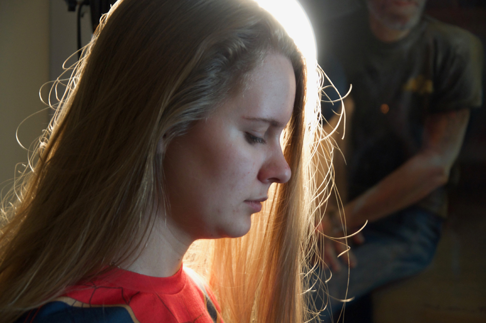
Now I knew if I tried to capture this photo exactly as I saw it then:
1. It would not be much fun.
2. It would probably look like I tried to copy a photo and would look like crap and
3. well… it would look like crap.
So with that in mind I always start with my intentions… why do I want to paint this? What colors would help me tell the story? What can I leave out/ leave in the image? What can I exaggerate?
I decided to go with a square format. Bing. First decision down. We artists are nothing more that decision-makers after all and our work is only a compilation of those decisions… for better or for worse… so, square it is.
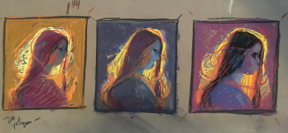
I started with these little pastel color studies…

Sometimes the key to not fighting with a background comes down to nothing more than trying some things out in a safe way… “do I really want a red violet background?” So I didn’t worry about features, or even proportions. (let those things go!!!) These color scribbles are “thinking” studies and are only for me to get my head wrapped around something new. Time consuming? A bit. But totally worth it! This got me thinking about the feel of the piece and not just copying a bad photo.
Then I proceeded to this little pastel. I left the pencil in so you can see how little it is.
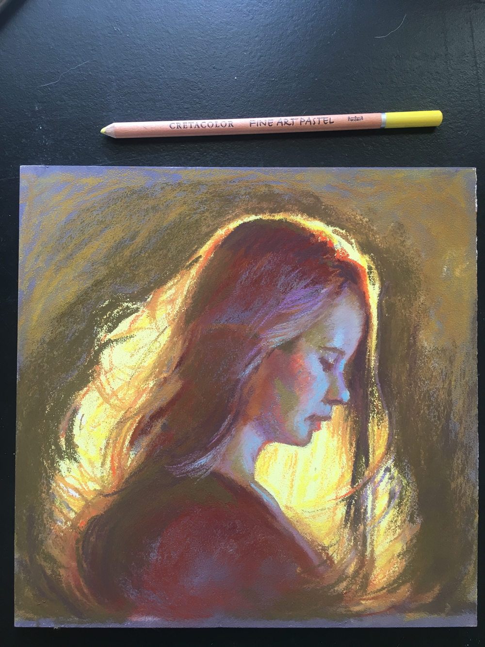
Which then led to this larger pastel. 14 x 14 inches… incomplete…
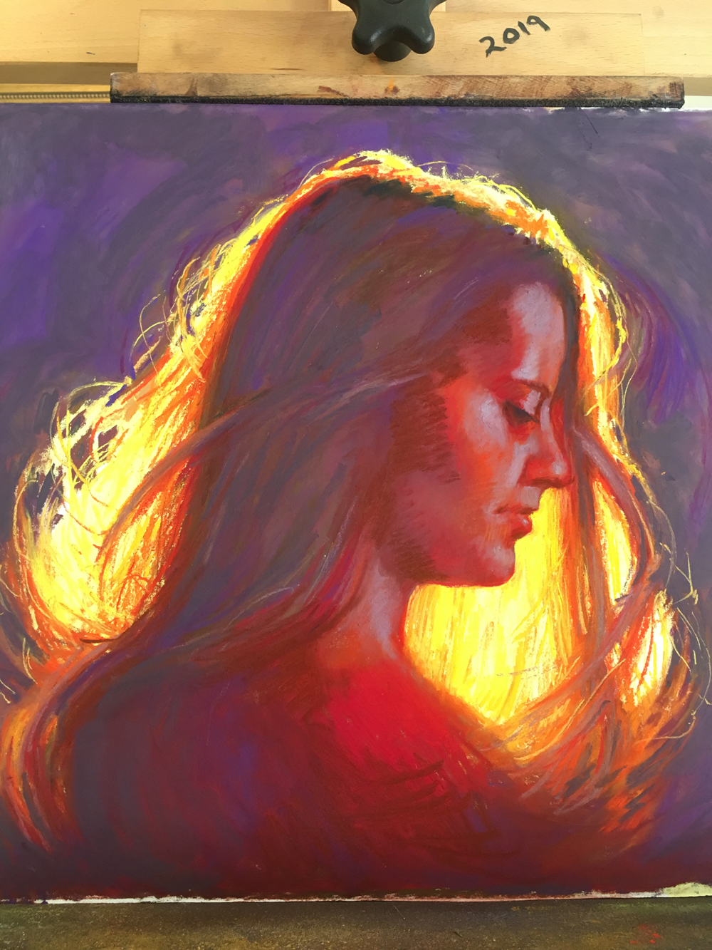
Such fun with color here! but then I decided that the chroma was too strong and brought it back down… I like throwing “crazy” colors around a bit because I can always decide to ramp them back a bit. Starting off with boring, chocolatey-brown-fleshy- wimpy colors can kill a painting right off the bat.
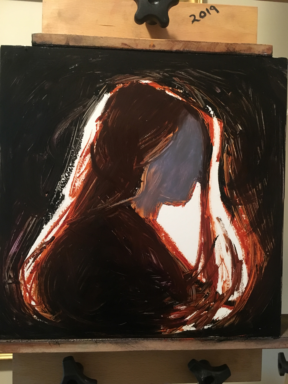
Then, since I have been teaching a class on glazing in oils, I thought I would try it in oil in the next version… this was done on a white-gessoed hardwood board. Sanded very smooth. I thought about glazing all those thin, wonderful, light-filled warm colors on top of white… just like I do in watercolor or pastel… yes pastel! I like to work on a white surface. This gets me thinking like a watercolorist- how to glaze on white! It is very fun.
This is the first pass below… no face… truly… that is not what the painting is about. Shapes, colors and the light needed to steal the attention, so her face will be included, but in a supportive role.
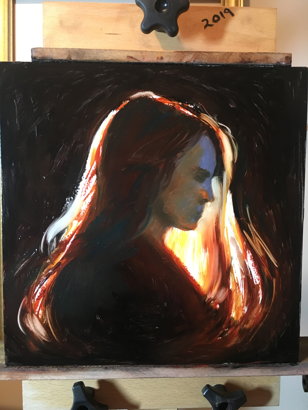
I am still figuring out what I wanted. So I added arcs running through the piece, a redder background, and more “finished looking” features.
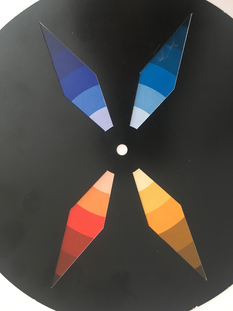
I decided on this color harmony… a spilt quad… and that made it feel much more “completes. I love it when colors talk to each other… picking a harmony allowed me to bounce blue-violet accents around her hair and face. Would l have thought of that just trying to copy the original photo? I doubt it.
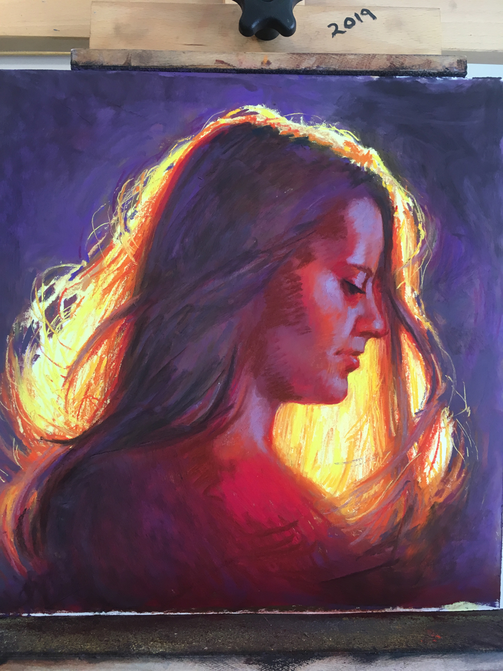
Here is where the painting is now…
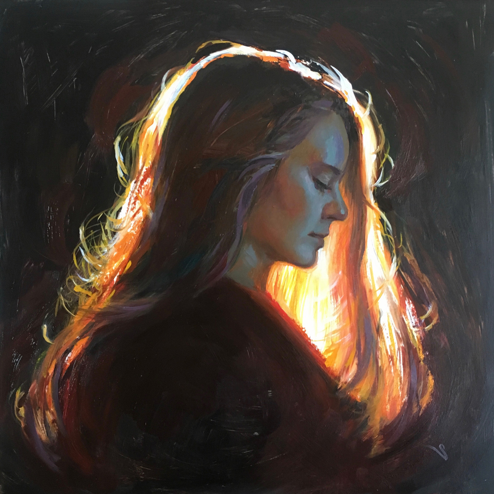
Am I done with it? Nope- I don’t think so. A few more tweaks I think. When the mood strikes. My title? Illumination. She is off to college now to get some learnin’ so it is a good title in more ways than one.
Painting needs to be fun right? A few deliberate decisions about colors and intentions and trust me, it will be more fun than you ever thought.

Beautiful work well done ,failing to plan is planning to fail
yup!
Wow. Captivating. And inspiring. It makes me want to concentrate on painting light. I really like it.
yes, go for it!
Great article. Thanks so much for sharing your process!
thanks! 🙂
Wow, this is amazing! I love to see these progression photos and the explanation of how you arrived at the different colors, etc. Thanks so much.
sure! hope it helps you on your journey….
Thanks so much for showing the progression of your thoughts as well as the studies behind the work, Christine. I wonder how difficult it was to learn to use oils after mastering pastels so well?
I continue to love your work!
Cathy
well this brush thing is a bit aggravating to me. I am so used to just grabbing the color I want and then directly painting with pastel sticks. Mixing color and then applying with a brush is definitely different but the same good art concepts apply. I just have to get used to it a bit.
It’s a beautiful painting, Christine, and your discussion of your creative process is very illuminating. (I’m an incorrigible creator of bad puns.) Thanks for sharing your insights into how you created this beautiful piece.
Bill Ceriani
Thanks BIll! happy painting to you!
Love your posts every week! What color wheel are you using?
Vicki
hi- I am using the Itten Wheel. But any color wheel can work as long as it has 12 main colors. Some have more or less and then you miss out on options.
Just love the lesson on illumination! Thanks
🙂
As always your post is right on the money. I’m doing a sunrise landscape with a lot of illumination in it, and so I was thinking how I could balance the color, maintain the warmth and light, and the shadows in the darker parts of the piece. I always want to jump right in and have to force myself to plan and do the footwork. Thanks again for an insightful post.
so welcome! Just even a little planning can get ya moving in the right direction. good luck!
Christine…this has been a most illuminating art share.
I really appreciate that you shared (once again, TY!) your ‘thought & painterly’ process from inspiration, development of intention and right on through to your present step towards a finish — full circle.
I, too, am working on a portrait of my eldest daughter…which with each step of ‘the intention’ — it reveals itself/multi-faceted layers of development. Fun!
The process also affords me a cherished, thought-filled connect to her, as I develop my original ‘from life’ sketches of her along w/the underpainting which were each captured during Our Mother-Daughter Invitational Artists -In-Residence retreat during 2019’s polar vortex in the ADK. Memories!
As always, my thanks for your gift of generously sharing your knowledge in a beautifully-grounded Art Spirit.
thanks! so happy you can relate to painting your daughter. it is a fun and thoughtful process. good luck with it!
THanks! ☺️
Thank you for taking us through your thought process and all the little pieces (thumbnails) – wow. Yes it was a great pic on fb last week. It is beautiful. Congrats!
thanks!!!