“Here Comes the Sun”
– The Beatles
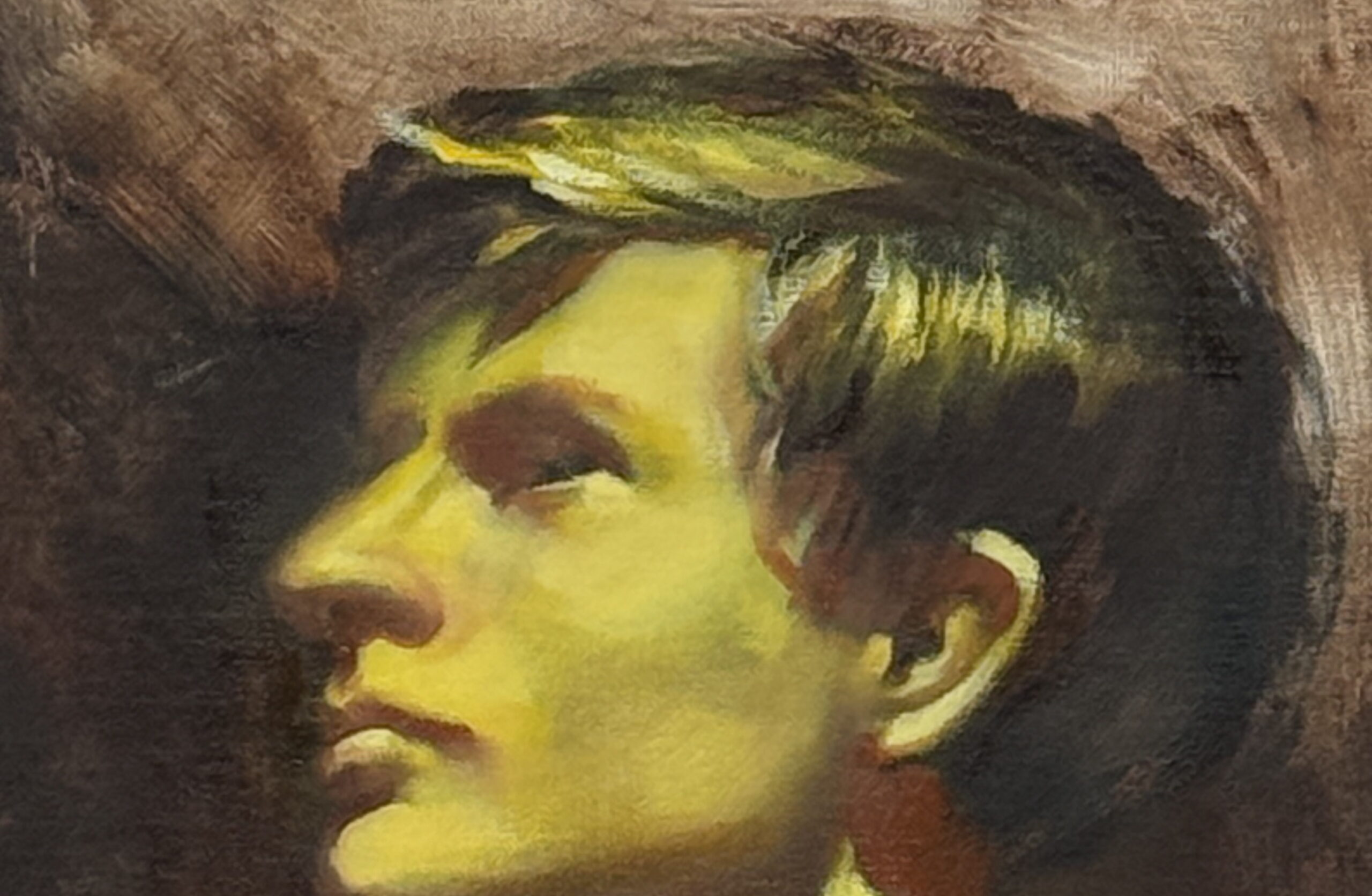
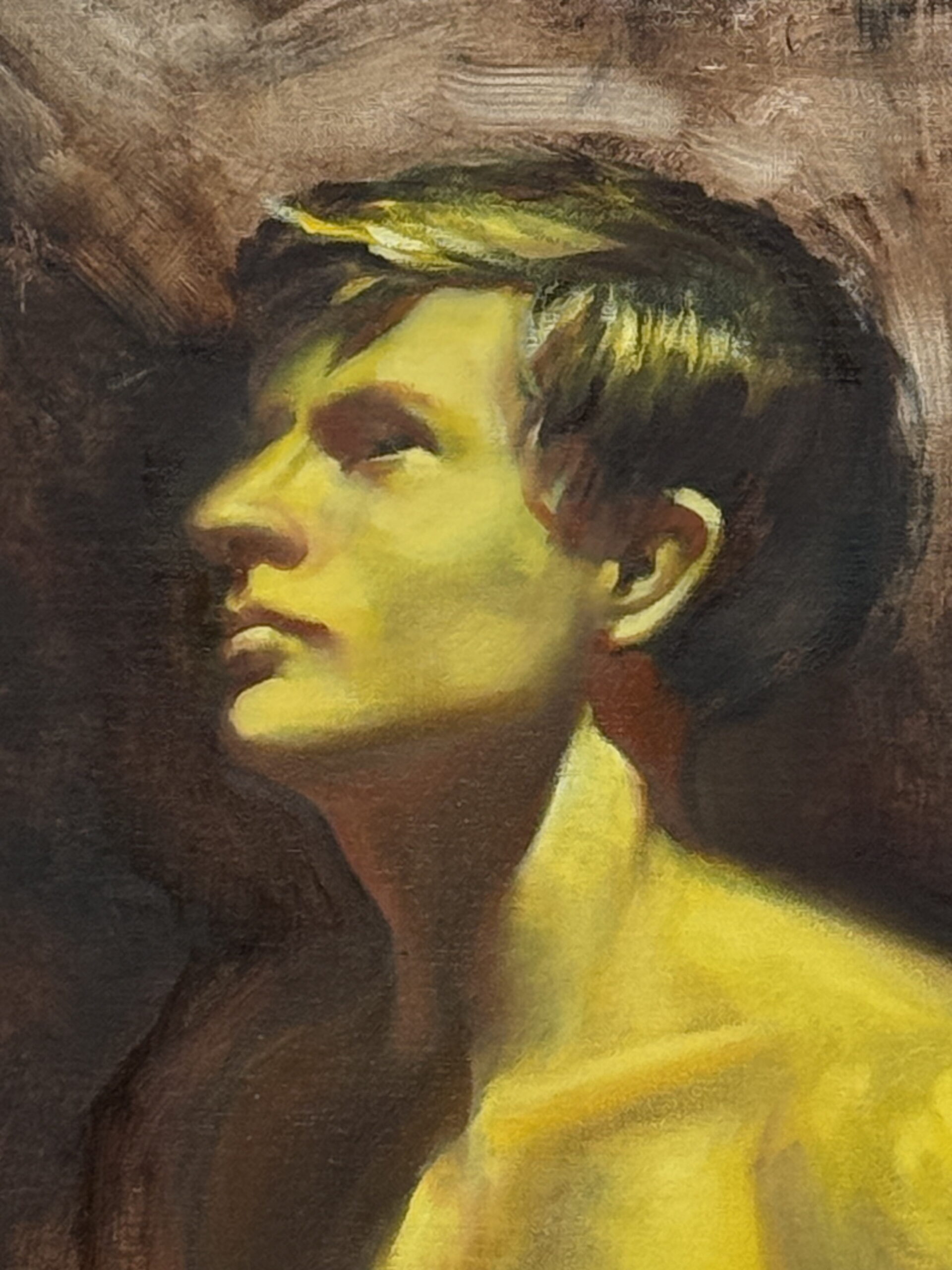
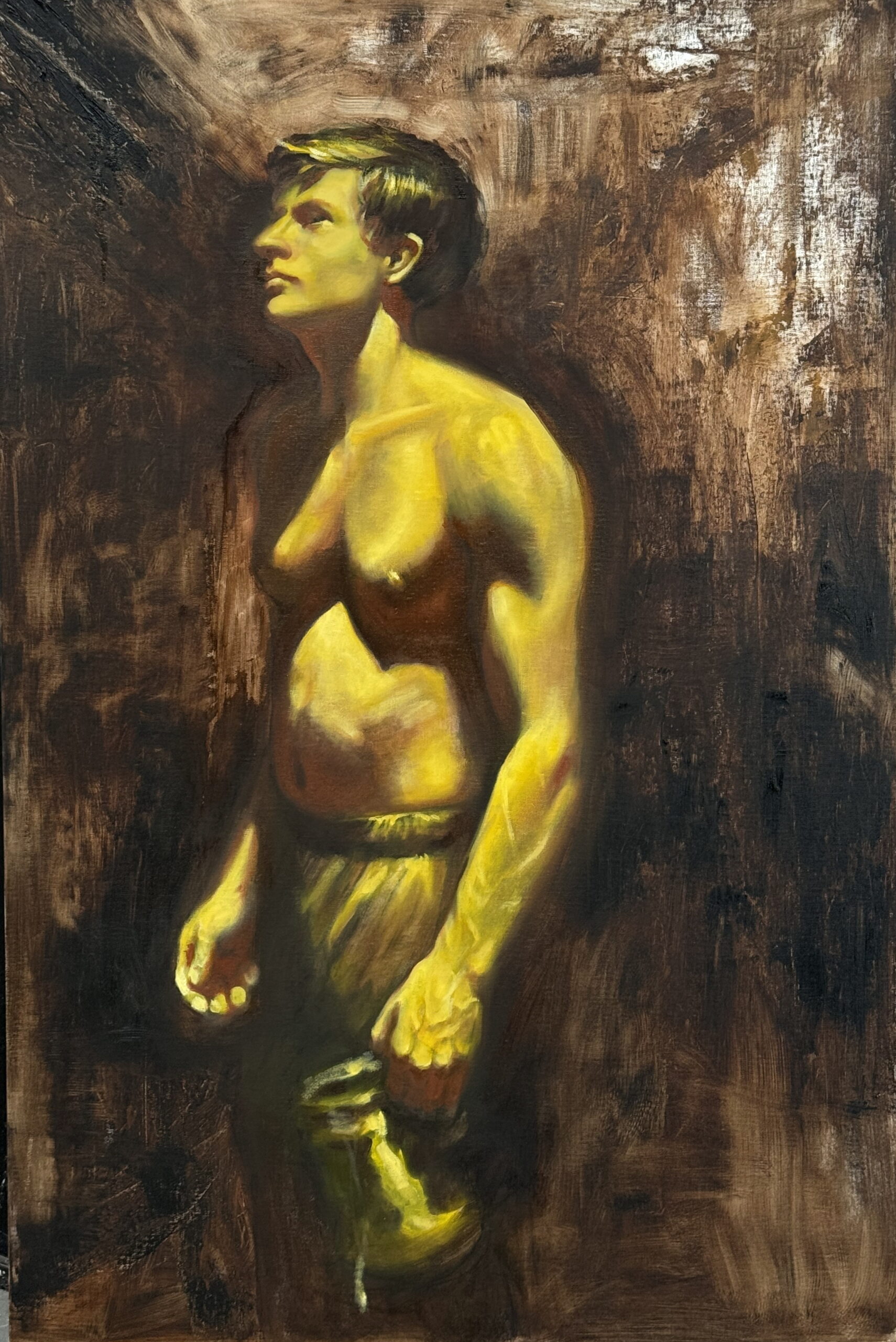
So over 30 years ago I used to set up my paintings with a “grisalle”- a base of grey tones that accurately represent the values in an image. Then, color is put on top of this base. A lot of oil painters still work this way. However, for me, by the time I actually got to the color stage I was so bored with the painting that I wanted to move on. So I figured there had to be a faster way.
Enter yellow. This gets to the heart of what I need to render. The Light. Color is always secondary to the form and this helps me figure out what the light is telling me. Larry the Light Beam and his buddies will show me everything I need to know about the forms if I slow down and understand what they are showing me. If you have ever taken a workshop with me, you know it starts with light. Everything relates back to the Law of Light.
So the figure went yellow. And not without understanding what the light is telling me. The yellow IS the light.
Then color becomes easy.


Chis-I’ve noticed in your on-site landscapes you still lean towards a yellow base. Why?
I completely respect getting used to certain preparatory methods, such as toned or untoned canvas, as one example. But the human figure and tones can be miles away from what we find outside. Years ago, I went towards a dull, reddish, light mid tone for on site pieces, as the cool colors on it really jump, and it is less vibrant enough that warm ones do, also. From time to time, I’ll purposely go with a cool color, just to expand my brain. I was happy that, one day in class, Dan Greene mentioned, offhand, “There is evidence that Edward Hopper used a red undertone.” Do you ever change up when painting on location? Thanks!
The yellow stage represents the light. It has nothing to do with skintone or even the light source. Which always has a color dominance. I treat landscapes the same. So no.
Does this apply to watercolor anything?
Yes. Absolutely.
Thank you. It’s been a slow process for me to use yellow to signify the lightest at least. I’ve even tried grisaille. I had some success, but didn’t care for it. I sometimes use a graphite drawing of what I intend instead. (A complicated notan I suppose.) I’m still working in soft and oil pastels and have avoided oils and totally run from watercolor and acrylic. So here I am with those lovely sticks of pigment. But I try to get used to new ideas. It’s never too late to teach this old dog a new trick. (And stick to it.) I use a large yellow thumbtack to show me where the sun was when I decided on the composition in plein aire. All I need to do is remember the law of light. Primary and secondary. Whew. Who knew that the study of color would be this complicated. It’s value, value, value. (I love it!)
Amen sista!