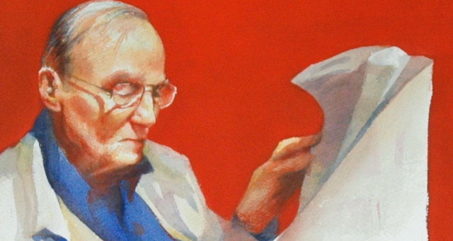
I was digging through my storage room this past weekend looking for a painting that I could rape for its frame…..
Looking through old work is like an adventure into the past. Sometimes it is rather melancholy and yet sometimes it is like meeting an old friend. I come across paintings that I almost forgot that I did. I used to work in watercolor and so I came across this piece which I liked a lot at the time. Primary color harmony (red, yellow and blue) and it is the first painting where I starting seriously thinking about “links” in a painting.
What do I mean by links? Well, this is a guy reading a paper, sure, but there is more to the story of his creation. He was a guy I saw in a hotel lobby who was nice enough to let me take a few photos of him. Once I got home, I had a few grainy photos, but I liked the overall feel to the pose. So I thought- how can I make the composition stronger? A good painting is typically less about what is painted and more about HOW a painting is put together.
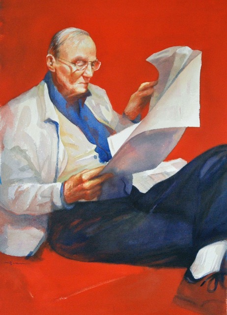
One way is to create “links” from one area to another. One of the best ways to do that is through diagonals. For example….
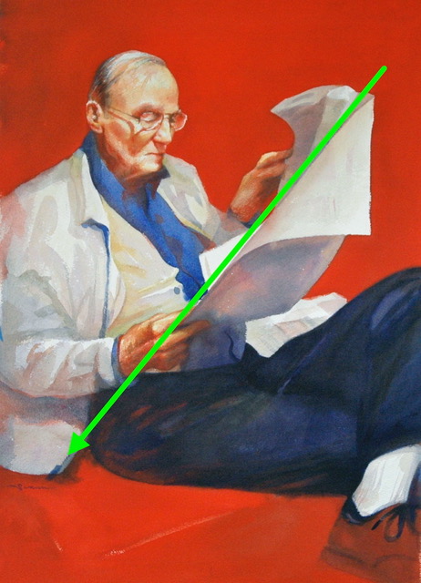
There is a lovely diagonal naturally happening at the edge of the newspaper. So, I moved the edge of his coat and the zipper to be on the same “line.” Linking the 2 edges.
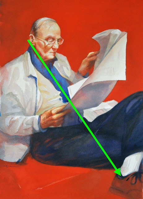
Then I realized that the edge of his jaw and the line down his shirt could be another great link across the image if I also added a very dark edge on the same diagonal to the back of his shoe. I think the shoe was black in the original photo. The rest of the shoe is not important, so it kinda “went away”.
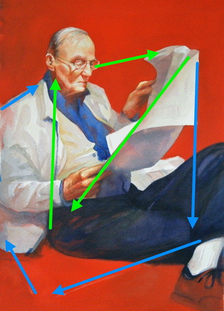
Above you can see the primary diagonals in green and the secondary diagonals in blue. I remember lining up the crease by his ear with the vertical blue line on his coat and making sure the meeting of the edge of the pants and coat went right under that line. The top edge of the newspaper leans in toward his face (yup, I did that) and gives a nice swing around the edge of the paper and down to that first diagonal and back up again. (green arrows) For the blue arrows, the edge of the paper on the right got lined up with the dark crease of the pant leg and then the edge of the white sock got lined up with a very subtle light mark in the red cushion he was sitting on along with a rather subtle red mark in the pants. On the left, another subtle mark in that lush red moved the diagonal up his coat and back to him. I thought I was so clever!
The painting is just ok. Technically, it is rather weak, but compositionally, I am rather proud of it. I think it was about this time that I realized that watercolor was becoming difficult to manage with so many things I wanted to move around and change as I went along. Pastel moved in and I never went back!

I love the diagonal information on composition. It is so important!
Thanks.
sure! I love my diagonals!
thank you Christine, very nice pointers on establishing and identifying links in a painting or photo.
thanks!
Enjoyed this very much. Thank you. I’ve been trying to follow your lead. Sometimes fail but also sometimes not. I thought I had a hand hold on understanding composition, values and such. But I have had thoughts before. So I appreciate these blogs that help me understand a bit more.
Composition is tricky. Once you think you know all about it, someone finds a way to break the rules. glad to help!
Thanks so much for sharing your knowledge. Very helpful.
🙂