I have to say the painting I posted last week has been a different kind of painting for me. I was less interested in “perfect” color or even in a perfect rendering than I was in making a statement. It was rather liberating…
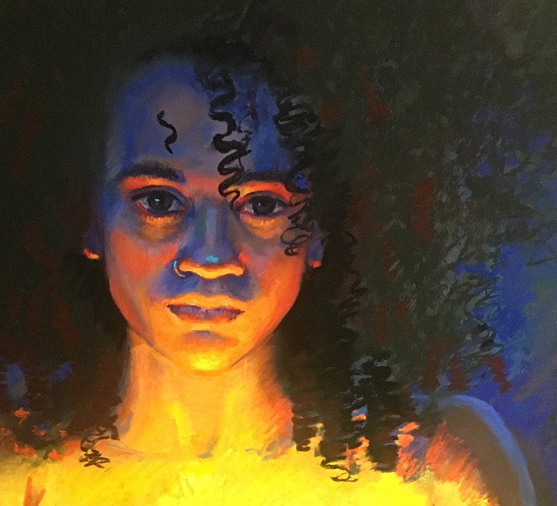
Sure, I labored over the face- who doesn’t do that when you paint a portrait? But this time is was more sculptural. I loved crosshatching and blending the exaggerated, weird colors together. There is hardly any “local” color to her face at all. I wanted to push the warm light and also the colder shadows. Mark-making became a way to express beauty in transitions as as well as in form. Lines followed the form of her nose, the curve of her lip.
Layer, layer, sculpt, sculpt…
Transitions between light and dark needed to be strong in chroma and in the power of the pigment as form turned away from the light. The shadow of the forehead got lowered in chroma and the path of the strokes followed the planes of the head. Sculpture in 2-D.
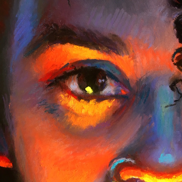
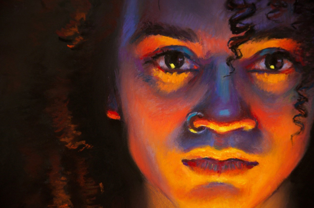 A strong pop of lemon yellow as the highlight in her eye? Oh yeah…
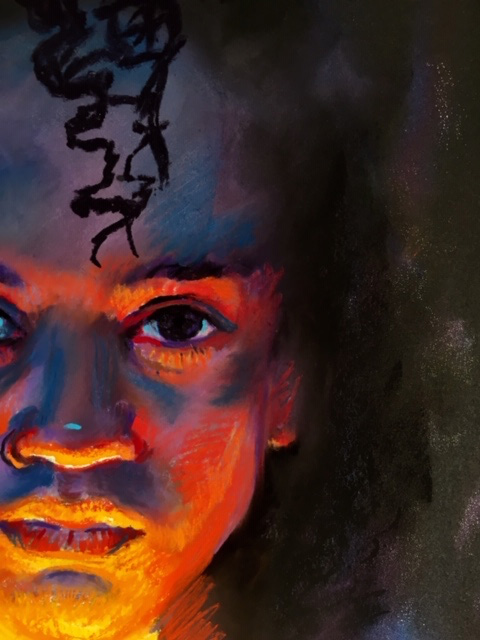
But below are earlier versions of her face as it went along… I left the forehead deliberately too high for awhile knowing I would carefully and eventually creep it down into the right position. I marked a few black curls in at different points just to see the contrast and how it could work. A tiny dot of the blue-green on the nose helped to judge whether or not that color being introduced there would be a good idea. Just to ask myself- did I like it? I am flexible and my paintings are too- I knew I could take it out, change it or put it back in bolder…
At these earlier stages she still looked pretty spooky and that was ok! I am always amazed by how much pressure artists put on themselves my workshops. “It is not right! It looks horrible!” and my response is: “Cool – that means you are thinking, taking a chance, and have no where else to go but up.” Becoming more precise in my decisions as I meander along and as I build something is a huge part of the joy of art for me. Basically battling myself… (bring me on!)… Ugly stages are welcome in my world… they show the struggle, the thought process… and I give myself permission to not “get it right” out of the gate. That would be too easy and clearly no fun.
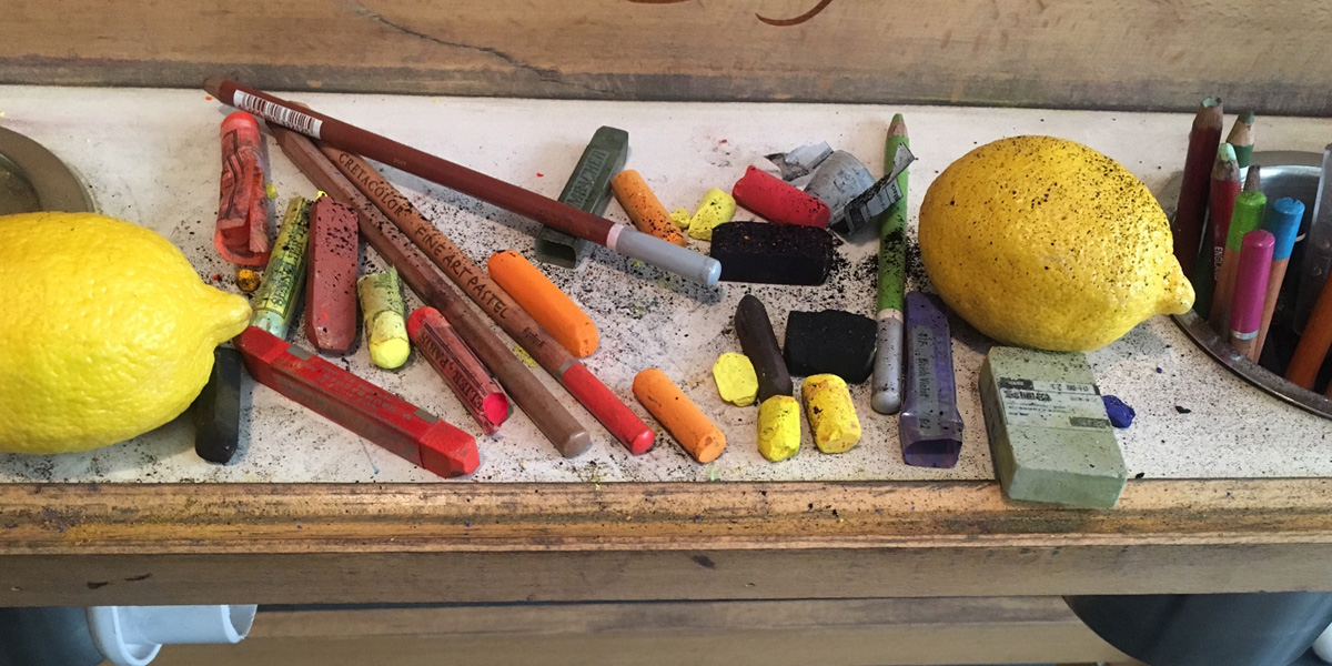
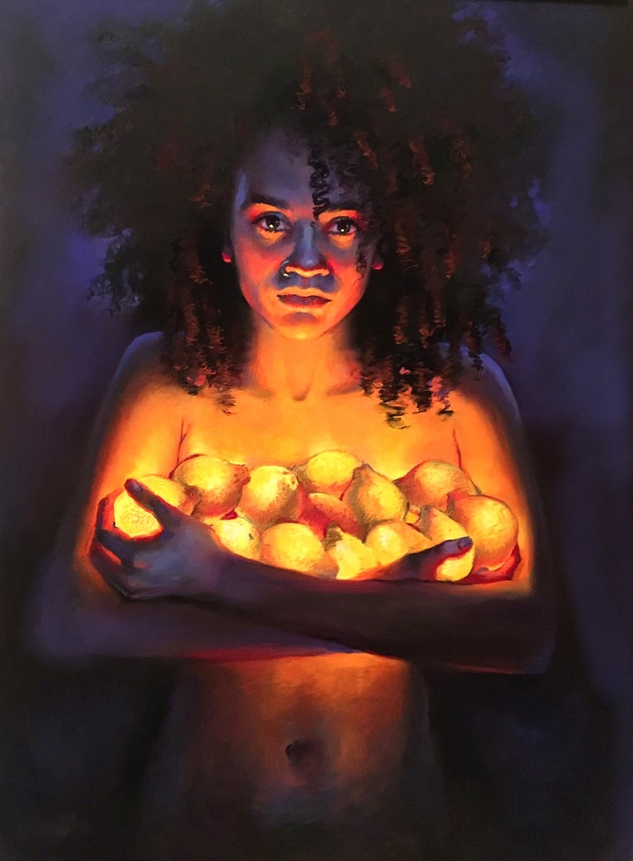
Then it was back to fighting the lemons. After deciding that yes, indeed, they did look like onions, I decided the glow could be painted as coming from the surface of the fruit more easily. This meant pure pigments in powerful sticks had to be used against weakened low-power sticks in the flesh tones and in the shadows of the lemons. In pastel, a true “glow” can only happen against a non-glowing area. Otherwise, they cancel each other out. I think I will be exploring other ways to make the powers jump and glow in future paintings… got some ideas…
But at this stage I warmed the lemons up. And her. Adding reds and such. But now they looked like pears… sigh… more next week…
Love the lights and complementary colors! Lots of drama.
thanks! 🙂
Christine, Just amazed by the haunting beauty of your lemon
glow portrait. So outstanding. Viewing it remains with me
and will remain with me for sometime. This painting belongs
in a museum for many to savor and enjoy! Thank you for sending
this lovely lesson for me to enjoy and savor. Gini
Thank you Gini. Miss you!
Loving these blogs! I’ve had to give up pastels, and will just have to translate your info to oils! Sheila
believe it or not, I have been doing oils too- teaching it as well!!!
It’s so great for me to see these stages Christine. It really makes me miss portrait painting!
🙂
I do love this new you. Or is it the old you “reborn”. You give me hope that I can change my ways. Thanks.
hehe… I think the latter. Just finding myself again at 50…..
I am so encouraged by your spirit and thank you for all you have already done to get our creative communities together
Bravo
Ps so which set of Girault to buy, the gray scale set or the portraiture set?
50 grey set. Hands down. We pastellists always have too many brighter colors, and we really need the lower-chroma ones. I must order that set nearly every year….
So, you’re teaching oils, too? Want to teach for MAL?
maybe…..:)
Thanks for sharing your process–it makes me stop and think and puzzle out next steps in my own art.
good! I know I pushed ya quite a bit when we were working together. hope you have good things in the works!