Just as in this tumultuous political climate, in art, there is no such thing as neutral.
In the commission I just finished I found myself reaching for the same sticks over and over. One that I always had at the ready and used repeatedly in the very lightest-lights in the faces was this little beauty… it was one of the sticks I kept track of as I was working on the paining so I could find it time and again.
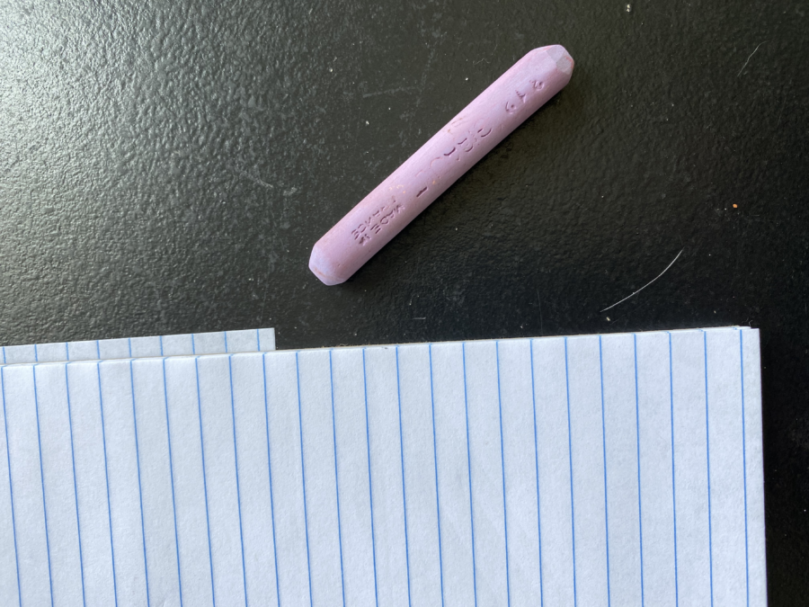
It is a Girault stick in a lovely lavender-ish color. It has a blue cast to it – look hard – so it is a color that leans toward blue. It was very helpful to keep their faces feeling like they were outdoors in natural light. (blue light) It was used in the very lightest areas of their faces. Everything else was kept darker. It seems pretty light value doesn’t it?
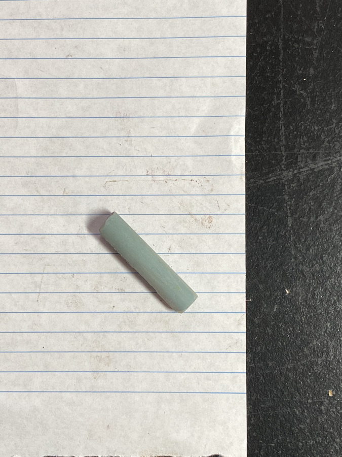
But here is the exact same stick on the white piece of paper. I did not change the lighting or anything else. I just moved the stick from the black surface to the white paper. And it now looks like this…
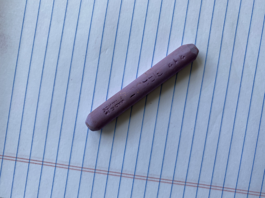
Ha! Fooled ya! It actually looks pretty dark in value now. But is it? That is the wonder of color… it changes based on its relationship to the other colors and values around it. Like a chameleon, and it can’t be stopped. I did not use anything lighter than this in the entire painting for their faces. Honest!
This is a trap that artists fall into – that we need those “oh-so-light” washed-out colors for skin tones – Nope. It can create a ghost- pale image that kills a portrait. Think color.
What is the point of this? For me, that putting all those sticks into a pretty box by value has no meaning. As soon as the stick is picked up and placed on your painting it changes so fast. Like a teenager at age 14. (I ought to know) It is an amazing phenomenon of nature. Recognizing these shifts is key…
Here is a lovely little fellow. Blue, I believe…
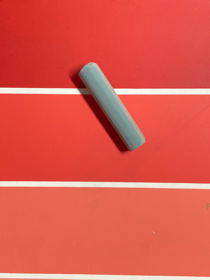
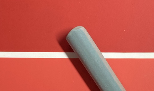
oh, nope. Sorry! Green… oh ya little stinker.
The red of the color chip he is sitting on makes him appear blue. (you would think it would appear green, right? “Complement” stuff? ) Nope. Color does not have to listen to philosophy.
Here is the same little guy on orange… ah yes, green.
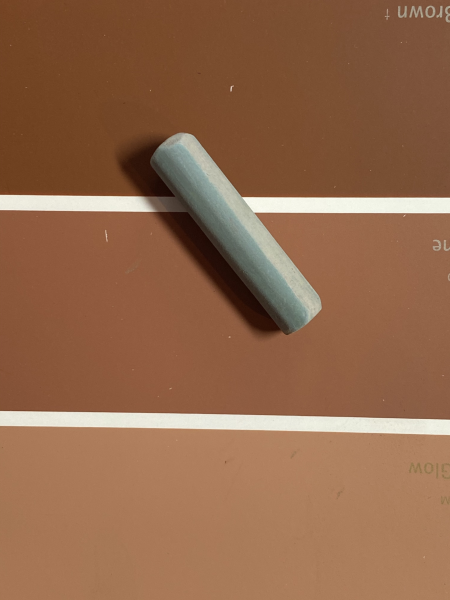
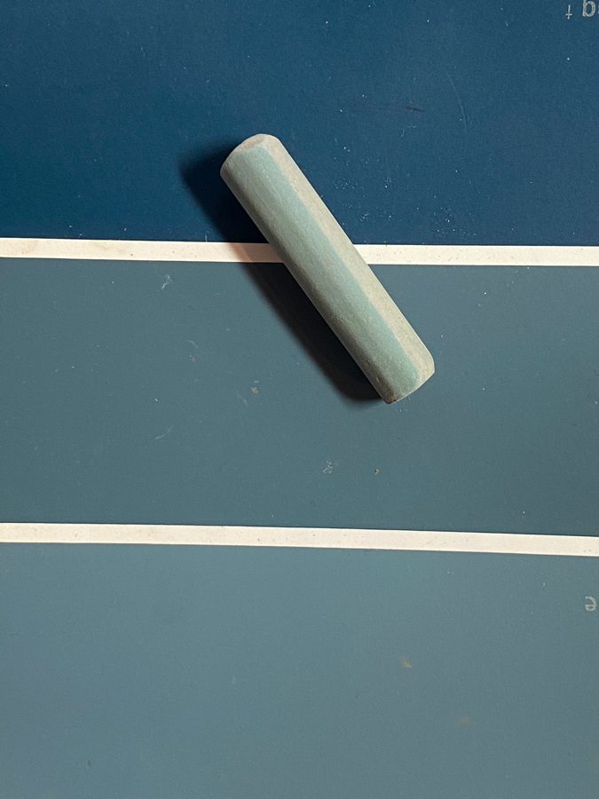
and then on a blue chip… now you can really see the green. It is surrounded by a “blue-er” atmosphere, so it gets to be “green-er” by contrast.
And what happens when I put him on a very blue, intense, microfiber cloth?
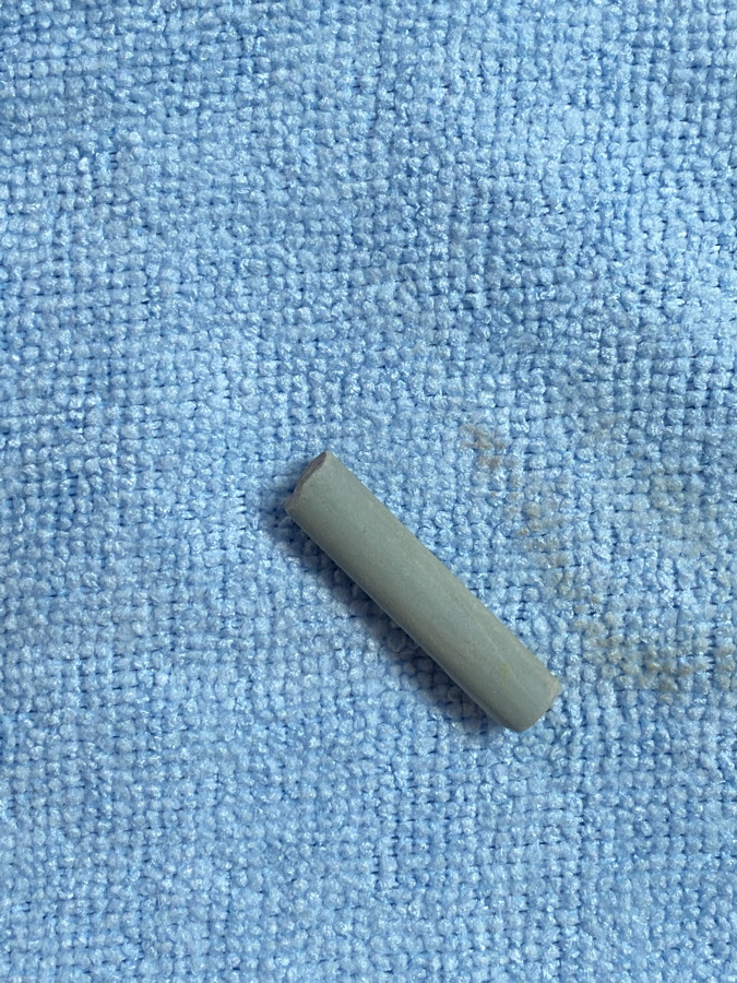
Apparently, he is a darker green value now… he dropped in value faster than a new car as soon as it is driven off of the car lot…
and on black?
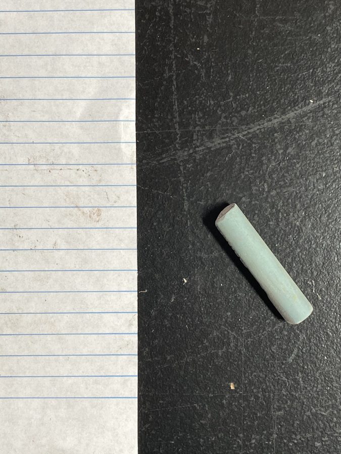
Whiplash- Lighter green! It can make ya dizzy- but it is one of those things I get very excited about as a painter. This crazy “search and find” relationship with colors. It gets me jazzed up in the studio. That quest. And it sets me out to control it. I believe we artists don’t fight what to paint, or how to paint, but how to control our images.
This is why there is no such thing as a neutral color. (Vince) Yes, this fight again, but it is true. No neutrals. There are low-chroma colors, and colors that almost disappear and lose their sense of hue the closer they come to black, but no neutral color.
Try it. Take a stick (any one) and put it in different lighting situations, against different backgrounds and watch the magic. You will learn more about color by doing this than making any “colors swatches” or color wheels of paint. Oh, those torturous studies that teachers love to have their students create. Bleah, means nothing when it comes to real life. Like putting on lipstick and then having to put a mask overtop… who cares?
Here he is again on the white notebook paper. So what color is he really? How dark? How light?
It depends on his journey. His background and what affects him. Where he is… like us, I suppose. We change based on our surroundings. What affects us. We can be “darker” or “lighter” in our personalities too depending on who and what surround us. So choose who you are going to be and more importantly, how you will be perceived. Especially in this crazy political climate.
Choose your colors wisely.
And if you want to really study color, sign up for my mentorship program. I am taking on two new students next month. If you are game, I promise to warp your thoughts about color even more.

Take me on?
if you are interested, email me! 😁
This is SO INTERESTING, Christine. Something that I have been aware of but haven’t paid real close attention to. Now I will!! Can’t wait to bet back to the studio and play with those concepts.
Glad to help! 😁
Hi C– early on, when I was super hungry for info, I read Frank Webb’s “Watercolor Energies.” Aside from the practical technical info, he gives great advice. Paraphrased, among the many points that helped tremendously then, and that I have carried along the way, is the he advised, “It is better to go down in flames, rather than make tentative, wishy-washy decisions.” With every stroke or painting, we are making it to the exclusion of all others we could be doing. One must DECIDE and be aggressive. The FEAR of “doing it wrong” is so common when starting out. In order to progress, we MUST overcome this hurdle and go for it.
amen!
Loved your comments and visuals. Very helpful!
sure!
So true! I love the analogy with relationships.
I would be interested in your mentorship program if you could comment on some of the work I have been doing. I have been trying to work with acrylics (miss the oils) and have started to focus on figures, now portraits. What is your fee?
hi. I would love to help. the cost for mentorship is $95/month. we set up a goal each month. it could be critiques, a lesson. or adjusting work. Email me and we can chat about it.. – [email protected]
Excellent post!
thanks! 😁
I’d love to do this with you. Funds are way to short at this time. But I can dream.
😁
Your writing about color always astonished me! I discovered lavender for lights when I was painting a child’s face whose head was backlit.
Thanks, as always, for your generosity in sharing your artistic knowledge!
sure! yes, love the lavenders!
Having always had trouble with “lights” I will now look at them in a different “light” altogether. This just may have cured my problem. Fingers crossed. Thank you Christine.
you bet! Always go for darker than what you think you need.
Hi Christine:
Could I send you a couple photos of some of my recent paintings?
I would need your email address so I could send attachments.
Marianne
sure! [email protected]
I love this. And always feel that my time was very well spent after reading your writings. Thank you.