“Pink” is just a name for a broad category of colors.
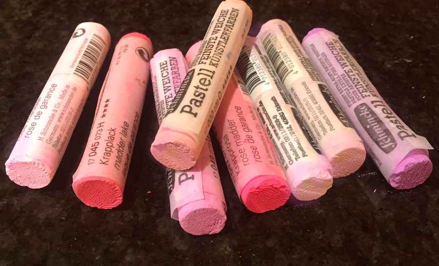
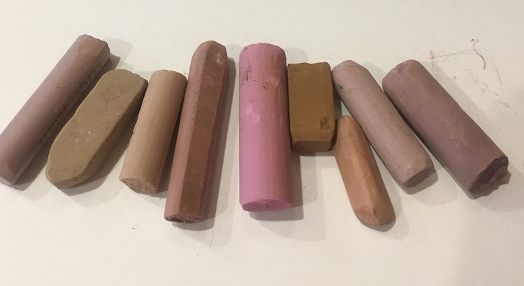
So last week I talked about how the appearance of a color can be deceiving. Colors shift and take on the properties of light and shadow. In the photo above I have some nice pink pastel sticks selected. Artists are normally ready to pull these sticks out when painting a portrait when the model has caucasian skin. So which of the colors above would be the best fit for a good “skin” color?
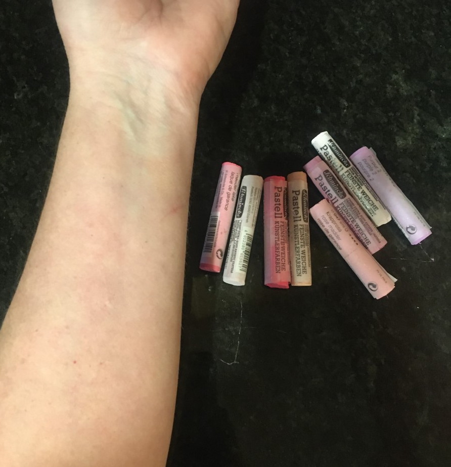
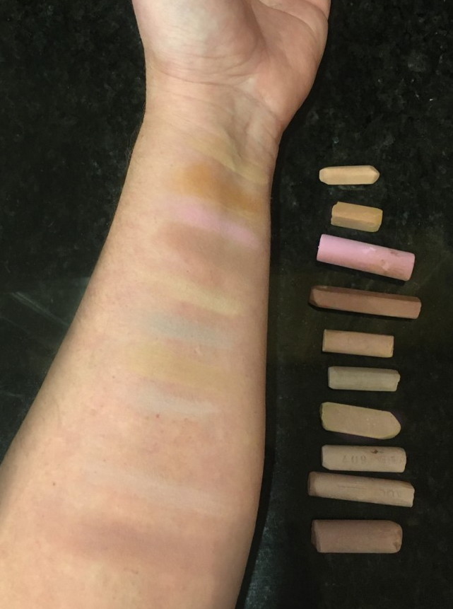
Here is my arm and the same sticks from above on the side. Which sticks would be a good place to start using to render my arm? ( if you are going for realism that is…’)
So let’s see what they look like right on my skin. These are the exact same sticks from the top photo above and I marked all of them on my arm like so…
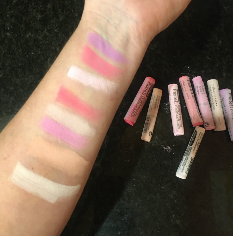
If you guessed the none of them … then you would be right. None are a close approximation to my skin tone. They are all too acidic, too “chalky” (meaning too much white in the mix) and the ones with more color are too “high chroma” (a good term to know).
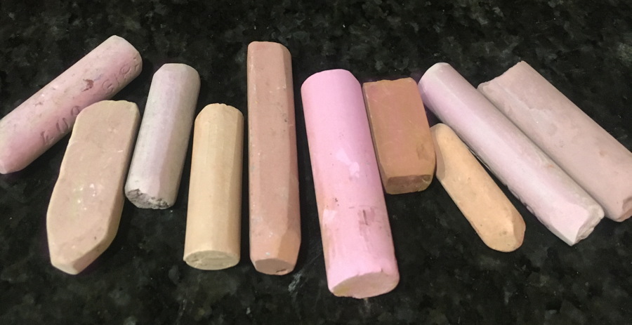
But if I take these sticks below, which I tried to keep under the “pink family” as much a possible, guess what happens? First photo has them sitting on a black background and then on white… yes, these are the exact same sticks… cool how they get lighter or darker based on what they sit on yes? But I digress.
These more apparently yucky, dirty, “neutralized” pink sticks look like this on my arm… each line is lined up across from the stick.
Yeah, now we are talking… the sticks are darker and have less “color” in them – they are desaturated and therefore LOW-CHROMA. But now they match up better. Otherwise, you run the risk of painting portraits that look like the models are made of plastic. Think Barbie. A few of the colors above now have an apparent greenish or blue cast to them now. They changed based on being up against my skin. Color is relative, remember?
And important to note- I tried as hard as I could to “match” my skin tone here. I have thousands of colors at my disposal. (yes, I have a lot of pastels). And guess what? They meld in, but none are really “exact”… skin is too complex! There is no “right” color.
If you want more good stuff on portrait painting, my next Monday Portrait class starts on March 30th. All levels and all mediums welcome. You don’t have to paint in pastel either. The class is based on learning about light and the portrait. You can even just draw if you want.
…. and if you really want thrown into the fire and come out the other side never painting portraits the same way ever again, then please come and be dunked into the deep end of the pool with my 3-day intensive workshop this summer on pastels and the portrait. Live models, understanding the law of light and pastel dust… what’s not to love?
July 31- August 1. 9am until 4pm. Sweetwater Center for the Arts, Sewickley PA. Links to sign up below…..
Portrait Class for 8 weeks starting March 30th. Mondays, 9:30 am.
https://sweetwaterartcenter.org/all-classes/the-portrait-with-christine-swann-pa05/
oh yeah, we talk a lot about color on Mondays!
and…
“Master Series” Class- “Power of Pastel”
(Don’t be scared of the title- beginners are welcome!)
https://sweetwaterartcenter.org/all-classes/master-series-power-of-pastel-christine-swann-ma01/
I promise I won’t let you drown.
Another de-mystifying blog thanks Christine.
thanks! and thanks for sharing these…..:)
I am jealous. I live in paradise (South Carolina), use to live in PA.
Still waiting for your dvd.🙂
ehe… actually working on videos now….. 🙂
Great demonstration, Christine! Nice approach. BTW, consider doing a Blog entry on people starting out with such a small, limited, set of pastels. As you know, this is a big hurdle for beginners. Nothing is cheap anymore (was it ever?), and the aspect of someone starting out getting past one of those tiny sets is daunting. Which sticks would you suggest as a limited number so the person doesn’t break the bank just figuring out how to begin? Would be a good topic.
good idea. I talk people out of ordering big sets all the time. I actually demo with a tiny box. maybe 40 sticks? and in different brands. that’s all you need.
Chris–Dan Greene gave me his ancient list of pastels that he used when he worked as a boardwalk artist. Talk about limited. I was fortunate to see a few sketches from those days, as he showed them to the assistants (actually, we got busted pulling stuff off his shelf when he wasn’t around. He laughed). He was about 18-19 years when he did them. From working as a quick-sketch artist for a while, we all noticed how solid his ears were on the 3/4 view drawings. That’s the easy place to get lazy for speed. HA! Anyway, I have the sheet if you’d like to check it out some time. (Sometime I think I’d like to hide for a month and do charcoals on the boardwalk to get a couple hundred under my belt to kick up to another level). Let me know! Keep up the great blog posts!
love to see those! 🙂
Christine,
You have beautifully demonstrated the
Importance of neutrals. I think of myself as a colorist and often forget the many uses of neutrals.
Thank you once again!
you bet!!! low-chroma rocks!!!
You have a way of making us think, and re-think. Ponder a bit. I impatiently wait everyone of your blogs. I’m still reeling from “Grey is not a color”. I can’t believe I hadn’t noticed before. I always felt that brown belonged with the reds though. Keep it coming, I can take it. Thanks Christine.
yay to making a difference to you!!! And yes some “browns do belong in the red category And depending on the the mixture it may belong to any of the 12 hue families. Talk about mind blown!