
Going back to Sorolla as our master of color, we can see he knew the value of using more than just 3 colors in his paintings.
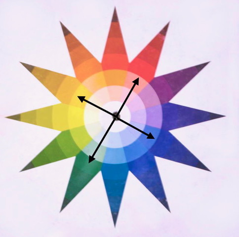
There are 2 “chords” that use 4 colors instead of 3. The first combination consists of rotating every 3rd color around the wheel. (thirds again) This effectively gives 4 colors which are directly opposite of each other. (make sure your color wheel has all 12 colors) So there are two sets of complements. In the painting below, blue-green dominates the painting which strikes a nice balance to the red-orange in the flesh, on the lit side and in the shadows. No bright version of red-orange is used, just low-chroma in both the lit and non-lit sides. Then there is that low-chroma yellow again along with a few barely scumbled, yet very important dashes of violet. Sorolla had a way of making a figure appear to breathe even though there are no detailed features in the face. This painting is more about color and application.

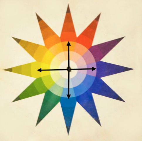
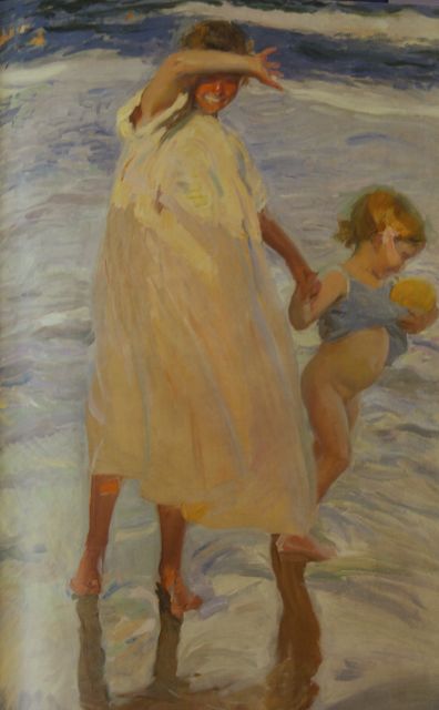
This painting below uses a split-quad chord. The colors are still opposite each other, but they are jumping around the wheel differently. The oranges take center stage here (yellow-orange and red-orange) Yes, the pose is cute, and the composition is very solid, but it is the oranges that make the painting work. They run through the entire painting, including the water, linking the color everywhere. The brightest chroma of red-orange? The half-shielded face and spot on her knee. He wanted us to look there. The red-orange runs though the child and into water as well, but no where else is the color that strong. Notice against these two red-orange spots that he runs soft blue-green right next to it. The blues in the painting run to blue-green and blue-violet. “True blue” is skipped.
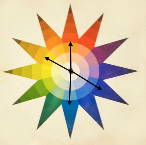
So sometimes you can learn so much by just finding a painting that you love and then taking the color wheel to the image. What colors were used? Was a chord used? Could an addition of a single color change the image into using a chord?
Here is a painting from a mentoree … what four colors were used? Which chord?
Answer below …

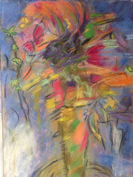
So try it! Less can be more. And don’t forget to make one color dominant to “set the tone” for the painting. My favorite chord- the “5-Chord”, is featured next week!

So interesting. My question:
Can you use any of the shades within the triangles, or should they correspond in their placement? It looks like the arrows point to different bands within each complementary triangle.
hi! The arrows are just a way for me to point out which color family I am using, so no, the colors can be used from anywhere in the triangles. It is actually better to use only a small fraction of a color family. It shows more control over the hues. That is the hardest part of using a color wheel like this- remembering that you don’t have to use the bright versions of the colors. Low-chroma “dirty” versions of the color (I dislike the word “neutral”) or saturated tints (lots of white in the mix) are just as effective.
hi again christine, im still having trouble with the idea of “chords”. perhaps its just semantics and different from ones ive always used and learned, (from the beginning of time when i was in school with the dinosaurs) to now. Can you please help me out?
jeri
Sure! So if you think about chords played on a piano, certain combinations of notes applied to keys cause a pleasing sound when they are struck all together. In art, we SEE the chords of color stuck all at once across an image. The “math” of the relationships are the same. Just like a “chord” on a piano, if some notes are left out, the sound feels incomplete. If notes are randomly added to the chord, then there can be discord and it may even sound very jarring to our ears. This is true also with color. I am not saying great paintings can’t be made with every color you own, and some masters I love such as Richard Schmid tend to do just that. However, it is good to learn about this effect- that visually, chords can be “played” across an image and harmony can be achieved by understanding how combinations of colors can help each other out. So this week I showed 4-color chords. Keeping those patterns accurate (no matter what colors you pick) will work well as along as you have that pattern going around the wheel> This will be completing a “chord” . Make sense? Send me a painting that you might be struggling with regarding color – maybe something that feels a little off? – and I will take the wheel to it and see if a chord can be found. When you see it done that way, it is amazing how using color harmony can improve the feeling of a painting so much….hope this helps!!!