Now let’s put color harmony knowledge to work. I love taking a painting and then making it “snap” to a color chord.
I have gotten a bit off-track with all the analysis of color harmonies, so let’s go back to paintings from mentorees…
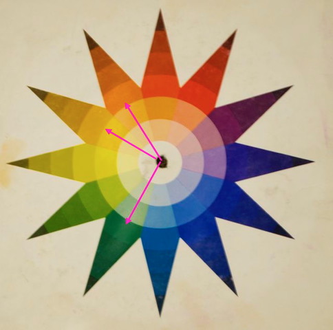
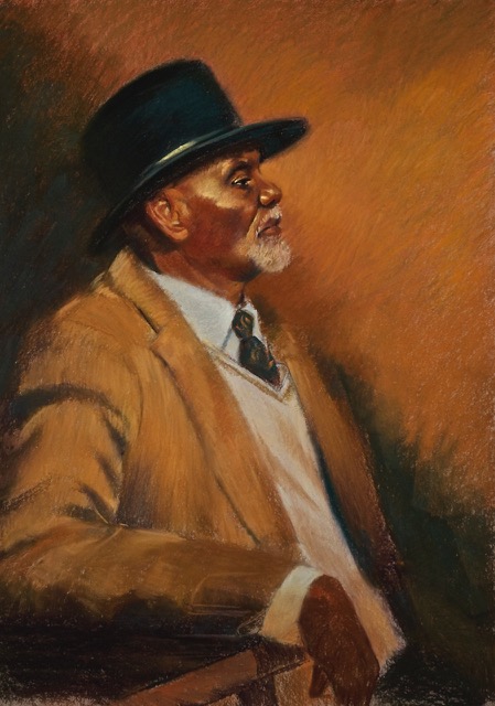
Here is another lovely painting. Great portrait, wonderful strokes in the coat and in the background. The artist is actively engaging the background with subtle diagonals leading us to the face. Great! But the colors feel a bit “ho-hum.” Many would call this a “neutral” painting, but I don’t agree. (I don’t like the word “neutral” remember?) I consider this an orange-dominant painting with a bit of true green and a bit of yellow-ochre. So it would look like this on the wheel…

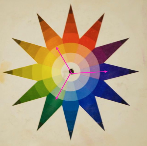
How can we make this guy more interesting to the viewer? First, I suggested we get him into a proper color chord so the colors can work together better. There is very little yellow-orange in this painting, so if that hue were eliminated and violet was added, then the painting will be in a 3-color “triad” chord like below. This means lowering the yellow-ochre “cast” on his jacket and incorporating even a tiny bit of an accent of the violet to offset the color dominance of the orange, and then this will give us our chord. The colors skip to every 4th spot effectively cutting the wheel into 3rd’s – our “good math.”
Along with that idea, the dark values that surround him feel a bit claustrophobic. Sometimes dark values all around a figure can make them stand out, but in this case I thought it was taking away from him. I suggested to shift the color without shifting the value. This is a very sophisticated thing to do in a painting. It will let you keep shapes without disrupting them with value contrasts. In other words, changing the background a bit to support the figure doesn’t have to mean going darker or lighter. The values can stay the same.
So below I shifted the upper right corner to about the same value as the orange background but instead of making it darker, I went more “green.” I also went more green in the dark shape creeping up his jacket from the bottom right. It can be as subtle or obvious as I did it, but you get the idea. Darks are precious – so keeping his hat darker than these areas supports the image overall. The bonus is that when you do this, the orange color in front of him now seems brighter. This is what I call color relevance. More on that later… I didn’t touch the orange color in the background, but look at how rich it is now compared to the earlier version- go back and forth between this image and the first one…..the colors of orange and green are now talking to each other.
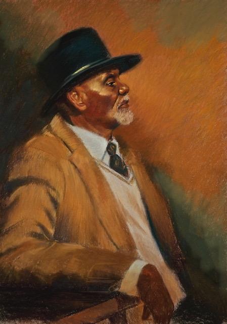
And watch below when I put in the sharpest edge along the edge of the hat – pow! – right to the eye! That is using the edge of an object to make a viewer see what is important to you as the artist. In this case, his gaze and eye. This only works if there are no other edges as sharp as this anywhere else in the painting.

So now to “snap” the painting into the chosen triad. We need violet now right?

Below I added violet to the tie. It could be bright or not, but since it is the only spot of it in the painting, it becomes important and bounces off everything else. It doesn’t have to be this dark or high-chroma either. It can be almost non-existent. Or the violet could have been introduced into the hat, the background or into the face, etc….that is the lovely thing… there is no right or wrong answer here. I just chose the tie. Mainly because it is near his head, is an easy adjustment, and I didn’t want to mess with the lovely job she did on his face.


Looking between the original and the one “snapped” to the color harmony, the one with a clear color harmony seems richer. It is almost a tactile difference to me. Like I can feel the difference with my eyes.
Using color harmonies will get your viewers more engaged with your work. Guaranteed! So snap to it!

These discussions are so helpful! Thank you.
🙂
Thanks
🙂
There is too much orange in this painting. The background dominates then the jacket and finally the face gets noticed. The face is the most important element in the painting but it gets lost amid all the orange. Although parts of the face are dark the highlights are still orange and too close in value to the background. The purple in the tie is a nice touch but it cannot compete with all that orange.
well, it was the decision of the artist to paint this guy this way and I feel this lesson was about trying to get colors to bounce off each other. She may love orange- who knows? Yes, lowering the chroma of the orange in the background may make the image richer by comparison too. Thanks for the feedback!
Absolutely. The artist is the final authority and this one may have very good reasons for doing the painting in this way. We can offer our critiques but the artist doesn’t have to listen to us. There have been times when I have not heeded my instructor’s advice and no doubt caused him frustration.
🙂
Such important info that I for one overlook. Thanks
🙂
This is so helpful. Thank you. Always loved coming to you classes.
🙂
Just found your blog recently, and it’s amazing! Thank you so much! I find your analyses so helpful!
glad to help!