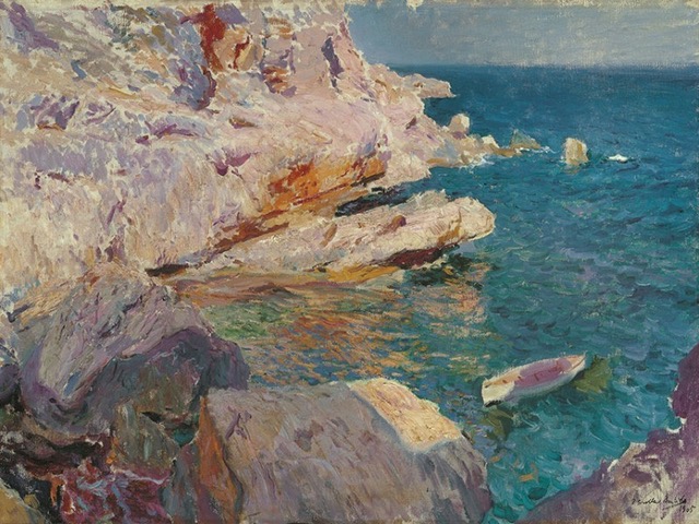
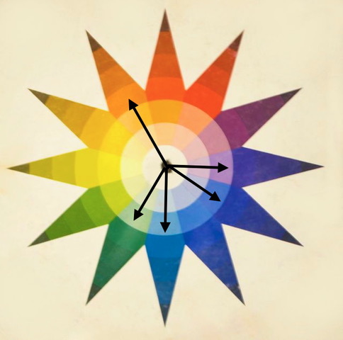
I had a harder time finding a painting based on a 5-color chord from Sorolla, and this one below may even be stretching it a bit. Some of the violet seems to run to red-violet. He mostly seemed to use 3 or 4 color chords, especially triads in the primary hues, but this one will do.
I love this chord because it gives so many options. It is based on a split-triad, and then ya just add two more colors to the split side. Its’ rotation leaves us with 12 different color combinations of 5-tone chords. (Did ya get that?) Simply, are 12 different possible combinations with this chord.
This combination I like a lot especially for this type of landscape. Try painting water without “true blue”! So lovely and refreshing.
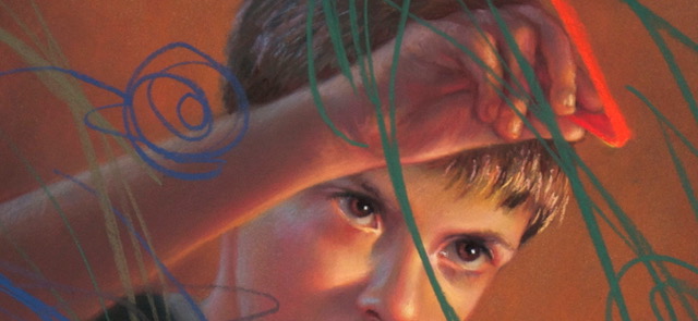
Here is a painting that I did a few years ago. My son paints with me and he gets the same determined look on his face that I know I get on mine! I rotated the chord and here is the color combination I used…
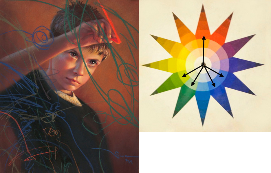
Perhaps it is better to look at it like this…
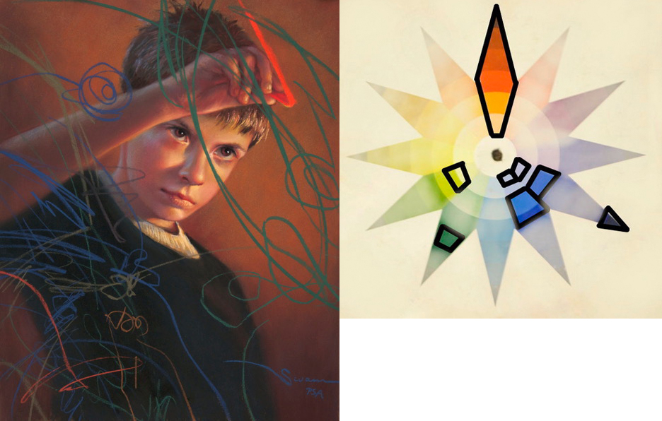
So in the color wheel to the right I ghosted out the colors that were not used. Then, in the 5 hue families that were used, I outlined the variations that were implemented in the painting and ghosted out the options of the colors that were not used. This is the hardest part of understanding how to use color harmonies. (Especially for pastellists – so many bright colors and we want to use them all!!!) The brightest, highest-chroma versions of a hue don’t have to be used in order to stick to a color harmony.
For example, there are literally thousands of options open to me in the green color family. (Just go to a paint-chip store and see all the variations) I only used a dark, rather low-chroma green here and ignored the rest of the green options. This green then made for a nice splash of scribble against all the red-orange that was used in his face and in the background.
For red-orange, I used nearly all the options… especially since this was the dominant color I wanted to run through the entire painting. Very light variations are in the highlights of his face and hair. “Dirty” neutralized versions of red-orange are in the shadowed skin and in parts of the background like under my signature. Only a few highly saturated hits of red-orange are in his cheeks and in that single, bright pastel stroke!
The hues of blue and blue-violet were used in the scribbles and in the secondary light source on the back side of his head and face. Even the soft reflected lights on the left side of his nose are blue-violet. The “black” of his shirt is also blue-violet.
This kind of elimination of colors may seem stifling, but it actually gives me a lot of freedom to be more sophisticated with my color choices. It also helps to unify a piece and gives a painting a “visual chord.”
Try it! You may like it!
If you are in the States, have a wonderful “4th of July!”

Wow. Thanks. I’d like to say that I fully understand everything you are saying. I’m getting there but I have a brick wall I need to climb first. My students love these blogs of yours, as I do.
yes, some of this stuff is tricky and boggles the mind. But it is good to get out of the comfort of “just painting”. Appreciating these kinds of elements in masterworks can truly help our own art!
I’m introducing the split-triad to a beginning pastel class just now .. one of my favorite color schemes! I like the idea of the extended splits. Thanks!
yes, I agree- sometimes just a 3-color harmony can feel so limiting. have fun!