So after the best photos are picked out with the client, I ruthlessly go through them at home and always ask myself as I go along…”Is this them?”… “Is this the child I met?”…
And also, “ Is this how they would want to be remembered 20 years from now?” “Will family members recognize them from across the room?” “What distinctive features make them who they are?” Always keeping in mind that photos LIE and watching for the errors. I paint a lot from life, and this knowledge comes into play here. First off, I want to sincerely thank my client for giving me permission to share this process and these lovely photos of her children. (you know who you are! )
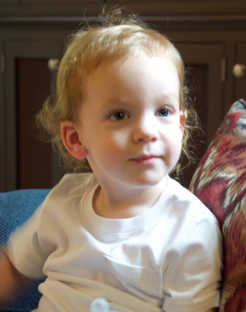
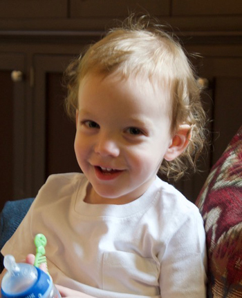
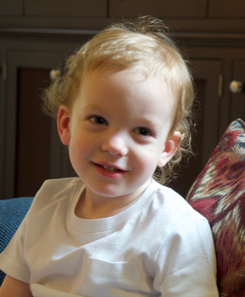
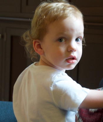
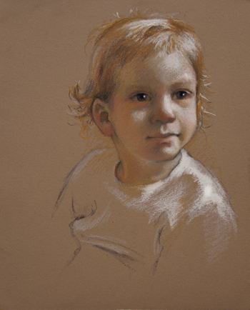
So here are the best shots of each child that was sent to the client and will be used for the paintings. Yes, each will be used as my references. I never use just one photo. I call them my “dirty dozen” because invariably I have about a dozen photos lying around that I keep referring to for a painting- especially if the image is large and elaborate. (Although anymore they are mostly on my Ipad which is attached to my easel as I paint). Very often I paint from a pose that is not the same as the pose in the painting. For example, the nose of the one-year old below is very distinctive, and if I only used the first photo (which will be the main pose) then I will miss out on the lovely rectangular-less of how his nose is shaped. The other shots give me more info regarding this. I find have to merge all the info from all these shots. And refer to my notes from the photo shoot! Notice how dark his eyes are- I know this is not correct in “real life” just being with him. They will need to be adjusted.
So here are my thoughts on each one. Each painting will be separate, but will be hung near each other, so I want each head to be turned in a different direction for variety.
For the one-year old, I think about keeping him young-looking by emphasizing the softness of the mouth and the roundness of the cheeks. (this is why old ladies with cheek injecions bother me- fat cheeks belong on toddlers…. )
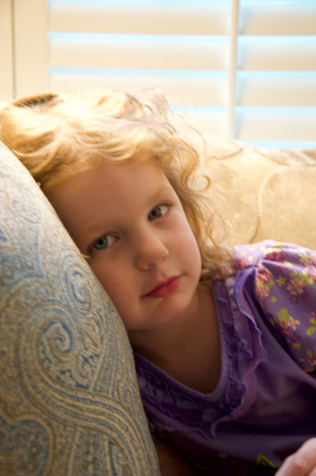
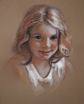
For the 4-year old we picked the first photo. The client remarked more than once at how she has wanted to capture that fleeting “cherub” look. I wanted to emphasize all that hair! So I will be merging these photos and adding more hair.
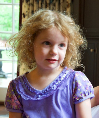
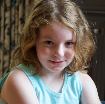
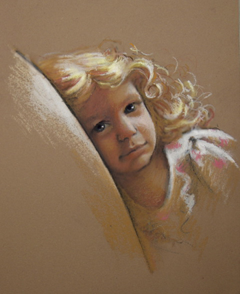
The client remarked at how she wanted to capture the nine-year old at that “edge” of childhood and the tween years. Child-like and yet almost ready to defy authority. The first pose has that direct, teenager-type of gaze, and yet still in a girlish pose. A good merge.
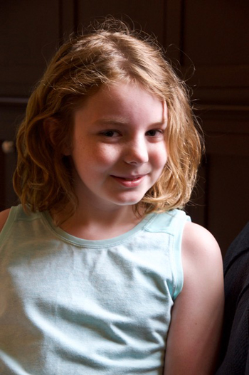
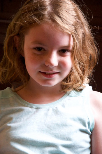
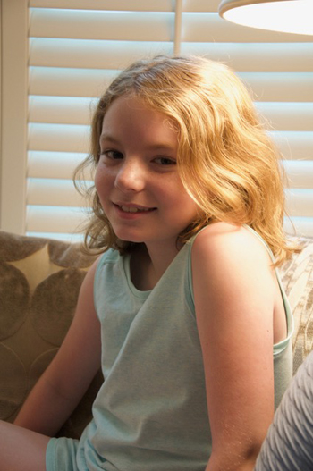
Yes, as I mentioned before, these are all slightly blurry- that is from setting the camera to a lower ISO so I can see into the shadows more. Doesn’t bother me. I know where I can increase the details and focus when needed.
I always send the clients color studies or what is called “poster studies” of the potential paintings. This lets me get feedback from the client, sets the overall “color tone” of the images and lets the client know what is coming, since I do not send them photos of the work as it is developing. These paintings will be pretty “neutral” with the background color running through everything to unify the image. After the color studies are discussed and everyone is on board then I can start the paintings. Sometimes clients like to get a wide range of family member’s opinions on them. I know some artists hate that- it can feel like “painting by committee”, but I like getting the feedback. It reminds me of my freelance days of working with businesses to develop a graphic. The more info the better, and it all plays into the final images.
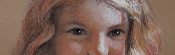
So these are the color studies I sent her. They are not meant to be great “likenesses.” They are not beautiful and not meant to be. After all, they are only 6 inches tall! They are working sketches and a communication tool. Typically I don’t even include the eyes. This sets the tone for them being studies – no room for details here! I did put them on this time however….
These will be in a “vignetted” style. ( vi·gnette- vinˈyet/ noun. 1. A brief evocative description, account or episode. 2. a small illustration that fades into the background without a definite border). So where elements fade off into the background is important. I have to carefully think about what is important to the painting and most important, what I can “let go.” For example, I could have included the entire cushion/couch and pattern in the 4-year-old’s painting, but is it really important? I really only need a feel of support for her head. I don’t need the entire thing.
I once heard an artist that was judging an international show remark that she would never give a painting in a vignetted style an award at a show because the artist didn’t “design” with the entire image. Like it was a “cop-out” or something. I disagree. A good vignette is carefully well-planned. It is easy to get this wrong and have it feel clunky, like it is missing something. Planned right, they can be very elegant and the background is a big part of that design.
The client liked the studies and now starts the real work! Whew!
Thank you for sharing your process, I think you’re a excellent artist, teacher, writer and a warm kind human being.
thank you so much! I hope we get to meet and work together some day. 🙂