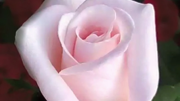
I often see artists getting ready to paint something like this flower above and I watch them getting out all their pretty, pink pastel sticks or start to mix up pink paint… uh… nope.
An important element to being an artist is the ability to see clearly. To express yourself, yes, but if you want to portray reality – which most artists desperately want to do- then you have to slow down and take a really good long look at what is in front of you. So we are going to play a little game I call, “What color is in the box?”
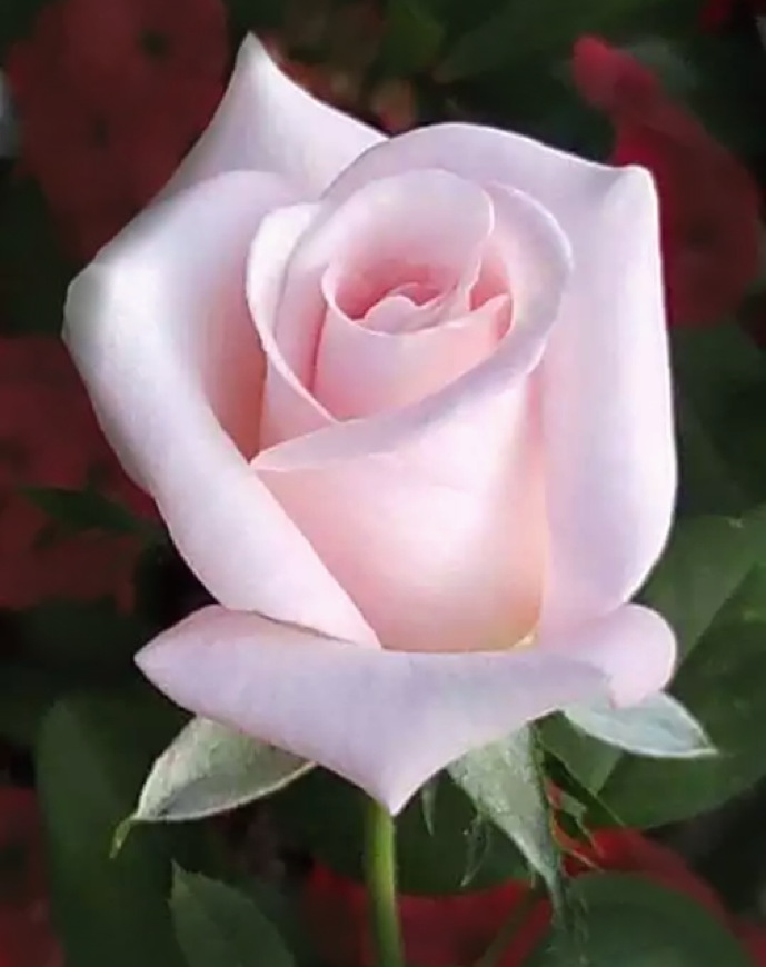
In all the photos below the photos were not altered in any way from the first photo of the rose below. All I did was put a box of different colors around an area. Let’s play!
Let’s look at this flower, for example. It is not pink. Not really. We call it pink and we perceive it as “pink” but what colors are really happening here?
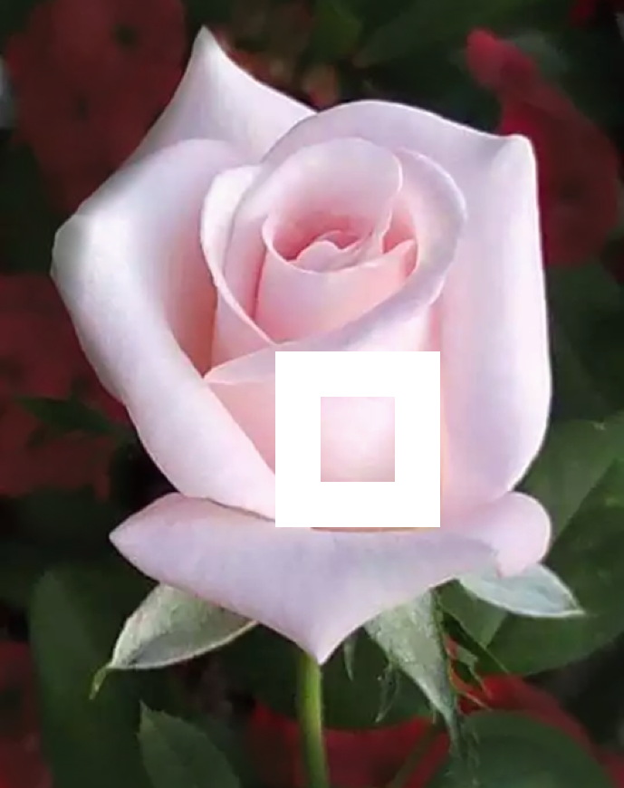
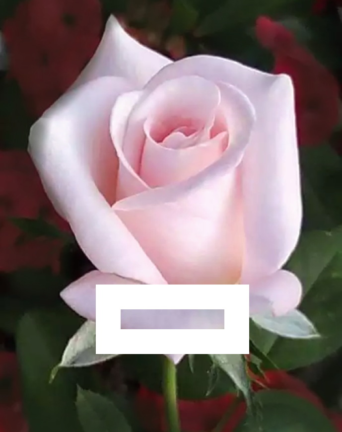
By putting a white box around this very light area of the flower below we can see it has a rather yellowish cast to it. Squint. look hard… that pink takes on a yellowish feel.
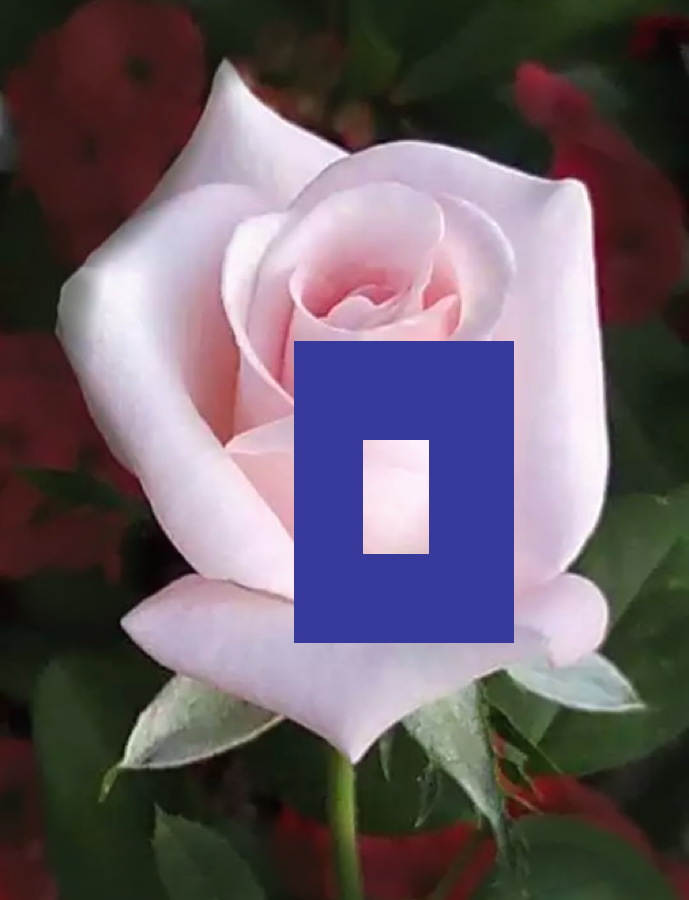
If I surround the same area with a violet box, (the opposite of the yellowish light that is falling on the petal) then it becomes even more apparent. So what color is in the box? It would be very difficult to render and paint this area with a simple blend of pinks. Some yellow would have to be introduced. Squint again and you can really see the yellow in the box. See it now?
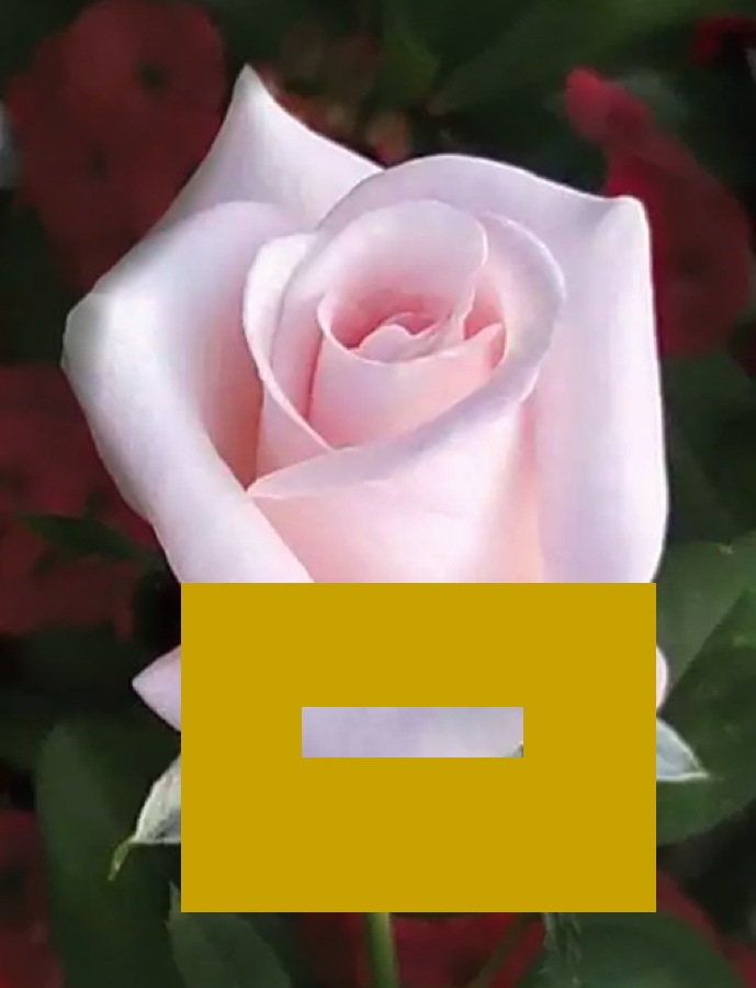
If I isolate this petal below where the light is not as strong on the form and the petal is turning away from the light into the more shadowed area, then this is what we get. What color is in the box?
It is a lovely, murky, airy, violet. Yes, some of you out there may say “grey”… ( oh Vince)… but grey is not a color remember? So look very closely. If you had to pick a color from the color wheel and give it a name, what color would that be? Yes, the color is violet.
I can exaggerate the feeling of the violet by surrounding it with a yellow box – the opposite of violet on the wheel. It is funny now how the color in the box not only feels more violet, but now also seems lighter in value because the yellow box is actually darker than that area. But the point being is that just picking up a “grey” or darker pink stick of pastel will not render this area accurately. Violet is the dominant color in this area and needs to be painted with violet in it or it will seem off and not represent reality.
So if this flower is made up of a lot of yellow and violet areas in the lights and shadows then why do we perceive it as “pink?” It is because of these areas right here…
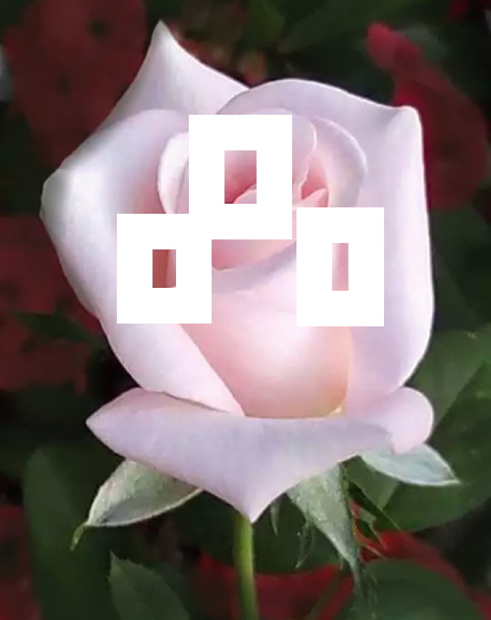
On all objects (and faces) the true local color (what we call the color of an object) of anything is in the “in-between” areas. The transitions between the lit and non-lit ares. Above I boxed out some of these areas and they definitely feel pink. (which is in the red family) The truest and brightest chroma of any object will always be here. And our brains tell us this flower is pink. It weeds out the shadowed colors and it takes into account the color of the light (here with a yellowish cast) and so we are left with our brains telling us that this flower is pink. We we can happily now mix up pinkish paint or pick up pink pastel sticks and apply them here. And only here…
But beware. There is pink and then there is PINK!!!!!
More on that next week.
Great lesson! (I love pink.)
me too!
I will treasure this lesson, seeing with new eyes!
Awesome! Thank you for your brilliant observation and talent to communicate color concepts and to inform others. I will share this with my Tuesday night Beaver Art Group. I love your blog.
thanks! Send them over to the blog! 🙂
I live the thought provoking manner that you use. You should have seen the look on the faces of some of my student when I said “grey is not a color”! I had a feeling that some have looked into your blog. Thank you very much. A fun way to learn and make me think.
you bet!
Thank you. You’ve opened my eyes
I saw the violet even before I started reading your comments but the yellow in the center of the white box is the extremely faint upper limit of a relatively stronger yellow in the extreme bottom right corner of the white box. I am surprised you didn’t mention this.
yeah, thanks for pointing that out.
Please do more of this with the examples! It was so cool to look back at the original photo and truly see the colors! Thank you!!
yay! 🙂
Great blog Christine
I have been struggling with these lighter colours for so long and torn up so many abandoned paintings and now I know why. I started to get to grips with “seeing” these other colours at my last workshop, but this article has just clinched it for me. I just need to stop my brain taking over and let my eyes do the work.
yes! Look INTO color! It will help. 🙂
Love it, thanks! I love finding colors in perceived colors.
Wow! Excellent blog! Thank you for sharing the strategy for really seeing the different colors!
you are welcome!