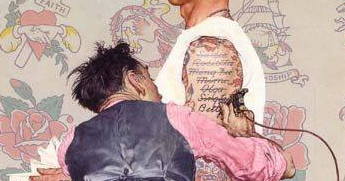
Nope, I am not talking about going anywhere… I am talking about how shapes can be put to use through design to travel around an image. A master? Norman Rockwell.
Last week I came across this image on Facebook. It stopped me in my tracks and not for the reasons you might think. It had nothing to do with the subject matter, the story, or even how detailed the image had been painted. No, for me, the fascination comes from the pure design of shapes that lead the viewer around the image.
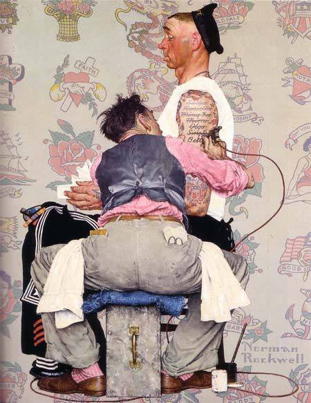
To me, there is a clear “grace” and harmony to this type of image… it has to do with the design. What do I mean?
Below I have put the image into black and white and turned it upside down. This forces the people and the story to become secondary to how we see it. Now look at the placement of only the black shapes…
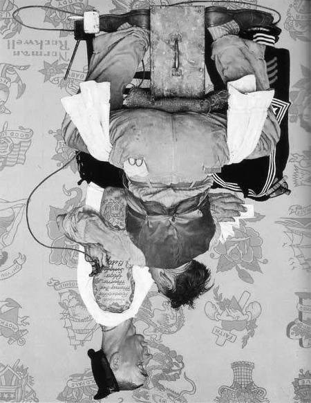
Can you see it now? A circular path that flows through the image. It also happens with the white shapes…
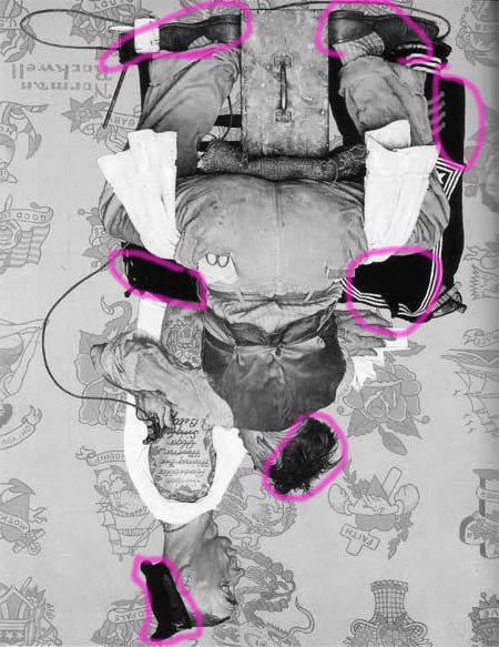
Each shape interesting on its own, full of variety and and clearly linked and flowing into the next shape.
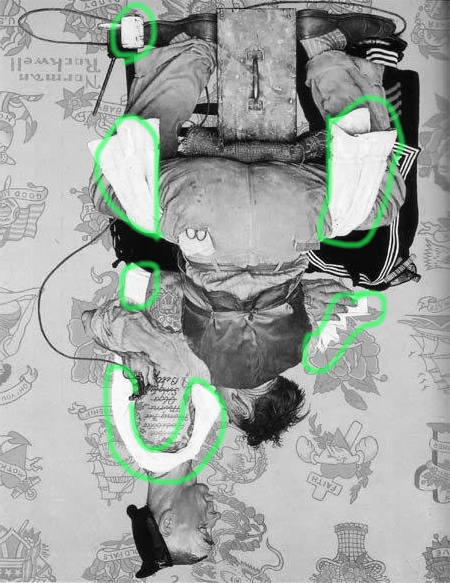
As I have gotten older as an artist (cough, cough) I find myself striving for this type of pure beauty in design. It is a difficult task. I can only imagine how difficult and deliberate this was to plan. The things in a painting get in the way so often. We artists can become obsessed with the small- the petals on a leaf- and forget to see the setting of the flower as a whole. This painting is a good reminder to carefully think about composition.
So the next time you see a Rockwell, take an extra second and see if you can spot the intended design of the piece. I promise, you will have a renewed sense of respect for this master.

Enjoyed it very much! Thanks!
🙂
This is wonderful, Suzanne. I loved how you made obvious Rockwell’s brilliant composition. I always loved his paintings!
🙂
Wow! Thanks for that.
sure! It is so cool to see something differently, isn’t it?
Great Point! Design/composition is required for art to rise above technique and craft.
you bet! it is why the masters are the masters. planning…. then execution!
The artist collapses the two figures into one. There is no atmospheric hint of one being in a different plane than the other. The background wallpaper floats even further away than we might expect, though the sample tattoos are larger than normal. The blacks you’ve circled break up the forms which helps stop the viewer’s eyes from slipping off the composition.The overall effect is to upend the way we expected to view otherwise very familiar forms. Thanks for your acknowledging the importance of composition and for providing your analysis.