So one of the best things about pastel for me is finding out how to get those pesky little sticks to act the way I want them too. No easy task. For years I created things that weren’t quite right and I lost control of paintings along the way. Now, however, beyond thinking about the power of the sticks, (beyond color, value, and intensity too- Whew!). I also think about how they layer- do they play nicely with others? Some sticks are more cooperative than others….
So, beyond the fact that different colors have different values and powers, they can just plain act differently – mainly in how they react to other brands and in how they drag across an area. I started referring to them in these categories mainly just to help myself out when I am looking for a certain drag of the pigment or an area to build up and knowing that I can do it “cleanly”. I have spent a lot of time on paintings where I destroyed them because I picked out the wrong sticks and then I wound up with a fuzzy mess on my hands and no good way to fix it other than starting over….here are the main reasons why….
Some pastels are made so they have bigger pieces of pigments or binders in them. These tend to be the ones that will “float” over the surface more, so they stay “above” the other layers below. Have you ever been painting in an area where the pastel doesn’t want to stick? Sometimes that is because the surface is very “built up” and there is no more “grip” to the paper or grit. But sometimes, it is just because the pastel itself is a bit slick and it goes on thick. Of course, different surfaces will affect this, but knowing which brands are better at this than others is a tremendous help.
So I came up with four categories in which different pastel brands fall into based on how they act with themselves and with each other. I have a rough idea in my head every time I grab a certain brand. To me, all sticks fall into the categories of Gliders, Burners, Builders or Blenders. Some can cross over between these categories, but for the most part they are one or the other. Knowing how a stick inherently acts can go a long way in gaining control over the medium and being able to use those sticks to your advantage. I thought for the next 4 weeks I would go over each of these categories.
First up- Burners.
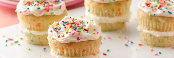
These are the easiest to identify. They tend to do a lot of heavy lifting in my paintings- mainly because I am in no hurry to get to the “good stuff”….I like to think of them as the cake layer in a cupcake. They can give you a nice solid foundation where they can support the sweet stuff coming later.
Basically, I started calling certain brands “burner” sticks because I was “burning” them up in areas of a painting that were not that important. These are typically the cheaper brands and I didn’t mind “burning them up” in areas where I didn’t want to waste the more expensive sticks. (frugal me) Then I noticed that they typically had less power in the stick (pigment to binder ratio). This started my thought process about what is in the actual stick and how they are made. I like to think of them as “helper sticks”. Burners are Rembrandts, Neupastels, Creatacolors, Richeson hand-made sticks (the thick ones, not the new ones) and anything student-grade. Mainly burners are my Rembrandts. They have such low power (no matter how bright the color) that I can burn them up in an area and not worry that the power will be overwhelming. Plus, why use expensive sticks when cheap ones will do…. I use them a lot in backgrounds or as forms go away in shadow, or in the hair- someplace where I need texture and detail, but not a lot of strength, or in an area where I don’t need to build up “glazing” layers. So, Rembrandts rarely make it into the actual faces of my paintings….
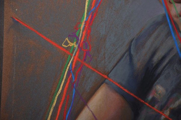
Burners are here in the background and in the shirt and around the strings….they are in a supporting role allowing the stronger pigments to come forward. Squint and you will see how the strings come forward and the other colors recede. Yes, there is a chroma change here too, but when you see the actual painting you can see how the areas are acting quite differently.
So, the next time you are building up a section that is not in your focal area of the painting, think about “burner sticks”. They will help you build a better cupcake.
Next week, Builders……
I can’t find part two of guilders,blenders burners and builders from June 2017
hi- I know- the website has such a weird template for the blogs. I need to get them straightened out somehow. Look at the side where the dates are. Then go through them one by one. Those 4 are in a row. 😊 or, use the search tool on the top of the home page.