Pastel can’t be mixed like regular paint. We pastellists typically have to hunt and peck for the correct hue, value, temperature, tint and chroma in our available sticks. This can lead to the never-ending curse of trying to find the “perfect” stick and a sense that we need to collect more and more pastels to get things “right”…
Paintings at their heart are based on values- the lights and darks of colors. Strong paintings have these lights and darks making up pleasing and deliberate patterns across the image, showing how the artist can control these areas. So a great painting is more than copying what one sees, even very realistically. A great painting is about design and control.
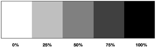
Values tend to be thought of as 10 steps including and between white and black. 0-100% of value. Most art books will show a range like this.

And we artists have to think about where a color will fall along this line.
I always found working with 5 values to be the best for me. More like this….
Much simpler. Some artists design with only 3 values. Especially in the beginning of designing an image. Whatever works.
A painting that wants to be noticed from across the room (“Hey juror! Over here!”) will tend to draw a viewer into its world when the values are nice and planned. Like large puzzle-pieces put together well.
I do lots of thumbnails using these 5 values. (my illustrator background popping up again). These are about 3 inches tall. I happen to LOVE doing thumbnails. So much promise! I feel like it is my brain “made visual”, and each time I do a thumb and redesign something, I get closer and closer to a stronger end result. Besides, if a design doesn’t work at a small size, it will never work larger….
So when I got my very first Sennelier set, I thought about how I could truly understand value and make sure I knew what colors could go into which value section. I found a great way to make sure the sticks I was using were in the correct value I wanted. This may help you as well if you are finding that you need better control of your values- the inherent lights and darks each color possesses.
I found electrical tape in the following colors- Red, dark blue, yellow and green. I used red tape on those colors that are called “midvalue”- about 50% grey which are right in the middle of the value bar. (this seems to be the hardest value for most artists to utilize correctly) Colors at about the 75% value got green tape, and 25% values got the yellow tape. Darkest values nearest to black got the blue tape.
I took grey paper like below in 25%, 50% and 75% grey values. The pastels that “disappeared” into the grey paper fell closest to that value. To differentiate the value, it helps to squint at the mark on the grey board. This will help to “melt” the color into the background to see whether the color is lighter or darker or about the same value as the grey paper it is on.
Which then begs the question- how do you know if the paper value is exactly 50% grey?
A long time ago I cut this page of a value scale out of an art book (sacrilege, I know) and then laminated it. I cut small square holes into the value circles. Then I lay this laminated sheet on top of the grey paper ( or anything for that matter) that I want to test.
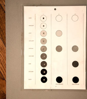
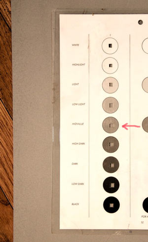
So through the cut square “windows” you can see the paper- it looks darker in the top circles and lighter in the bottom circles. At the “MidValue” circle, the grey paper seems to blend into the circle. This is what I mean about “melting” into the value. The red arrow shows where it melts into the paper. That makes the paper 50% grey. The paper hasn’t changed, just it’s relationship to the circles.
Then, I took the pastels I wanted to mark and hit them onto the paper. (This is a different piece of paper from above – Canson cool-grey, but same value).
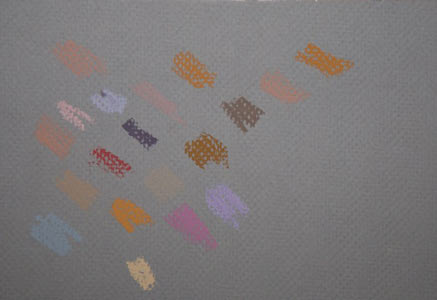
The sticks that “melt” into the grey paper are exactly 50%value. Anything that seems lighter or darker than the paper is a different value from 50%. Notice how even the bright pink will pretty much disappear into the paper especially when you squint at the mark. The bright orange mark is actually a TAD bit lighter than the pink mark, but I would still mark that stick as a 50% value with red tape. It is close enough. The lightest orange mark on the very bottom below the brightest orange mark definitely doesn’t belong. It is like the Sesame Street song, “Which one of these things doesn’t belong here?”
Yes, this process took a long time, but what a result!
The great thing that came out of this study was that as long as the value matched a planned area, it didn’t matter what color I used as long as it was the same value….greens and purples in a face were ok now as long as they were the correct value. It truly freed me up to think more about the design of the piece and to become looser with color without breaking the values. No wrong colors now. Refreshing!
Here are some original sticks that I found with the tape still on them….
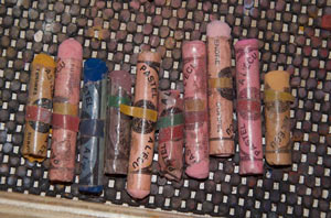
Yikes! Can’t believe these sticks are 20 years old…. (And yes, I leave the wrappers on Sennelier sticks for as long as possible.)
Anything very dark- near black (like the blue stick above) got dark blue tape, and anything near white, I never marked because I could figure out it belonged. Some sticks will seem to be exactly in between 2 categories, so when that happened, I used both tapes to denote that they were tricky and near both. Like the second one from the left with both the red and yellow tape on it above- it is between the 50% and 25% categories. But if you try this, force yourself to make a decision on which category they would fall into as much as possible.
Try it! After a few years, I found I didn’t’ need the tapes anymore. By then, my eye was better trained to see the inherent value in a certain color. It lets me grab a stick with certainty now. More importantly, I don’t feel the need to collect every stick ever made by every manufacturer. As long as I know the value, I can feel free to be interpretive with color. A little boy in a bathtub can have a green face!
And although “grey is not a color”, a color is always a particular grey.
This has been Deep Thoughts with Christine Swann…….
Oh no! I can’t believe Caroll Spinney died! He was an actor on Sesame Street for a long time. He played Oscar and Big Bird. At least he lived a long life. I used to watch Sesame Street all the time.