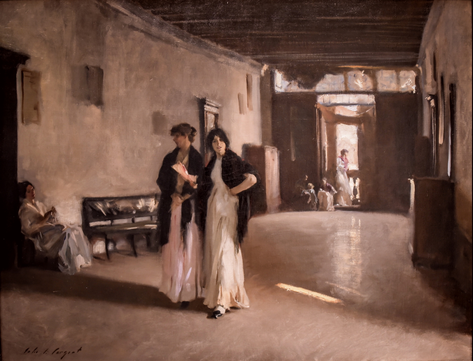
One of my favorite paintings is the “Venetian Interior” by John Singer Sargent. It is part of the permanent collection at the Carnegie Museum of Art in Pittsburgh. Since I live only 20 minutes away I get to visit the original any time I want.
So cool.
A few weeks ago found me back at the museum and since I had not been there for a few years, I was happy to see my old friend. And it struck me again at how this is painting is saturated in red. Above is the photo from the museums’ website. Below is my photo.
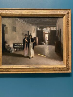
Yes that’s right- this is a very red painting. (Btw- I am always amazed at how this hangs on such a bright blue wall….the blue kicks it more toward orange in my photo…..)
What? Really? You may say…. I don’t see any red. Ahh… look closer…….
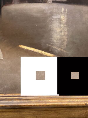
It may not be obvious at first, but the entire painting is saturated in low-chroma red. Does it feel a bit “pinkish”in the boxes? Think dusty roses. If you study the airy shadows in the hallway, red. If you study the floor, red. Watch how it appears to get even more red when I surround an area with green……
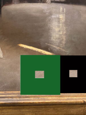
Does it feel more pink now? The red is there. And It is striking in person. Sargent mixed red into each of these “grey” areas so that the red dominates the mixtures. So, red painting. Low-chroma red, but red.
So a painting does not have to scream…… !!!RED!!! ……to create a red-dominant work. It can whisper it. With a smoldering, lingering warmth of red. Unifying an image in a sophisticated way. This is what is missing in paintings where the artist does nothing more than slavishly copy a photo. No unity of color. Where is the art in that?
This is what masterworks are made of– whispers of control and spice. And color dominance.
Besides… there is no “grey” remember? Look for the color in real life around you….it’s there. And if you are a master painter like Sargent you can exaggerate it and use it to your advantage.
I dare you to try…..
I loved this blog, Christine! Thank you.
Outstanding! Thank you for your blog!
thanks!
Awesome observation and insight into a master art work!
Fascinating.
OMG! Love this painting and had never seen it before. Thanks!
right? it is only adjusting the way to see….
Christine, such a great post! I had not seen this Sargent, so that was a treat in and of itself. And it’s even more fascinating to view it keeping in mind your point about red saturation!
As one of your students, a question did occur to me. And to put my question in perspective, I know that certain media lend themselves to certain subjects/styles/effects, etc. And so perhaps there are also some limitations inherent in certain types of media. So my question….
Could this painting be painted in this style..well let me be more restrictive – could this painting be copied more or less precisely – using pastels? This is a painterly painting, of course, but could the level of detail and the various rendering of textures be achieved with pastel?
Thanks!
I guess so, but why bother? The reason to copy a masterwork is to understand what the master did. He didn’t do this in pastel, so other than understanding his color choices you may find yourself in a fight to recreate it. Not worth the headache I would think.
I do agree with you completely on the ‘why bother’. I guess my question concerned the possible limitations of certain media. I’ve decided to focus completely on pastels and sometimes wonder if I’m giving anything up. So it was more of a theoretical question! =) Anyway thanks for a great post, Christine.
Awesome! When it comes to great art, no, I don’t think you would be giving anything up. It is the artist that is the brilliance in any work. Not the medium. Study and conquer!