Sometimes with color you can be “all in.”
Color harmonies may seem to come across as being about restriction. Limiting certain colors in order to bring about harmony with the ones that are being used, but it can be about inclusion too. Paintings can have all 12 hue families and be successful.
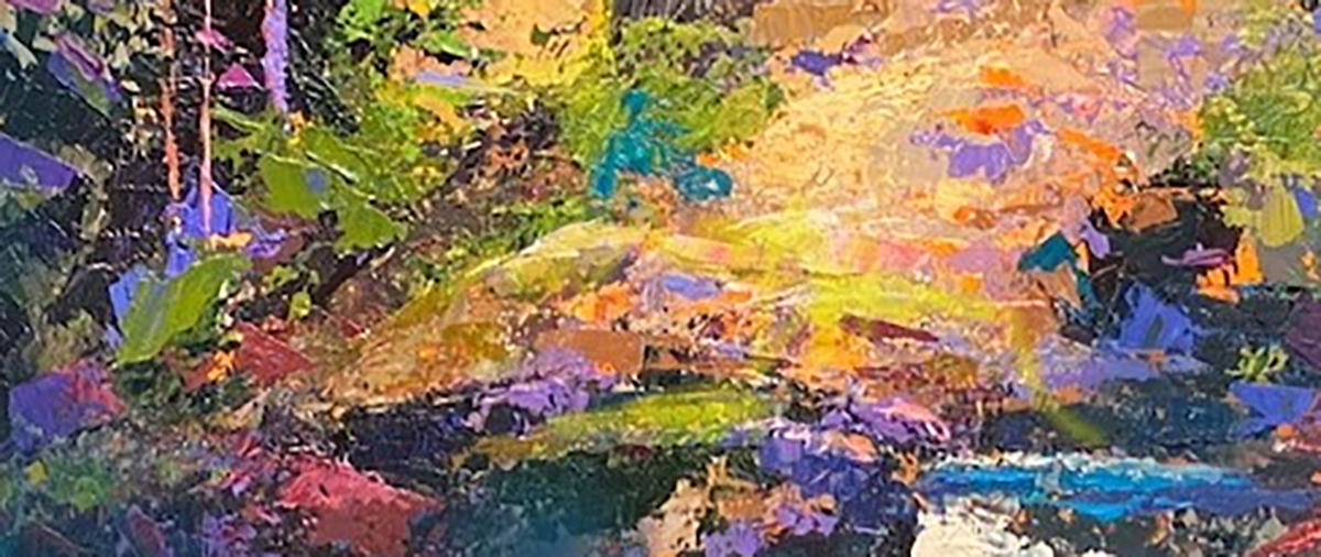
Here is a case that came up in my Color workshop. So bold. So lush! This painting has every color hue from the color wheel in some form except one- can you spot it?

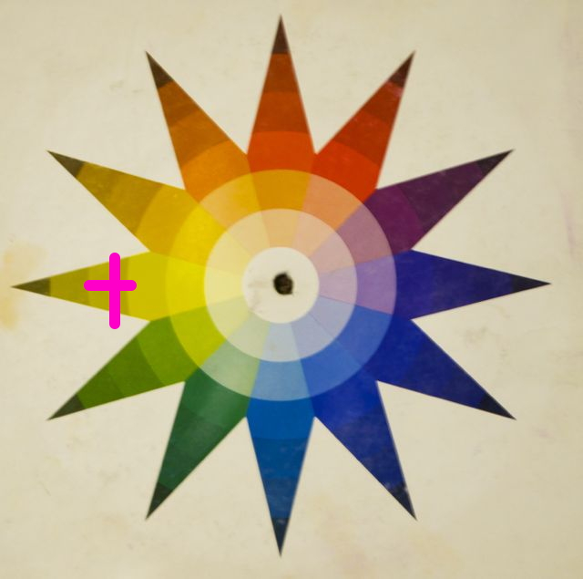
The only color missing in this image is yellow. So it woud benefit from adding it. (+)
I knew if I only added yellow in some way to the image the rest of the colors will “ring” off of each other so much better, so I added a few bits of bright, (high-chroma) yellow- watch what happens…
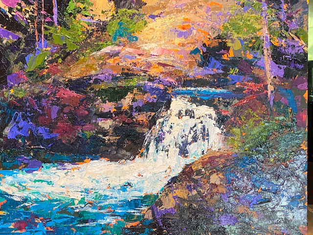
Before
After
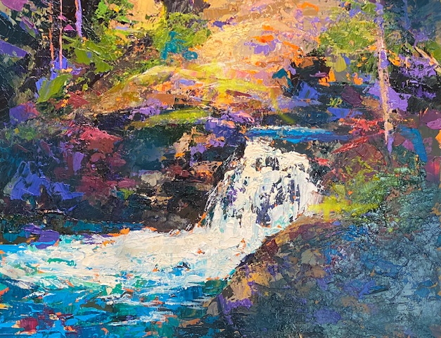
Can you FEEL the difference? I can. Like a penny dropped into place. Go back and forth between the 2 images.
Again, the yellow could have been added anywhere – it could have been low-chroma yellow or deep yellow, or dark and dirty near-black yellow- as long as it has a say in the image it will have an affect.
The other thing with this work is that if you have all of these colors popping around one has to have a dominance. It just helps to keep things orderly. Dominances are great!
So I added more blue-green to the image in the foreground where there seemed to be a bit of a glare on the image and made sure it had a bigger percentage of the entire painting. Why blue-green? It was the easiest color to add to the foreground without distubing much else. Voila! Color dominance. (But it coud have been any hue). All the team members playing nicely together and it is a very colorful and powerful image- yet with control. Without all 12 hues and a dominance it felt chaotic. Now it pops. Very sellable. Cha-ching!
For more info on color, join me November 12th for my one-day Color Workshop!
You won’t be sorry…
Yellow is powerful. Yes, “…yet with control…” I find it’s tempting to punch it all up with a spot of cadmium yellow, but one must make sure it is supported and not arbitrary. Interesting post, as usual.
Very interesting. However, your ‘Before’ image is upside down.
yeah – changed it- the website was having issues- technology!