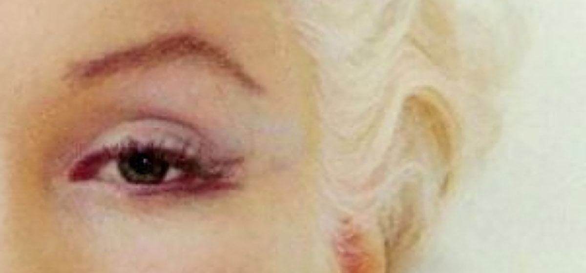
Eyebrows can be tricky.
It is so tempting to paint eyebrows as just a line without thinking about what we are really seeing. So let’s break it down.
When you see an eyebrow, you typically see this…
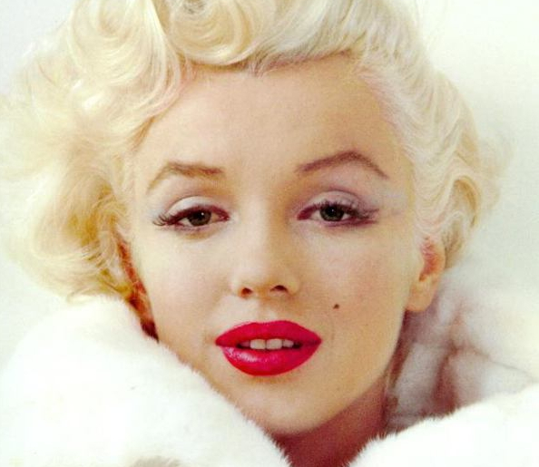
I say “typically’ because there are always those faces that break the rules, but more often than not the eyebrow has a “triangle” shape to it. And almost always there is a “high point” along the arch of the eyebrow like on Marilyn above.
But what are we really seeing?
That high point of the eyebrow is when the plane of the head changes. So that pinnacle of the triangle is not only when the eyebrow starts to turn down, but it also turns “back” in space. That part of the eyebrow is on the 3/4 plane.
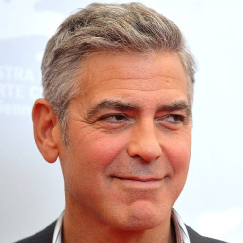
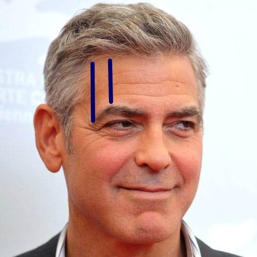
This area here is a 3/4 turn from the front of the head- and from the front of the eyebrow.
And once the eyebrow ends, this area beyond is actually the side of the head. In other words, the front of the eyebrow is at the front plane, the top point to the end of the eyebrow is at the 3/4 plane and when the eyebrow ends it is now 90 degrees from the front of the forehead. You can feel this for yourself. Put your hands on your temples- this is the side of your head.
When we see this area here in pink…
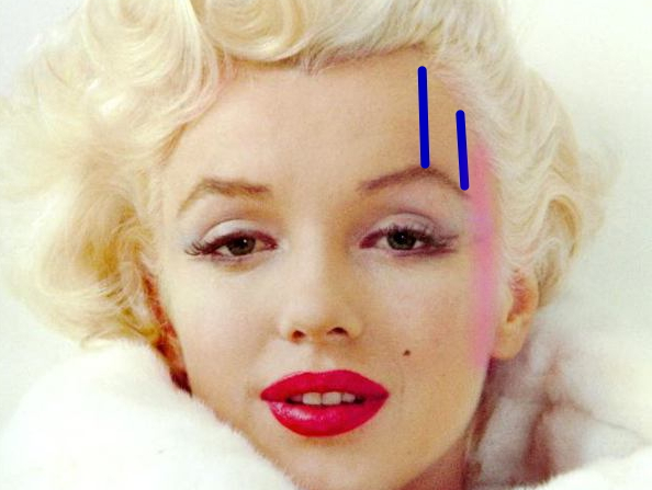
We are actually looking at the SIDE of her head- so it is dangerous to see the forehead and eyebrows as the same all the way across. ( and even more dangerous to paint it that way) To paint this area effectively we need to convey the structure. Eyebrows are complex. Because the head is complex.
Even when someone turns from us only slightly, the 3/4 view of the eyebrow disappears and all we see is the “front plane” of the eyebrow- it disappears right at the peak of the arch because the eyebrow is now wrapped around her head as well as traveling down and out of our view.
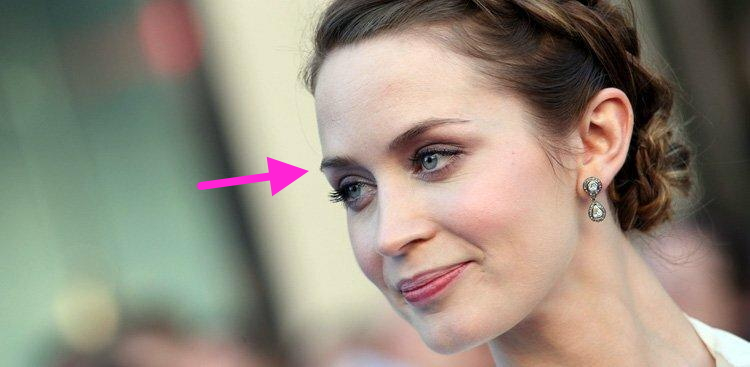
This is why portraits that are not conveying this sense of structure can fall into that dangerous category of “dinner plate portrait” that I have talked about so many times. Painting the same value, temperature and hue to both the front and to the side of the head and around the eyebrows results in a flattened appearance. This structure is so very apparent when working from a model or when we are talking to someone on the street. But in photos? Ah, darn those lying pics….they tend to show that the eyebrows are just a flat curve. And the face is one big, evenly-colored flat plane. Not so.
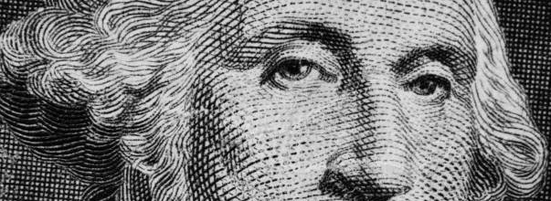
So as tempting as it is to just put in an arch that we are seeing, it is better to think about the space this curve occupies… straight across then BACK and DOWN… and if your color, hue and value changes along with these plane changes – Voila! Structure is created as an illusion on a 3-dimensional flat surface. That is all realism is in a painting- “breaking” the picture plane so forms look as though they have the depth they do in real life. Look! Even this George on the one-dollar bill has a change in value at the eyebrow where it gets darker at the temple where the eyebrow ends. This was not due to a whim of the artist. This was to show the structure of the head.
For more helpful information on painting the features of the head, please check out my upcoming workshop schedule starting in September. Plane changes, structures of the head and most of all- understanding LIGHT helps us in painting a believable portrait. I am passionate about teaching all of this good stuff.
The kids are back in school, so let’s paint!
(Oh! and you are welcome for including George Clooney in this post.)

Loved this post, and especially your choice of “examples!”
Thought you might! 😊
Important for sure, so much of the expression is determined by the brows! Just added eyebrows to a watercolor before sitting down. I try to do each of the 2 sections with a single upward stroke using the width of the brush, keeping it soft.
And you are so good at those eyebrows on children!
Thank you for your insight, most helpful.
sure!
Great post as always!
😊
Thanks, Christine , this was very helpful.
you got it! 😊
HaHa!! Thanks, Christine, for including George Clooney!!! I had to laugh when I saw your examples! ‘Eye Candy’!!!
Gotta keep you interested! You are quite welcome! 😊
Hahaha! Great blog. Love your sense of humor! Great information
😊
Just yesterday, I was looking at head shots of a model by a photographer friend, Archie Carpenter. In one 3/4 shot, with the woman’s chin slightly down, the terrific shot instantly looked like something was distorted to me. I quickly noticed that her right eye, top of eyebrow to under eyelid, was larger than her left, noticeably. But her head was turned to her right. Since the right one was clearly, to me and Archie, a larger “overall” eye than the left, it all looked distorted because the eye further from us was bigger than the one closest. These nuances are much more important than many realize. Think of it: Using math, let’s say each subtle nuance amounts to 3 or 4 percent of the overall subject. It doesn’t take lone for a few of them to add up. And in the case of portraits, likeness is so critical and it becomes even more important. Great post, as always!
thanks!