Warning- if you have an aversion to horror films or are a very tidy artist, you may want to look away…
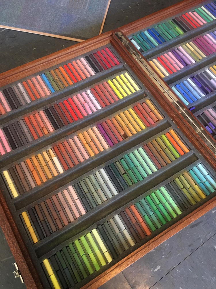
Recently I bought a set of slightly used pastels from another artist. She had an entire set of Giraults (my favs) and she just was not using them since she is more of a direct painter than I am, so she decided to sell them. It was such a good find and at such a good price, that I couldn’t resist and I said I would buy them. When we met so I could pick them up, she had them all arranged so beautifully in the original wooden box…
Yeah, that’s not gonna work for me…
Looks like she had broken the sticks in order to use them a little shorter so they would not break on their own and then she made sure they got back together with their partner in the same spot… how cute…
But color is relative. It changes based on what is around it. So a green stick can even appear pink when you put it against greener sticks. It is all relative. Known as color relativity, it is an amazing feature of nature. It is the reason I don’t believe in “neutrals.” For a recap of that idea, here is a blog post from 2 years ago called “Grey is Not a Color.” It’s worth a second look…
https://swannportraits.com/grey-is-not-a-color/
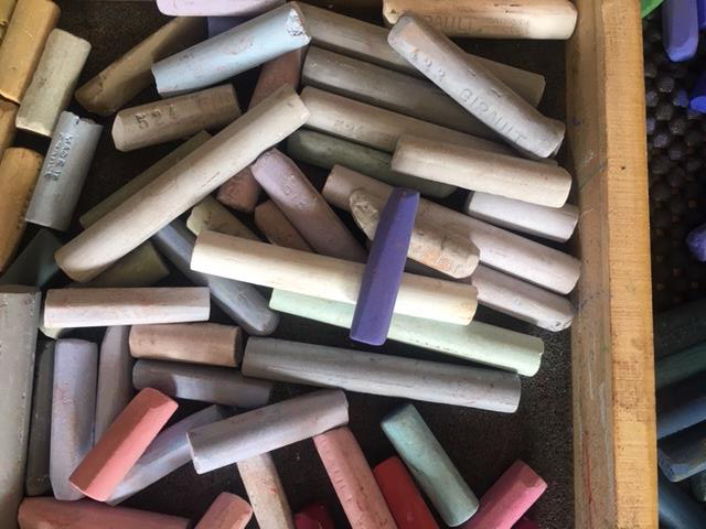
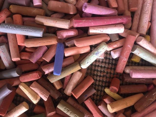
So for me, colors need to be all together and register against each other and plus I don’t have time to putter around with their perfect places in line. It doesn’t matter. So when I got home, (so I didn’t give a heart attack to the woman I bought them from) I did this…..
(Look away if you have a weak stomach…)
Which brings me to my point. I see artists all the time posting on social media about how they spend days sorting their sticks into pretty fans of color and hue. Such work! Such time! They are prouder than a young mama with a newborn in a fancy white outfit… but that kind of coordination sets my teeth on edge and gives me sweats… ‘cuz I know that baby will only throw up on her soon.
Does it really matter that a certain color has to be sitting next to ones only like itself? Nope… dare I say that this is color discrimination… it is ok to intermingle people!
In the following 4 photos the exact same violet stick is set against other sticks. I assure you, it is the exact same stick in each photo… this little guy appears brighter and more chromatic against some of the sticks, and yet darker or even lighter against others. It’s all relative.

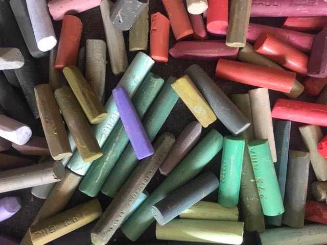
So he has changed each time because of what is around him… cool huh???? If you know this, you can plan for it and put it to work for you.
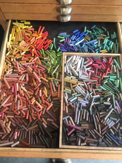
So this is how the Giraults look now in their drawer… roughly the highest-chroma colors are shoved to the back- I don’t use them much, and then the ones I use the most ( lower-chroma sticks) are divided roughly into the left and right chambers by colors that “go toward” yellow or blue. All colors fall into a yellow or blue category. (more on that next week) Colors toward blue go on the right, and yellow-based hues go on the left. Yes, even reds can be blue-based like the ones at the top of the right chamber below. Purples tend to change between being yellow and blue, so I throw them at the top… this is so I can roughly see what I am getting with the colors before putting it on a work, knowing, of course, that it will probably change in both hue and value like a chameleon, and knowing to be prepared for that change. There are a lot of sticks on the left that are thrown together- pinks, oranges, peaches, yellows, greens… all playing happily together… I need to see them against each other to see what I need. Roughly, I have the darker sticks near the bottom- just so I can find them quicker, but they are all the hues- green, blues, (brown is not a color either) oranges and the 3 violet families… it’s ok… just breathe…
Does it matter if I put a stick back into it’s “proper spot?” Nope. Ahh… what a relief… because to me, seeing the colors move and change against each other is awesome. It makes me pull things I normally wouldn’t use, and makes me realize that there is no “right color” for anything.
Drop the mic…
I loved this one, to the max. I am an accountant, (in the past, so I suppose I should say “was”.) as such I find that for most things in my life have a spot and I appreciate it when it’s in that spot. It’s terrible! I do like to keep my pastels clean and use a bunch of foam trays that I keep them in. So they don’t touch. But that is the extent of my fanaticism. I really don’t care where they are in the box, because I have my corn grit box that I use for a pallet and cleaner. I pick the ones I’ll be using and into the grit box they go. I do test colors together on a piece of the same substrate I am using for the painting before the box. After the painting is complete, a gentle shake and the pastels are clean again. Now I do have color storage trays and I do try to keep it going from lights to darks within the box, all hardness levels, but that to me is unimportant. Am I insane? I don’t know but if I was as fanatic about my pastels as I was about numbers, I would be. I’m going to a workshop where the instructor wants the pastels set up I a certain way. I am having a miserable time with that. But, I’ll try. Having a good time.
good to try that and see why they want it set up that way. But also good to know if it doesn’t work for you!
Awesome blog and lots of food for thought! Thank you.
🙂
Oh my goodness you are my kind of artist!! When I got my set of mt visions I put them in my Dakota box according to shade and value. I said never again!! That’s to stressful trying to make sure everyone needs to be in a certain space. My other box is the true me!! 🤪🤪🤪
be true to your pastels!!!
Beautifully written. And I love your sense of humor!
thanks! 🙂
That purple stick thing is amazing. It is really something to think about when painting. Its like the clear blue sky in spring is different than the clear blue sky in fall. The oranges make it look warmer than the browns of spring.
yes, exactly!!!
Your messy with your pastels like I’m messy with colored pencils.
🙂
Christine, you are a genius….AND you crack me up!! ❤️
🙂