Controlling color is one of the most important things you can do as an artist… as well as the most difficult.
I am currently teaching an 8-week Color and Composition class. This means no “painting” in the class, but rather deep thoughts and planning about design, structure and color. What I feel most artists miss out on seriously thinking about. So when I teach about these important elements, I like to think about stripping away any thought about what is in the painting and only think about composing the picture plane and how to get colors to “talk” to each other. This week I was teaching about color dominances and how to get a painting to be primarily one color. In other words, the largest percentage of a painting would be that one color. I like to think of color hierarchy in color chords as a family- the “Papa, Mama and Baby” hierarchy of colors in a piece.
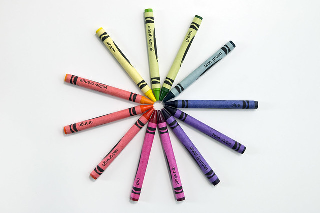
Below is a demo I did of a live model in a workshop in New Mexico from years ago. I have the class pick out a color chord for my painting as I work and so the chord they picked this time was a split complementary. They then picked the orange-red hue as dominant.
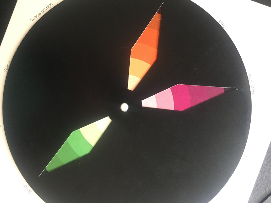
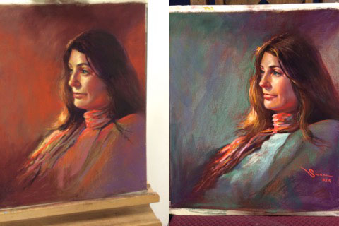
I put the chord next to my easel with the orange-red hue at the “top” of the wheel so I can remember to keep that color dominant as I work along. In the first painting on the left below you can see how this color is the dominant color in the painting and how it runs through everything, not just the background, and how red-violet acts as the next “momma” color and the green is then the tiniest percentage and acts as my “baby” color.
Then as the painting was considered “finished” I took the wheel and rotated it so now the same chord is still being used along with the same colors, but I wanted to show how a different dominance can be set up. Like this…
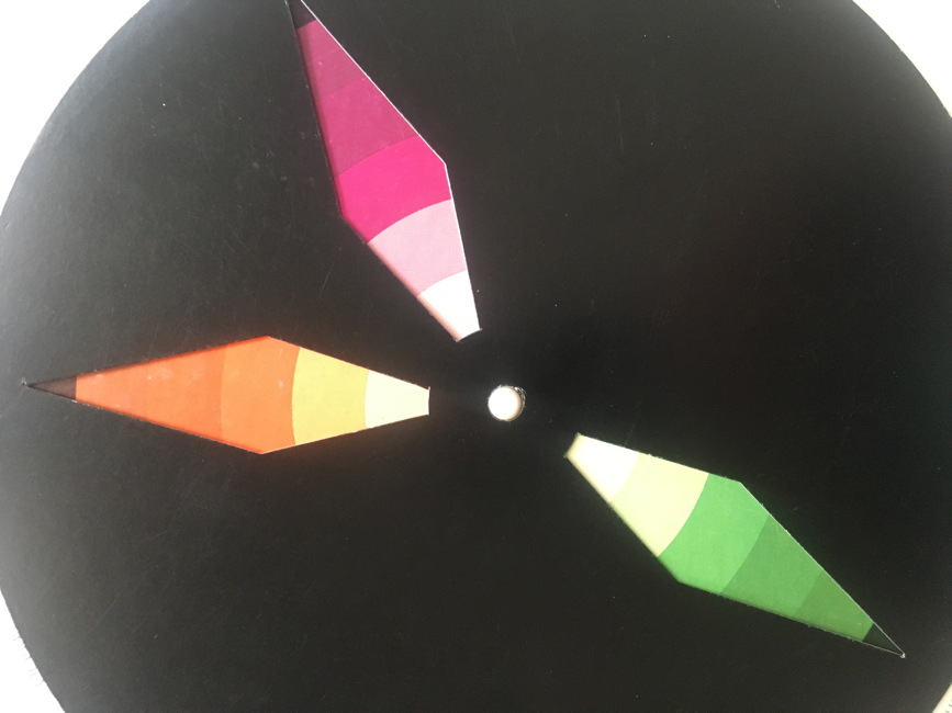
The color at the “top” is now red-violet and after a quick demo of working across the painting I changed which color now dominants the painting. Without changing anything else except HOW MUCH of each color was used in the scarf and background, I shifted the dominance to red-violet so that the red-orange color now acts as the accent color, or my “baby” relationship.
Yes, this is the exact same painting below. Note the different mood in each of them. Color is amazing how it ties into emotion… it is a great way to think about and loosen up about color, especially for artists that are scared to move past their photo references.
Cool huh? So don’t be frightened of color… move it around, smack it upside the head and show it who’s boss.
Your paintings will thank you.
I truly enjoy your posts. Thought provoking, and appropo. Thanks. Still blown away at your blog on “Grey”.
🙂
What a delight to see the model from your workshop here, at The Artist Studio, in Albuquerque. Of course, I have a painting of the same model!
I do enjoy your blogs, though I no longer do pastels, but am thoroughly enjoying oils!
hi- I was wondering if anyone would remember this… oils are cool too!
Hi Christine,
Has your color class started? If not, what is the time and days that you teach it?
HI Yes, Saturdays, but we are a few weeks in already. next time!
What kind of color wheel do you have? I can’t seem to locate on with the cutouts like yours.
This is WONDERFUL information for me, as I use photo references exclusively, and need a boost to move past what I’m seeing to add more color!
It is an Itten Wheel. They dont make them anymore.
Yes, very cool. Thanks.
Absolutely fabulously lesson, Christine, and so practical. Thank you also for the top notch illustrations and portrait demo examples. Makes perfect sense. This lesson is a game changer for me. So very helpful. Thank you!
🙂