
All light sources have an inherent color. Photos tend to throw things off so we see things as “white light” yet did you ever paint something, say, a sunset, and when you added white to the sky it just looked plain “off” or even felt not very lit? Why do some paintings glow with light and some just seem chalky?
All light has a temperature. Either toward the warm or the cool. Now if you know which pastel sticks lean toward the blue and which toward the yellow, this is very helpful in building up temperatures. But light can not only be yellow-based or blue-based. Sometimes the light itself is green or orange or even purple.
First let’s start with determining the temperature of a light source. There are 4 kinds of light- Indoor cool, Indoor warm, Outdoor cool, and Outdoor warm. That’s it. Indoor light depends on the bulbs. How they are made and what kind of light they are putting off. Fluorescent lights can have a very cold, almost greenish feeling to them, while standard bulbs (not the twisty kind) are yellowish and warm. Outdoor light depends on the sun and the time of day and how light is being filtered in the sky. First determine which of the 4 kinds of light above that you are working with and if you can, the best thing is to have only one light source with one dominance.
Here are a bunch of photos. What is the color of the light source?

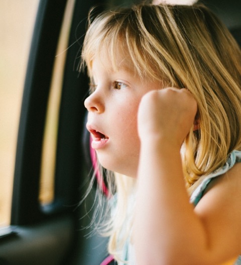
This one above is pretty easy- Outdoor cool light dominates. (there is also some secondary “greenish” indoor light on the right and above her– see hair) You can clearly see the blue on the left side of her face- notice how warm and orange the right side of her face is in the shadow of that light (shadows are always reversed in temperature!) Notice too that as the right cheek gets lighter (in the middle of the cheek) it gets more blue! Look closely… this is because it is picking up more of the ambient light source. Which is blue! Because the light is blue her skin does not just get a “lighter” skin tone, so you can’t just add more lighter “flesh.” It has to get more blue.
Think how nice it will be to pick colors that lean toward blue and know that the colors you pick will keep the integrity of the blue light since you know to look for the leanings in the sticks.

This one above is easy to spot too… outdoor warm light. Yellow- dominant. Not only are the brightest spots on her hair yellow, but her legs and arms are too. (there is no white in this image- none- not even in the dress- it is yellow. Don’t believe me? Look at the contrast with a strip of “true white” below and see how cold the white feels against the lit parts of the dress.
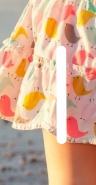
So to keep a warm temperature and a warm feeling to a painting, you can’t really use pure white! Especially in a warm light source.

This one is trickier… what color is the light? She has a California fake tan, so you would think the light is warm and orange. It is not. She may be orange, but the light falling on her is cool. Look at the colors in the shadows… look now at the highlight on her shoulder – see the bluish purple cast in the highlights?
Midday sun is cool. It is true! The sun gets warmer as it falls away from the zenith- morning and at twilight- but at noon it is cool. You have no idea how many paintings I see at shows or in competitions where the mid-day light is warm. Or where everything is warm. Light, highlights and shadows. Can’t happen. It’s one of those lies that photos tell and it breaks the law of light.
This is a type of reference I see all the time… oranges and pinks abound. Very soft transitions. So pretty. But what color is the light? Look at the shadows.
Yep… the light is cool.
So be sure to take a close look at your light sources. They may just surprise you with how colorful they really are.
Excellent explanation be well . Thank you
thanks! 🙂
Thank you! I have learned about the color of light before, but it helped so much to have you reiterate it. Your photo examples were excellent.
🙂
This is so tricky! It is something I have a difficult time seeing. It is especially hard to see in photos. Thank you for the post.
when in doubt, put your hand into the light source. Ask if the highlights are blue or yellow. if it is in a photo, take a white piece of paper and cut a tiny hole in it and then move the “window” around the photo and you will see the colors better. blueish or yellow….
I learn so much from all your blogs! This one has me confused, tho’. I can see the difference between warm & cool light and understand that shadows are the reverse, but I can’t see the indoor/outdoor difference, unless the subject is clearly set in or outdoors. The first photo, for example, looks to me like indoor cool. Help??
so she is indoors, but the blue light on her face is blueish and therefore cool. it is very diffused light which tends to be more diffused. Indoor light from a lamp will have more of a direct “cast” to the rays and throw more distinct shadows. Since it is diffused it is outdoor lighting. hope that helps. Knowing which it is is not as important as seeing the colors.
Wow. You did it D. I’ve read this three times and just when I think I’ve got it, it slips away. I do understand that light has leanings of color. And I appreciate how you put the “indoor light” into words. I’ve been trying to word this “indoor Light”, (which I’ve never called it that), into something understandable. So far I’ve failed. I never before thought about the difference in outdoor light. Just “longer the shadows-cooler the color.” Can you recommend a book or two, that would guide me a bit?
hmmm…. Doug Dawson has a great book that is out of print now- I think called the Color of Light. He talks about the 4 kinds of light. If in doubt, put your hand in the light source and ask- is it more blue or more yellow? Then you will see it….
This is fascinating and your description is really clear. What I find interesting is that ‘warm’ light of early morning and late afternoon is actually a cooler temperature (kelvin) than noon hour light which is cool blue light but a higher/ warmer (kelvin) temperature. This is very confusing but is that the reason the shadows are the opposite in colour temperature, or am I trying too hard to find a link?
hi- no that sounds exactly right. 🙂