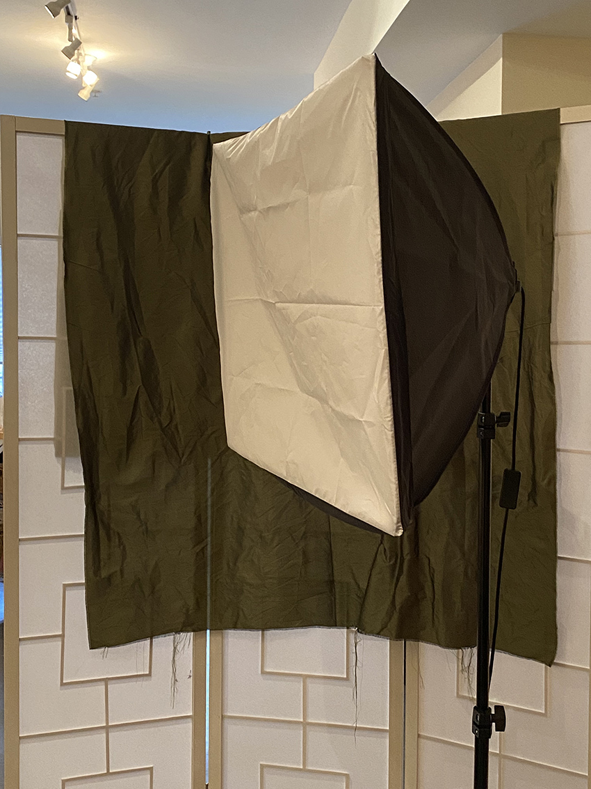
I recently bought some softboxes from Amazon…
These have been great to use to work with models and especially young kids. The light is soft and flows over a large area so I can pose a child anywhere near it and it gives me lots of info on a little face.
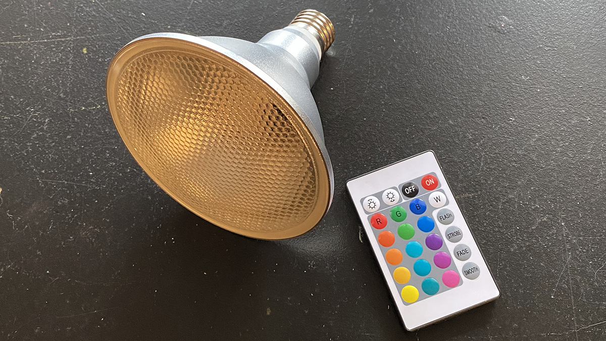
Then I bought some light bulbs that change color– and they have a remote! (top photo above)
Oh baby… how fun is that?
And that is how I created this painting of my son with the 2 different light sources – one bulb is set to red and one is blue-green.
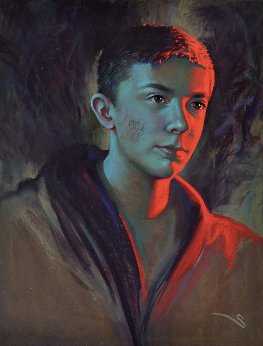 “Angst” pastel 20 x 16″
I have deliberately been doing a few paintings lately that are as far away from “real fleshtones” as I can get. Asking myself the simple question- “Can the colors be extremely exaggerated and yet can the person feel alive and breathing?”
Does “realism” have to be “real?”
Color has mood. It tells us things subliminally. So I wanted his painting to be screaming red on one side (the less dominant side) as though there was this lingering angst and turmoil just below the surface of his calm appearance- like a typical teenager.
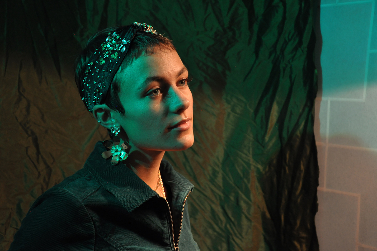
Then using these lovely lights I recently started a new painting while working with a new model. She has the most beautiful face, and now I wanted to ask this question- “Can I push the color so completely that it creates a flat, abstracted shape within the light and yet the rendering of the model is still very believeable? Can she “breathe” and still feel realistic and yet be so emersed in distorted color?
So she came over and we did a photo shoot. I like to start with photos. And then take a lot of time figuring out the painting. I mean, there is no sense paying a model to sit for me when I still need to figure out composition, intent and the basic likeness. I have to figure out all my own idioscyncrises and what I want to say first. Once I feel like I have all that under control, the model comes back and then I paint from life. It is always so much easeir then. Photos lie so much and are so “heavy” when it comes to color. There is nothiing better than painting a live model and seeing all that fresh airy COLOR in the shadows.
Here is the basic pose I went with- for me it is always a mash-up of a few photos. Lots to keep and more to let go. I found this saturation of color to be simply awesome, and it was so much brighter and intense in person.
And here is the beginning drawing…
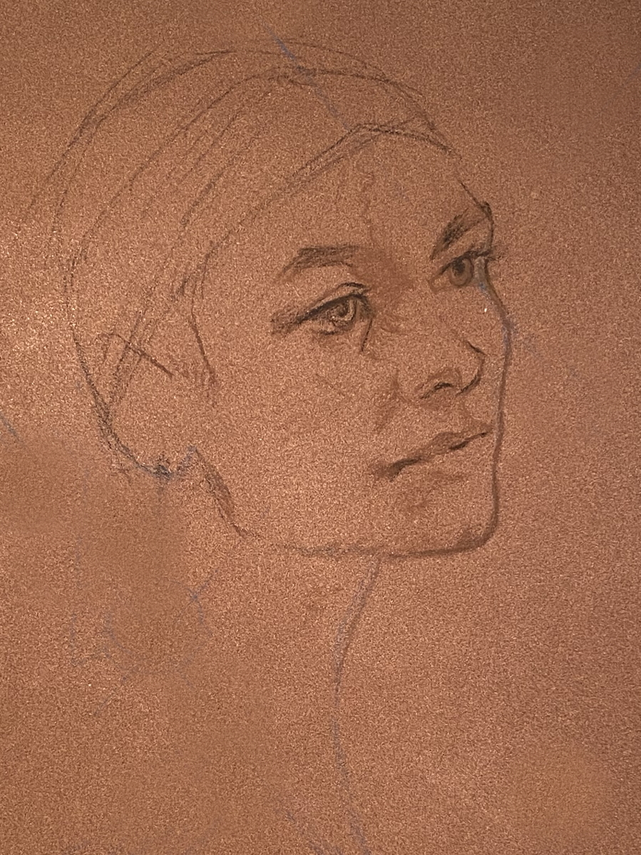
As always, I start thinking about color first before I even start a drawing.
“What do I want to say?”
“Why am I doing this?”
And then, can I find a color harmony to help?
Over the next few weeks I will share the journey/creation of this painting and my thoughts and challenges along the way.
Till next week…
Thanks for this. I was wondering how to soften yet spread light. ❤️
Loving your “journeys’, I learn so much. Thanks.
hugs!
Spectacular! Innovative! Immediate impressions that come to mind when I view this creative spin on your portraiture. Color sure adds to ‘the story’ of each sitter’s portrait/the intention you speak of…
Thanks, Christine, for sharing yet another artistic insight you’ve ‘played into being’.
thanks! Yes, its fun to share and keep ya guessing while realizing that this is all a struggle- and lots of work!
Thank you Christine. I look forward to watching this develope😊
Vibrant painting of your son. The lighting implies city lights, action and his expression looks as though he has a purpose in front of him. The colors moving from warm to cool are subtle.
thanks! Color does bring out narratives…
Love your wit and your wisdom. Thank you your approach to your stunning work. It’s amazing how the color chords harmonize.
right? thanks!