Now the path gets rockier…
At this point I am feeling pretty good about the painting and where is it headed. But that is the danger- getting lulled into complacency. Most paintings start off full of hope and potential. The stars seem aligned and my heart is playing some kind of happy music. (Metallica, I think) I smell hope in the air….
Then my brain kicks in.
How to do this? What strokes to make? What color harmony? Which brands of pastel? etc, etc…
Don’t get me wrong, I love figuring all this stuff out. I grab a huge machete of audacity and cut my way through the decisions. Check. Check. Check.
Anyone who thinks serious painting is just sitting around and “playing” all day needs to be locked in a room just one day in Hell in the afterlife chained to an easel and made to create a portrait with Beelzebub standing over their shoulder repeatedly saying, “That doesn’t look like them… that doesn’t look like them… that doesn’t look like them…”
A true artist’s Hell.
I started by picking out this color harmony… the 6 split-chord. Then picked out paint chips from my color box to help me with color variation. (If you wonder why, my next Color Class is November 12th)
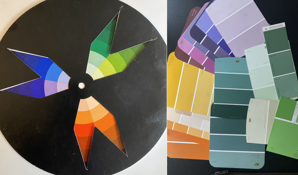
But as you will see later, the chord changed. Being decisive is good, but being flexible is better.
In art and in life.
Then I started setting darker textures and values along my set diagonals. If you have taken my Composition Workshop, you know why this is important. If not, my next Composition Class is November 10th. (Ok- shameless promotion over.)
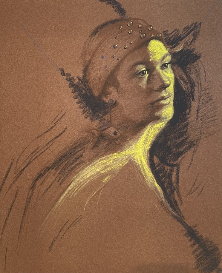
Then I reinforced the yellow shape with “power.” The pure power of Roche… Soft pastel. Hard pastel. It means nothing without understanding power. Paint light first. Paint dark first… everyone’s “rules”… uggghh. All that means nothing to me. I needed to strengthen this shape, so I did. The subtle yellows from before now getting ramped up. Like pouring gasoline on a fire. This is still an underpainting and as such it needs to support the upper layers. Nothing else in the painting will get this level of power now. Everything else will be deferential. This is extremely important to me. And will be to the image.
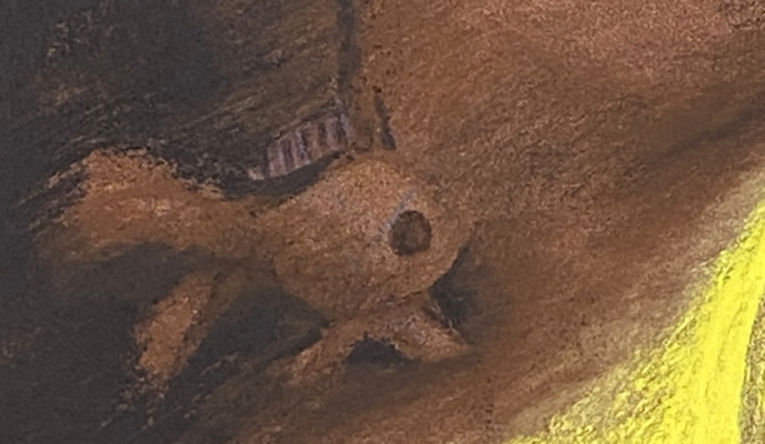
Then more building up of the background along this form. (I hate the word “background,”as though it is an afterthought- it’s all important) The darker value and texture around the goldfish helps to pop it out even more. Oh yeah, baby!
I know I have to worry about this background “energy” so I don’t lose this lovely motion later on.
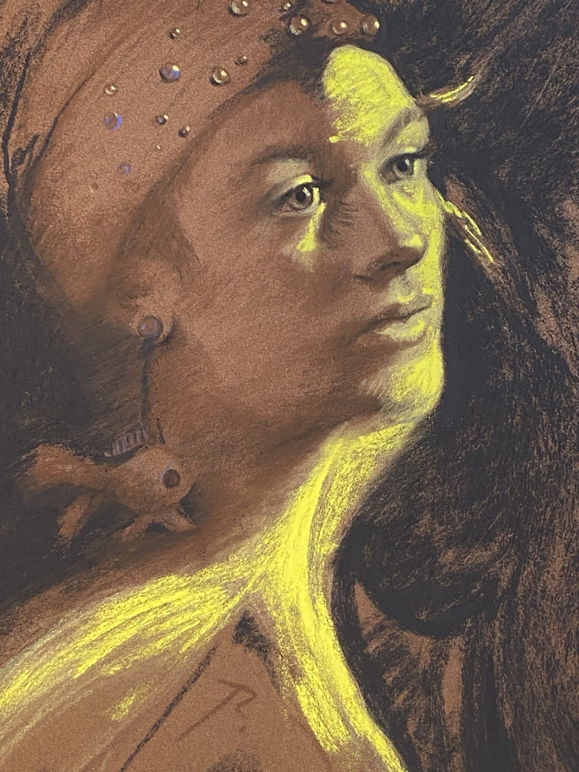
I like this little guy- the earring. Gotta keep him in the shadow though, I think.
Then I started adding color.
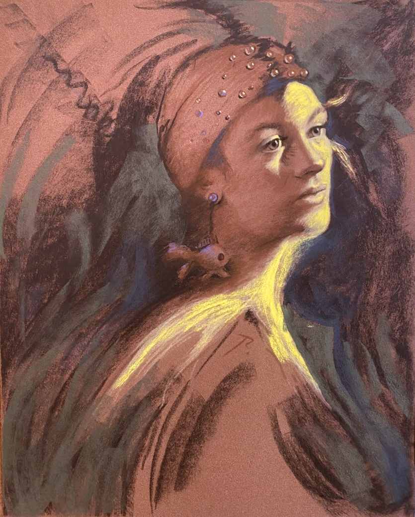
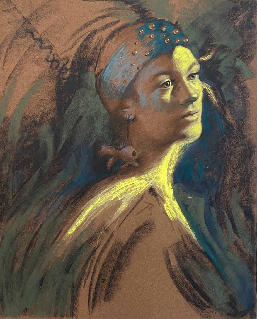
I wanted a feeling of a cool pond surrounding the fish. Blue-green will be important and as part of my color harmony it will be the dominant hue in the painting. (decision) Not the brightest, not the most saturated, not the most important, but the dominant color. In other words, it will have the biggest percentage of the surface area of the painting. It will hold everything else together.
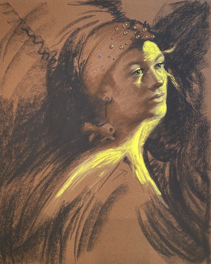
So yes- there are two narratives happening here at once layering overtop of each other. (and I have never done this before)
1. A beautiful face in striking orange light and
2. An orange fish gliding through water.
Oh, what a novelist I could be…
More next week.
WHY do you climb Mt Everest ? because it’s there … they say
climb girl climb … there is a summit
amen!
WOW with a capital”W”!!!
hehe….
Thank you. Very informative. I love the enthusiasm you have, and show through your writing. Yes you could write.
😊
Christine
Do you charge for giving a critique of a portrait and how much?
hi- I do- Send me any paining and I can give it an in-depth critique. $25. 😊