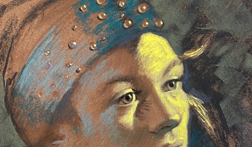
“Go out on a limb – that’s where the fruit is.” – Bob Ross
The photos I have been working from up to this point really do suck compared to the original lighting and beauty seen on my model originally. But soon she will come back for sittings.
Until then I play…
Blue-green and true-greens start swirling around. Dashes in the hat. Saturated color up against the face. The background colors have to be added into her and then added in some more or else she will become too isolated from her surroundings. Color needs to be mixed around and integrated like spices in baking.
Here is a photo I took of the painting at this point on my easel with notes and thumbnails on one side and a printout of a black and white charcoal sketch by Oliver Sim. He has the most amazing sensitive strokes in his charcoal paintings. I wanted to keep that uppermost in my mind. Sometimes that helps- a reminder from an artist that I admire to remember WHY I admire them and to help channel that very element in my own work. His drawing has lovely strokes and gentle, gentle marks. I frequently find an image from another artist so different from myself and put it up on my easel to remind myself of why I love their artwork so much. In this case, I wanted to remind myself that strokes can be soft and fuzzy. Beautiful and have meaning. Will my marks look like his? Hell no- but this gets me to think about my marks with greater care.
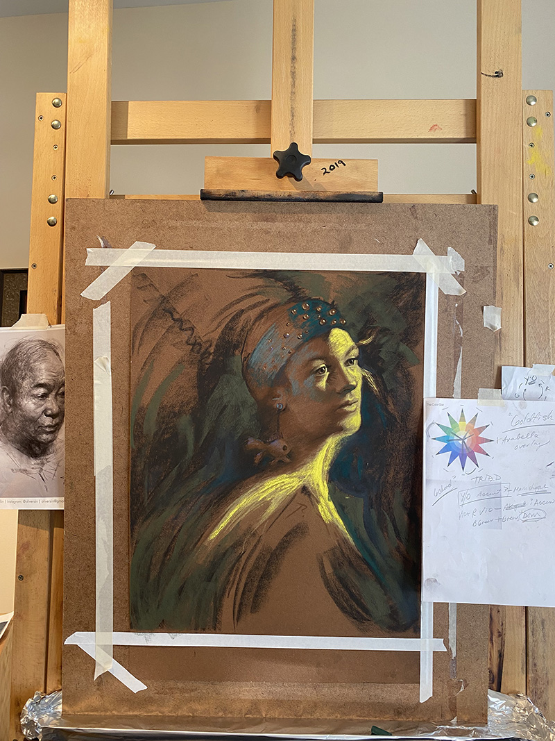
You may have noticed a question mark I had written right on her shoulder in previous photos. It literally had me guessing on how to treat this area. Time to dive in.
Now comes the color. Red-violet. Blue-violet. And I haven’t mentioned this yet, but there will not be just one bright, orange light on my model, there is also a secondary light source (soft box) on her left side that is set to blue-green. Monkey-wrench! So, everything I know about light and its ramifications gets doubled in complexity. You can start to feel a hint of that blue-green light here. Oh, don’t worry- I will be studying that in greater depth later.
Do ya’ get the feeling I like complicated stuff?
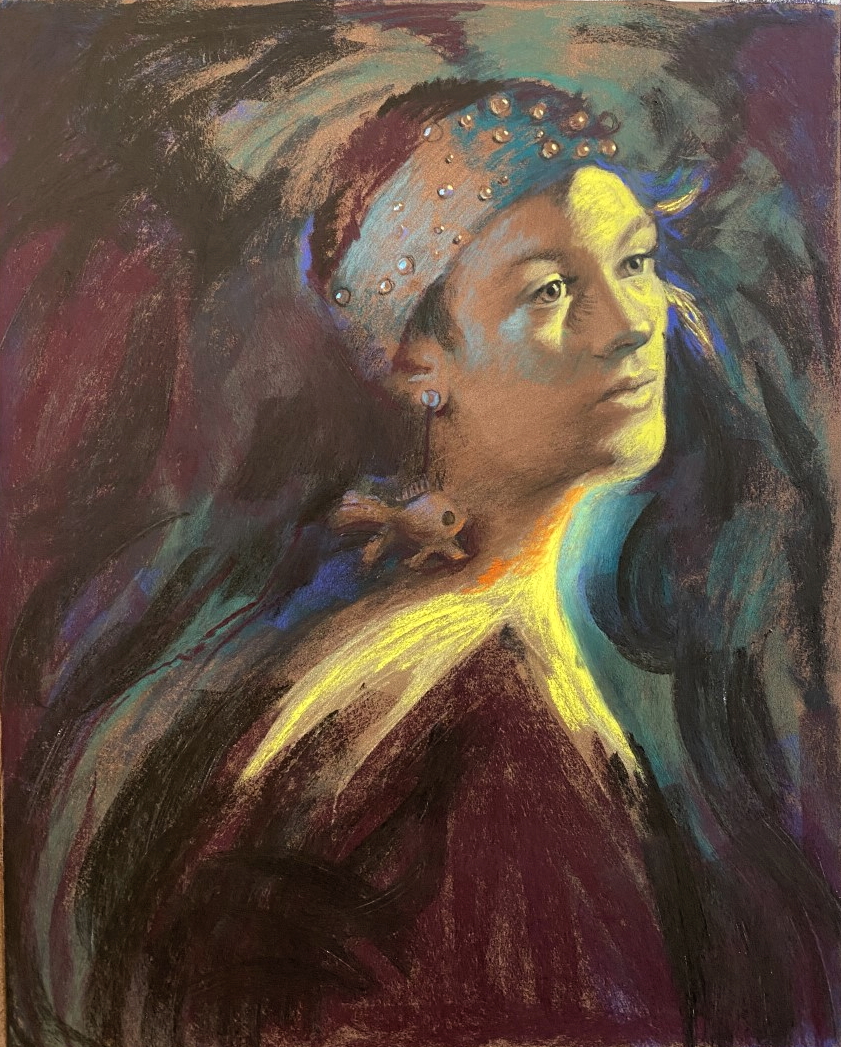
Delish. I know some artists seeing this may start hyperventilating. Unnatural color in the face? Unrealistic color? Don’t swoon. It’s all ok. We can’t be afraid of what we create can we?
As I am thinking about color in the image as a whole it gets richer. Deeper. It is funny, but I am still not really thinking of her as a “portrait.” I am not overly concerned with her likeness either at this point. I am creating a painting with intentions. She is only a part of it.
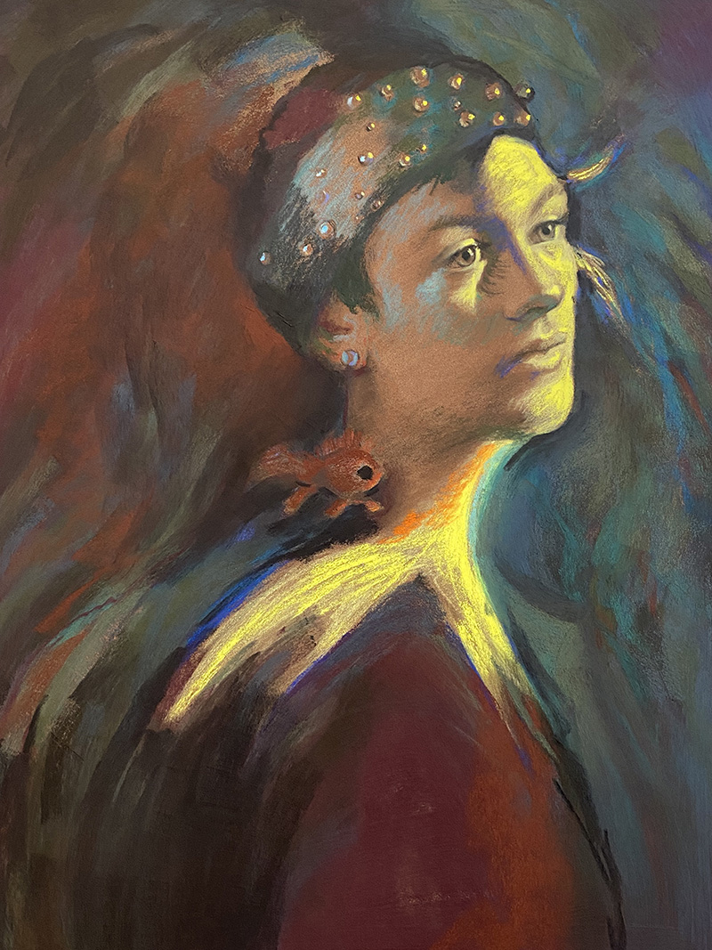
I slowly started to add blue-violet and blue-green from around her into her face. The originaly paper colro was still pretty prevalent. Time to creep over it while “knitting” the colors together more and then bouncing some subtle, muted, low-power orange around including on the earring. I start to feel the image rise to the surface. It is still murky, and I know I have a long way to go yet. I give myself permission to figure it out.
And then, just when you think it is pretty colorful, I do this…
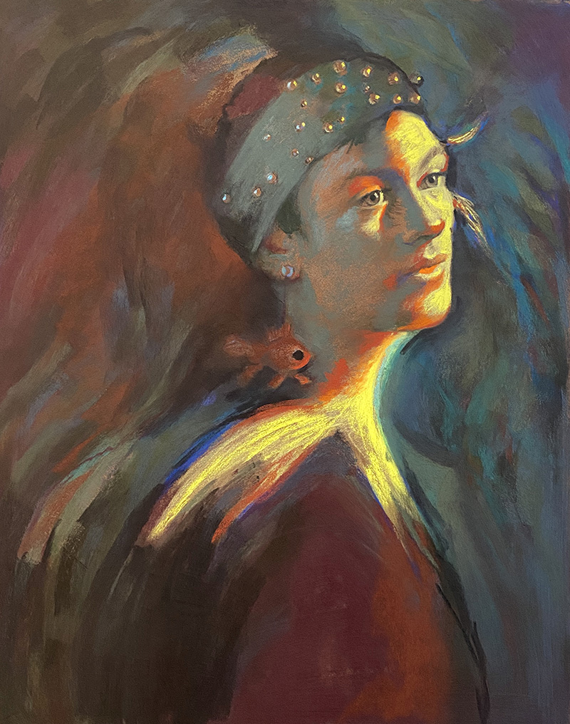
Sometimes a choking baby needs slapped on the back. Not tender care. I started dashing in dark orange on the break between light and dark. The bright yellow “goldfish shape” will be covered up by “goldfish” orange, but I was savoring the moment to do that until the model comes back and I can see that screaming orange light right on her face.
Otherwise known as my “Crazy Color” stage or Layer #3, this stage of development is about lack of fear. And pushing color around before it can bully me. (flashbacks to catholic school?)
Next week… the model comes back.

This is fantastically inspiring and genius. Thank you for sharing.
thanks!
This process has just been amazing to watch! Can’t wait to see what happens next. Thank you for sharing step by step. You really are “fearless’!!!
hehe! Go forth and carry a big stick of pastel….
You’re blowing my mind !
yay!!!
Christine have you gone this far only using pencils? And is the head larger than life size?
She is right at life-size. And no, at this point I have started introducing low-power pastel sticks. Old grumbachers and Giraults. The colors you see now are mostly those brands except for the yellow which I talked about last week to dash on top of the low- power yellow pastel pencils on the second pass in Roche which are the most powerful brand.
Your process and comments are amazing, but how much of this is creative instinct first, then rationalization?
right- I think it is half and half. I feel like I am a very intuitive painter but I really do think about all of these things along the way.
First time I’ve seen your work. I’m truly impressed about how you go step-by-step by your feelings and you were teaching along the way I’d love to follow you, susan