One thought leads to another…
This summer I went out with two other artists that live in my town. We were meeting up at a restaurant for lunch. As our waitress approached the table both of my friends looked at each other and then looked at me and said “Christine, you have to paint her…”
I agreed. And luckily so did the waitress.
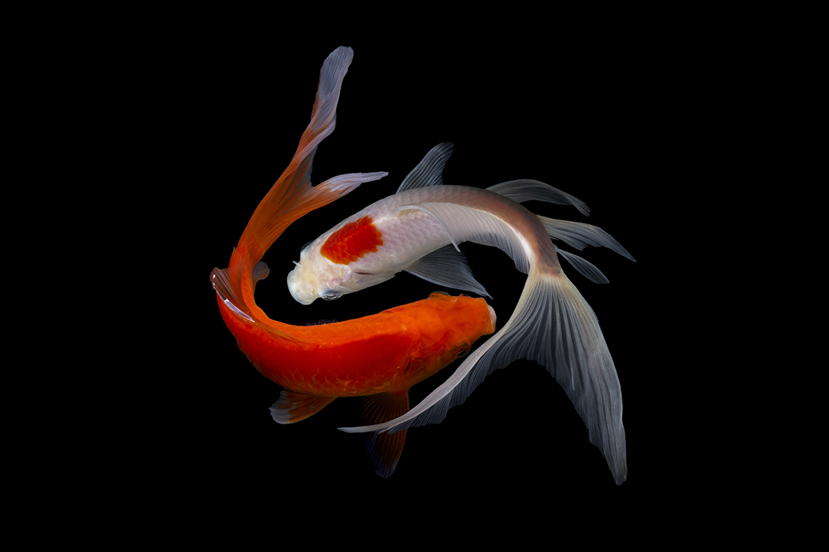
A few weeks before I met my new model I have to admit that something was tugging on the back of my mind. Images of goldfish kept popping up in my head for some reason. How graceful they are. The liquid shapes of them and especially their flashy color sitting in cool water. (I have learned not to question the things that the universe throws at me… sometimes I just run with it)
And so I wondered, “Could I paint someone in a strong, orange light that woud cast the shape of a goldfish on their face and yet keep the sense that the person was alive and real?”
So when my new model came over to pose for me, mainly for a bunch of new reference material for my workshops, I also mentioned that I had been thinking about this “goldfish” idea. She liked it so I put her in a bunch of different poses and orange lighting situations to see if I could create the shape of a goldfish down her face. The floodlights I talked about last week came in handy to play with different colors.
Then. Design.
If you know me, I spend a lot of time figuring out my composition. And the story. And my intentions. And the color harmony. And the diagonals. And the focus… and mostly- what do I want to say?
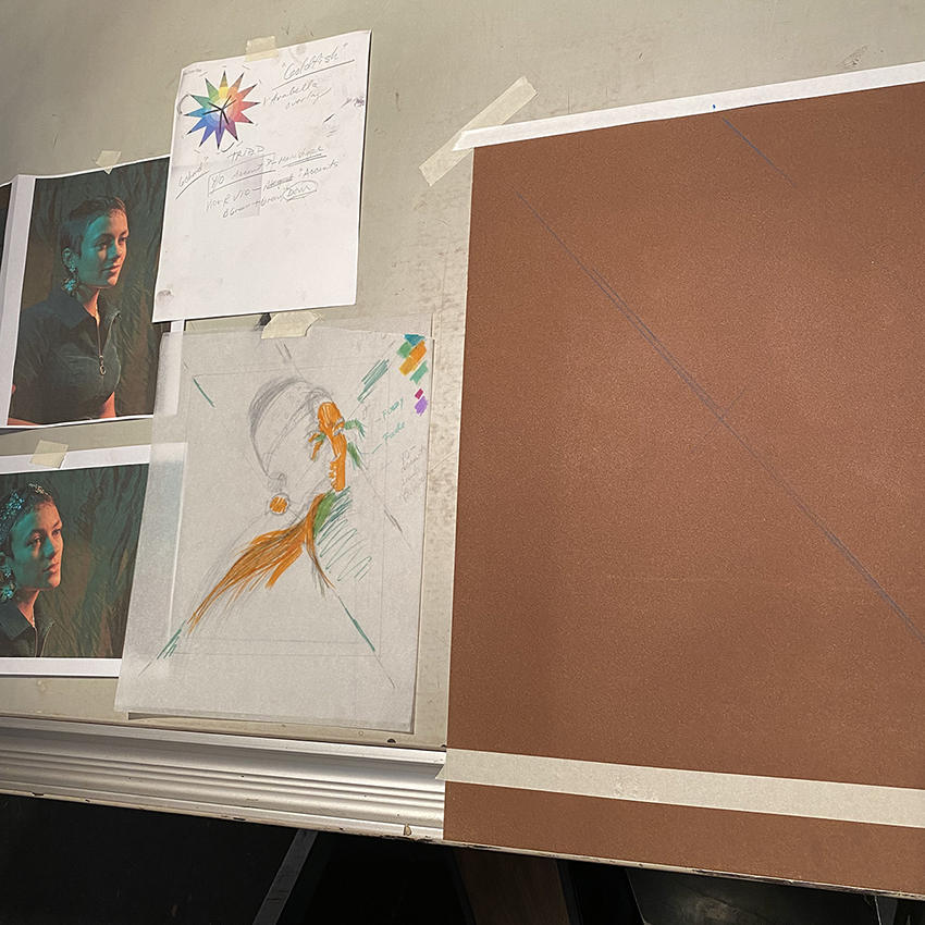
I do LOTS of thumbnails. Then afterward, since tracing paper is my friend, I figure out some diagonals to support and point to her face across the picture plane and composed how the “goldfish” could sit in the image right across her face. I am “old school” I am afraid. I can think better adding simple sheets of tracing papoer on top of the original drawing. Doesn’t take long (important) and I can scribble and move things around to my hearts content. Then add some markers and ideas for color. (of note- I only use kids’ non-toxic Crayola markers so I dont get a headache like I would from the professional ones. I killed many brain cells from using professional markers during my graphic design years.)
If the fish shape is bright orange, and everything else – through color and edges and design- is secondary, will it hold?
It became less important to make her pretty and accurate, instead, I wanted to see if I coud push the colors and that shape completely.
This type of “letting go” is important I believe. It becomes less about what is in the image and more about what I want the image to be about. Remember- it is not what you paint, but how you paint that counts.
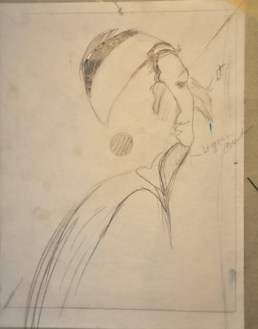
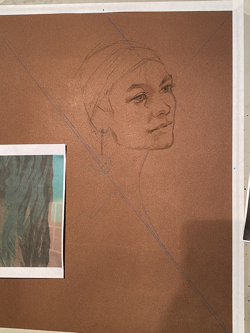
Then time to start the actual drawing on my drafting table. Those that have been in my workshops know how important diagonals are to locate things and beside me are my notes, photos and thoughts on color.
Then I started the begining drawing that I posted in detail last week. Here is the larger version.
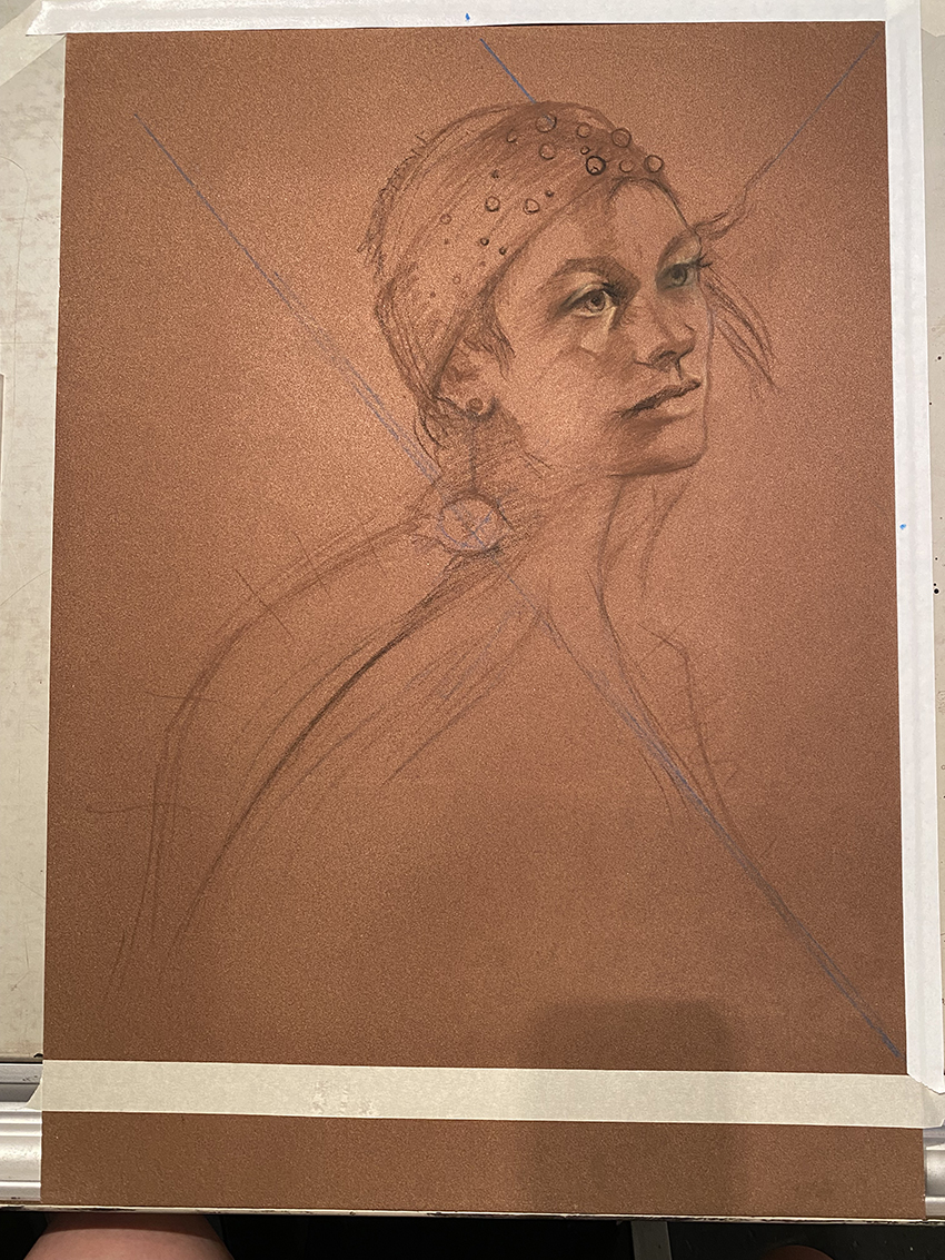
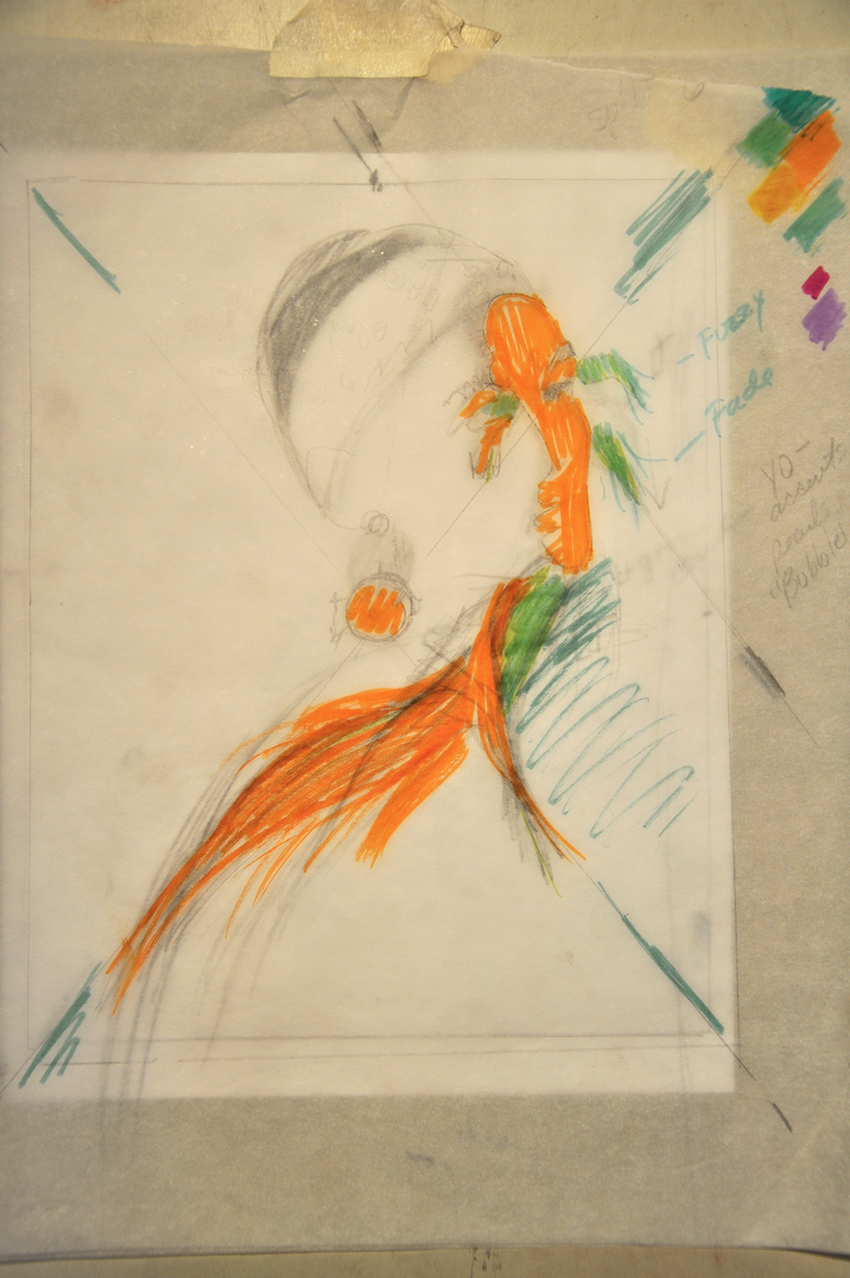
I decided to add in that she was wearing a goldfish earring on the main diagonal intersection. So yes, right in the middle of the painting. I found some cute ones on Etsy and just picked one and drew that in.
Then the drawing advanced to this…
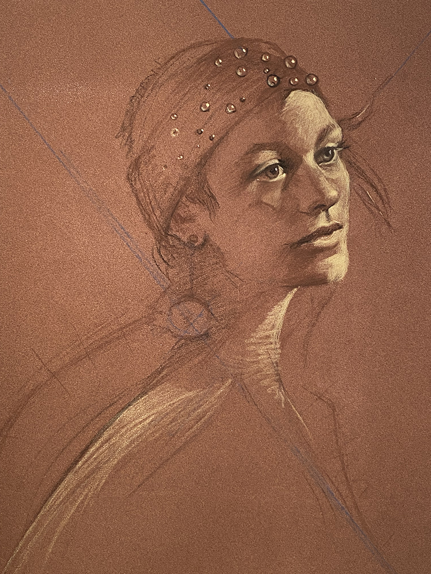
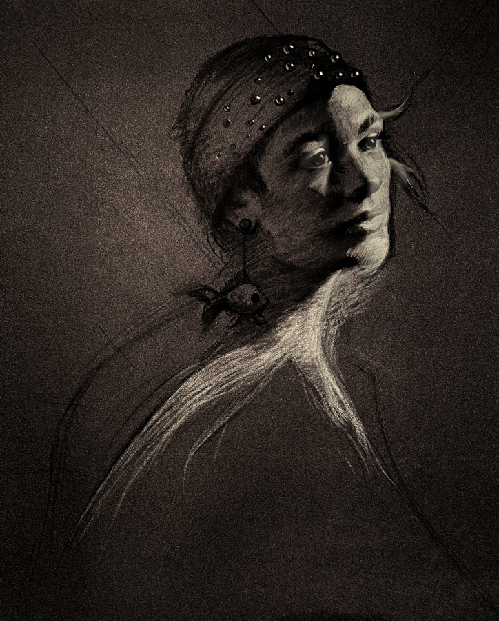
I always have to figure out the light- what it is telling about the topography of the head. Then deliberately adjusting the light pattern to become a more clear “fish shape.” I love this drawing stage. Sometimes I think I need to leave my work at this stage… but no… I have to move forward…
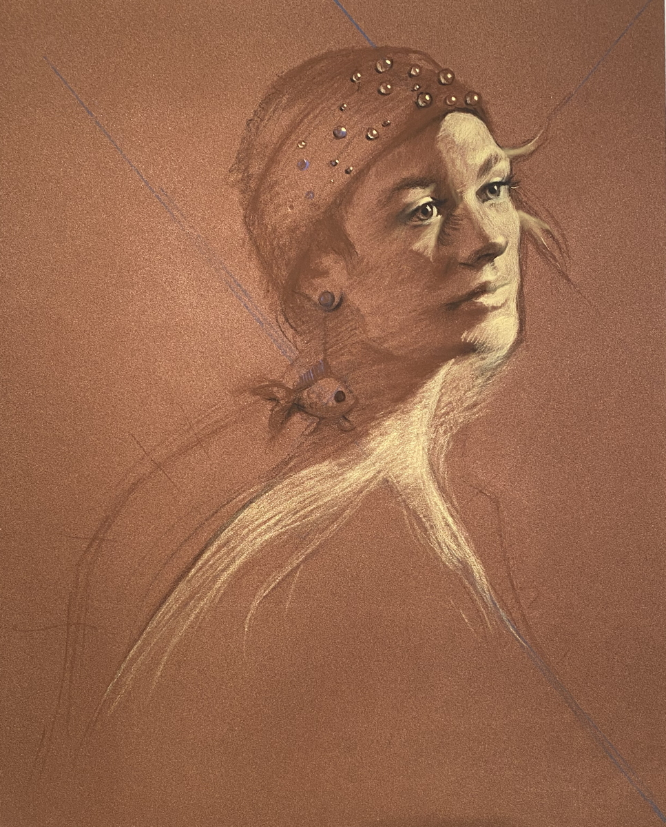
If I darken the image the “goldfish” becomes more clear.
Ok – some may think this is a bit weird, or (God forbid) “illustrative” to paint something like this, (I actually had an artist tell me I was “better” than to try to do this… (love you John) but I found it intriguing to set up this kind of difficulty for myself and see if I could pull it off. Just painting her realistically? Yes, I can do that- but this is much, much harder… and I like the road less traveled.
I knew I would have to carefully control the image and use color to keep the integrity of the fish while yet building her face to still stay believeable. I wanted her to still feel alive. Breathing. Could I do it.? Maybe.
So some things had to be let go in order to keep the fish shape. Beyond accurate color, I also had to adjust the neck somehow to keep the fish attached to the “tail,” so will adding lighter background near her neck help keep that shape? I also exaggerated the roundness of the light shape at the top of her forehead to keep the “nose” of the fish accurate. How much could I change the “break” of light on her face? Could I push the light on the chin or nose around a bit to help my cause? Does it matter? Can the fish shape be subtle and yet read into the image? Will viewers see the fish first? Later? Only after it has been pointed out?
Do I care?
These are the crazy musings of an artist.
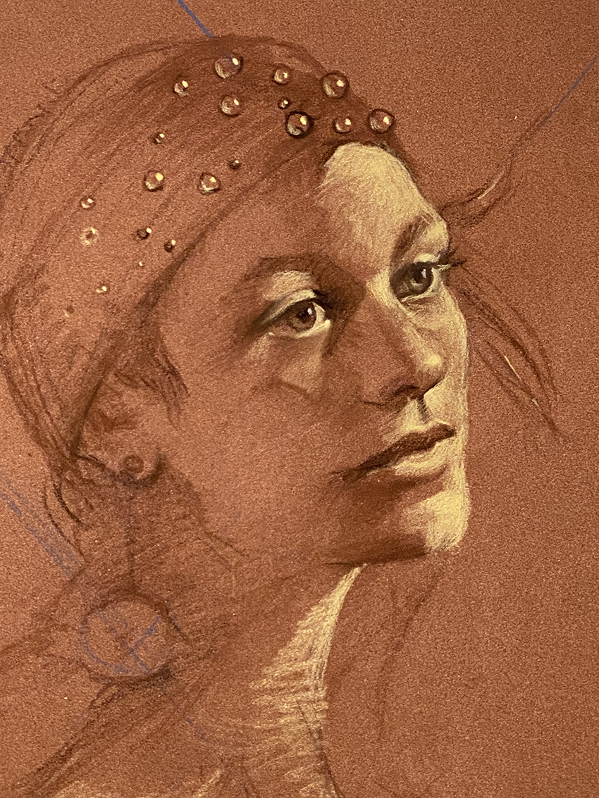
She had even brought a cool headband with sequins on it which I thought I could change to having clear marbles on it to feel the illusion of “bubbles” coming from the fish so I added those to the headband… again, not thinking literally, but to suggest my theme.
I liked it…
Next week- the color harmony I picked, adding more fish and building the image.
How different, we artists think. No wonder our heads are ‘in the clouds’. We are observing the beauty surrounding.
LOL! That should be, observing the beauty surrounding us. Head in the clouds and spell check confused me.
😊
😊😊👍
ESOTERIC…… fish shape lady dives into the pond.
please do not DROWN . try to come up for air every now and then during this venture .
Got it!!!
You never cease to delight and amaze me. Thanks for the respite.
You got it! Now get to it!
Mind blowing! …In a good way 😉
It is this stuff that sets you apart.
aww! thanks!
Fascinating process! I always learn something from your emails! Can’t wIt to see the next installment!
😊😊😊
Wow, can’t wait to see more femme fish.
You never fail to energize me through your thought patterns and implementation. Thanks. Earlene
thanks! 😊
Thank you for allowing us to see into your thought process. How very important it is to think and plan ahead. I have a tendency to not do enough of that.
We are all like that I think…I am guilty of rushing ahead all too often.
Wow! I love this! I look forward to seeing your next blog!
This is one of the most amazing and inspiring posts I have ever seen. Thank you_.
yay! Thanks!
I am inspired and enthralled by artists that share the inner workings of their art process.
This was brilliant !
thanks so much….
I find it very interesting that you are combining the 2 sides of your brain, the creative, emotional side and the more analytical, orderly side. You’ve made it a challenge to create something that is a pleasing piece of art and more importantly something that satisfies your own self. I’m excited to see how this turns out.
I am an analytical painter….
I’m off to find my old roll of drafting film. I’ve been wondering how I could try to move things around without having to do lots of drawings. This little hint has opened up lots of avenues. Love your blogs Christine. Always learn something.😁
yes! tracing paper and any tricks to help!
Wow! Fascinating! Can’t wait to see where this leads next week. Thank you for opening doors to a new perspective.
you got it… just gotta follow a lead….
Wow! This is so exciting and what a privilege to see your thought process. I’m excited to see next weeks post!
hehe. I think there will be 3 more posts on this painting.. so much to say….
Have been working the yellow lights. Can’t really tell on email but did you use the yellow for beginning lights and what paper are you using. Love your sharing!
Paper is Sennelier LaCarte in Sienna brown. Yes, yellow for light.