It was time for Orange…
The model came back and literally as soon as she sat down, I knew it was time for my goldfish to finally be orange. Under the orange floodlight I could see the relationships of color better. This first session was 2 hours and we set up additional sessions for the next few weeks. I knew I could not just rely on my photos for this painting. If I wanted her “realistic” at all I had to paint her in the flesh. And yes, I pay my models. $20 an hour. Be nice to your models!
But that first day I knew- no warm up. No planning. No time for fear. Orange. I reached down to where I have the Roches hidden from myself for only the most daring occasions (They are $20 a stick) and grabbed the boldest, most saturated beautiful hue of orange I could find and marked that baby directly onto that yellow shape. To say it changed the painting in a split instant is an understatement. Remember the scene in Harry Potter when the wand “picks” Harry? The wind blows though the room and lights come up behind him? Eerie music?
Yeah, it was like that.
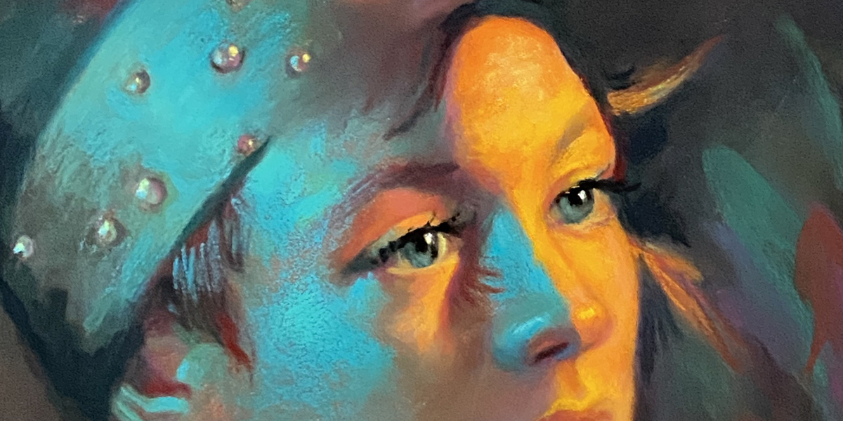
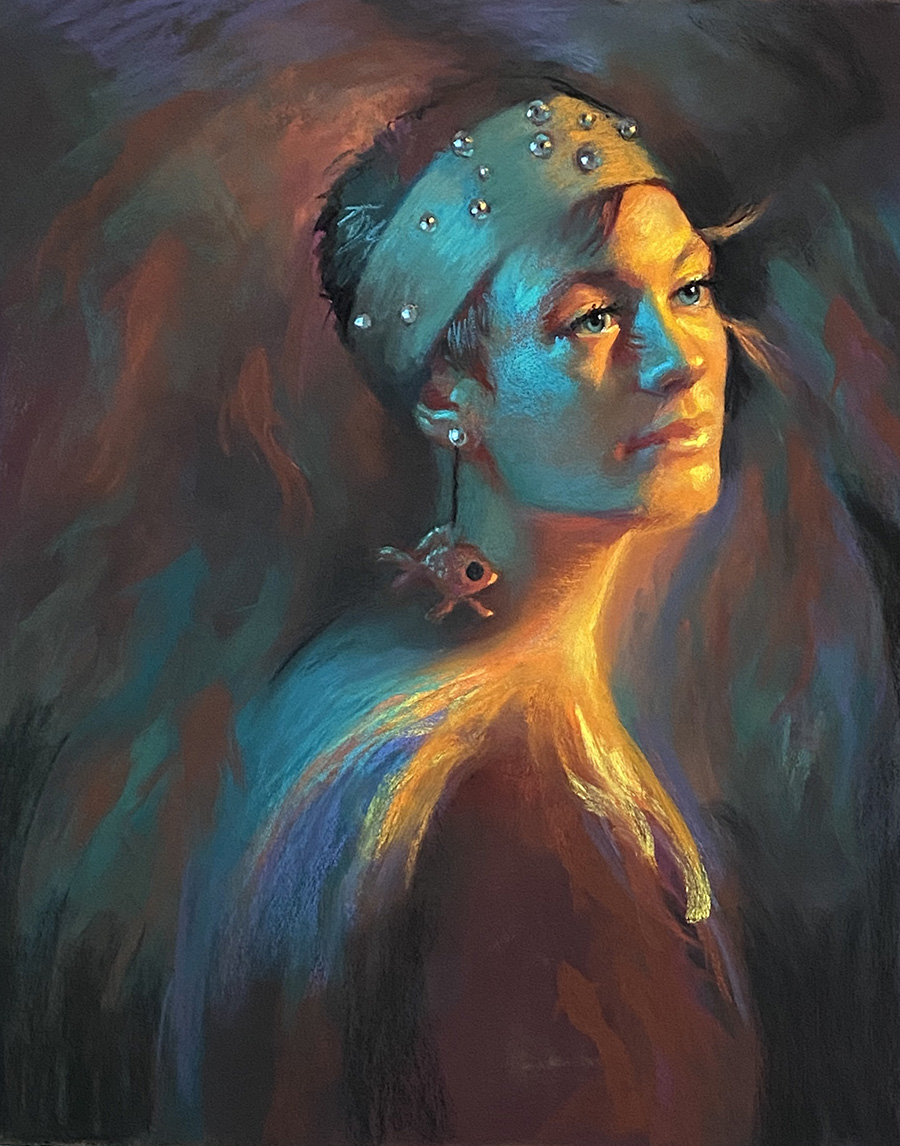
Now there was so much to think about. The more decisions made, the more there are to make. The shape of the “tail.” How to keep both light sources clear and distinct with the blue-green light submissive to the orange light and its cast. Above you can see some spots – head and hat- where I start adding extreme darks to edges in order to set up variations in the turns. Biggest question? How to keep her realistic without a single “realistic” color in the entire face. Ha! Love it. How delicious and fun and frightening.
And how to not go through an entire bottle of whiskey while answering those questions. Ah, self-flagellation.
By this time, I had collected many, many references of actual goldfish. I studied pretty tails. Different species. Different colors. But when deciding to paint in some other “fish” all around her I just kinda dived in. (high-end art term) I figured it was more important to feel those shapes I was thinking about in my head and dash them in. With control though. Sometimes it is not about drawing every little aspect. It is about following your gut.
I kept tweaking the face. Adding color.
Graceful Acid.
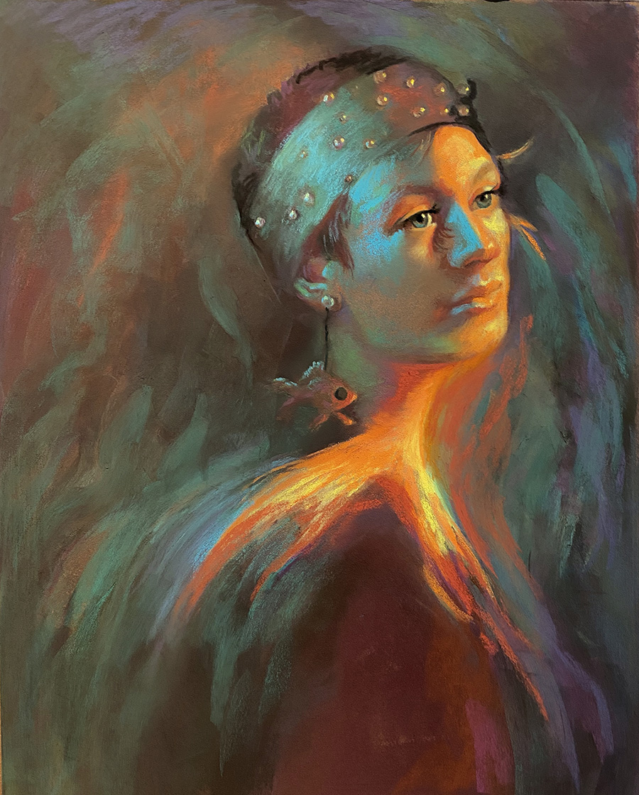
Fishy forms started flowing around her. Some distinct. Some not. The neck was always an issue. I had to make it look wide enough to keep the large goldfish shape without making her look like something was wrong with her thyroid. It goes through a few color changes.
She came out for a few more sessions. I carefully painted her face and the light and the breaks there. The blue-green light was lovely.
Then I had tail issues. I loved the tail, but found it was taking away from the rest of the image- I kept looking here at this hard edge at her shoulder. It is disruptive and causes the viewer to look here first-
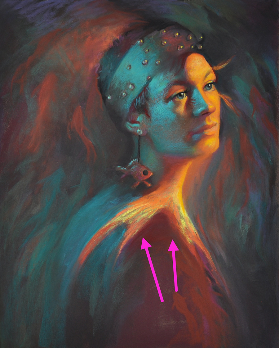
It felt awkward and so it is disturbing the careful “theater” of the piece. The goldfish shape itself needed to be center-stage and a main actor along with her face/portrait. Not necessarily just the tail. Plus, the shoulder just looked wrong for it to also feel a bit realistic sitting in that blue-green light. I softened it. Changed the shape.
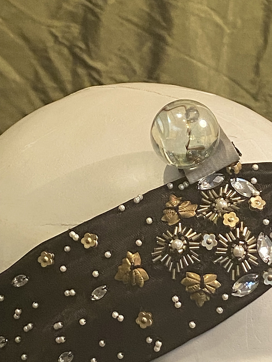
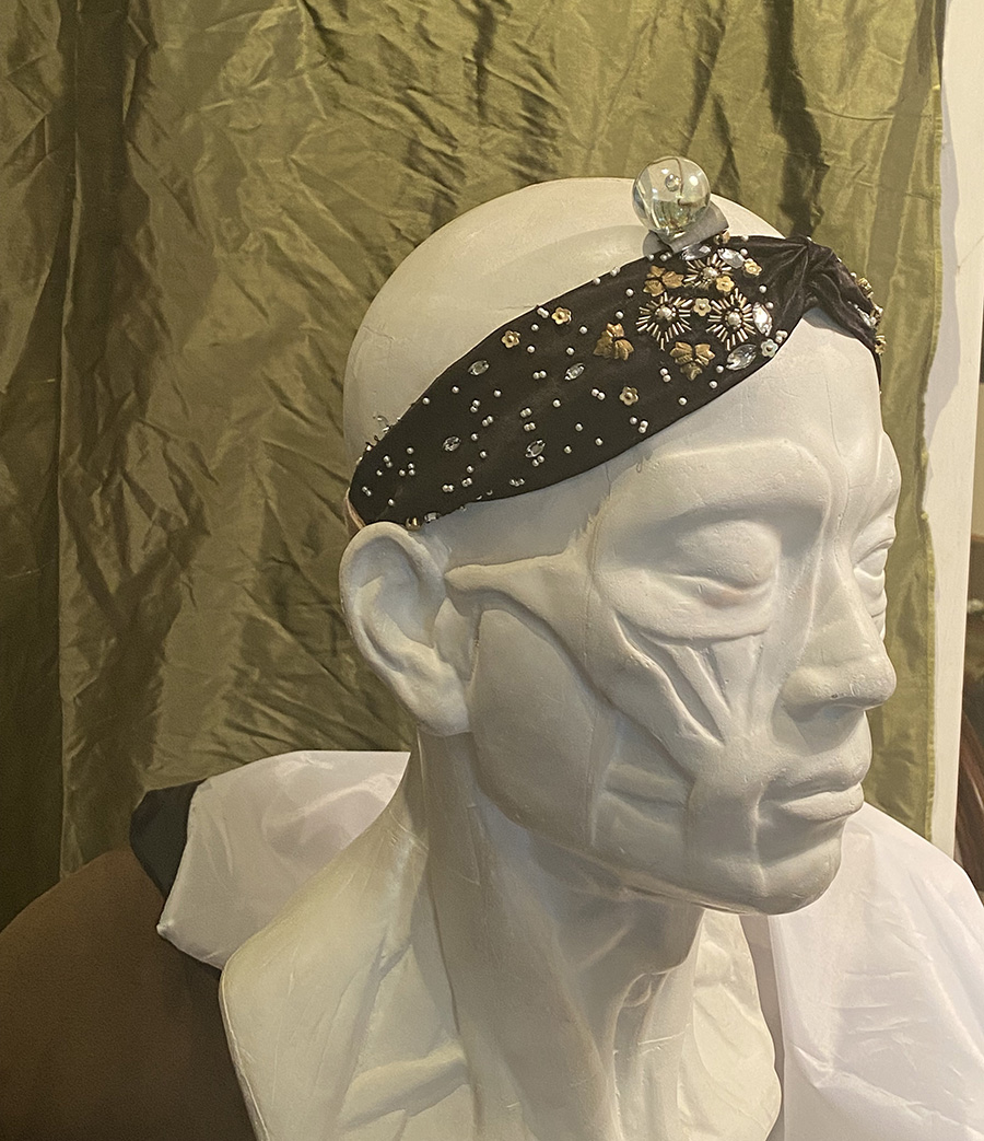
When she was not visiting for a session, I worked on the background, the headband and the little round “bubbles” on the headband. I found this large marble in my house and taped it to a mannequin with duct tape and studied that under the lights. Then used it to paint the tiny marble shapes that were on the hat to feel like bubbles coming up from the goldfish.
That helped.
Next week- the final corrections, color changes and re-finding the composition.
Thanks!
Who-hoo! It has been wonderful to watch this emerge, and understand your planning and thinking behind it.
WOW…the ORANGE 🧡
right?