“What color should I use for skin?” I get asked this question all of the time.
Last week I talked about how low-chroma colors can serve you well when thinking about painting people. This week I want to think about the opposite. How high-chroma color can zing up an image and make those dirty colors sitting on top perform better.
Oh yeah… It’s like Viagra for your portrait.
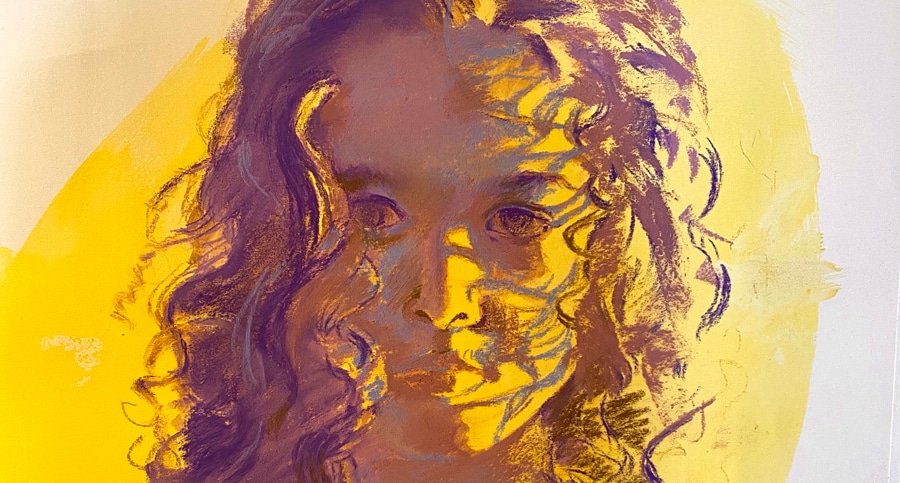
Here is the start of a new portrait that I have been working on. Without violets and reds and greens floating around in a portrait, skin tones can become flat and stale. And no one likes eating stale chips! What could have been a powerful and beautiful portrait can become… boring. Then that type of painting gets the “Oh that’s nice” curse… said by someone as they move along to the next painting.
Don’t incur the curse!
Portraits without color are cream of wheat. In a white bowl. With skim milk on a white placemat. No sugar.
Put some dang berries on that cereal! Maple syrup. Cinnamon.
That’s why I started this portrait of a little 4-year old with bold color. Painting a four-year-old is like painting the wind. And this spunky gal is a whirlwind. So the painting needed to reflect that. I always start off thinking ahead of time that the next painting will be elegant, powerful… blah blah blah… (insert cheerleader stuff here) and then sometimes a painting takes on a life of its own. This one was no exception. How I think about the little girl plays into how I paint her. And when this little angel stops and looks at you it is like arrested momentum.
So boring browns and pinks aren’t going to cut it.
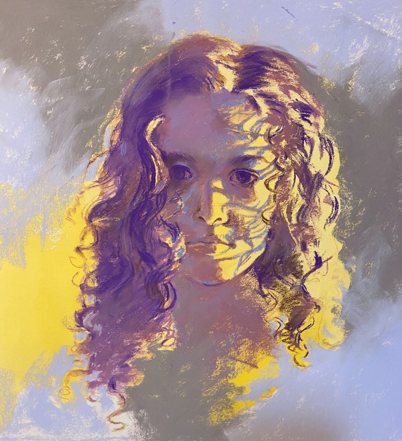
Her hair is dark and very curly. But pulling out every “brown” stick I have will not do her justice. Violet against the bright yellow? Violet underneath that curly brown hair? Yes, that will be richer. And the background has to move. Support how I feel about her. Bounce around her like the wind. Is there any right answer here? Right color? No. But this feels like the right direction. And yes, her eyes are a bit “off” in the drawing at this stage. I didn’t care. The overall feel is what I am thinking about… time for details and fussiness later.
I don’t understand how artists don’t think about the background until the very end of painting. The “important parts” get care and attention. Then there is a desperate look of “Now what?
I got news… every inch of the picture plane is important. Even if all you do is set up an area to say this is not an important area.
So she is coming along… and the “real colors” will get added (or not) as the painting talks to me. More next week.
I can just see your students gasping … “WHAT !!.. those colors are NOT in the photo ! how do I know what colors to use if they are not in my photo ?
You must be a genius ”
and of course you are girl
hehe…you know I like to freak out my students…..:)
I love it! I’ll try it this week in our life drawing group!
yay! 🙂
Awesome post – great reminder. Sometimes we forget these things! 🙂
Great article!
You are a wonder, Kippy 🌟💕!
Can’t wait to see where your vision takes you with this wonderful wild whirlwind …
So inspiring, Christine! Do you have a blog where you talk more about backgrounds?
hmmm…. I am not sure… I make comments in passing about the picture plane as a whole, so I guess I will have to write one specific to that issue.