Creating a realistic portrait is tough stuff. Creating a realistic portrait from a photo is nearly impossible.
I have been talking about issues to think about when painting a portrait. Eyebrows, proportions of the head, etc… and those are the easy things.
I recently was asked by an artist to critique a portrait she had been working on. She has graciously allowed me to share her painting and my feedback on her image this week so we can talk about things that aren’t measurable… and sometimes that are not even seen.
Here is the original painting she sent to me along with a little note to not pull my punches in my assessment. I value honesty above all things, so I feel it is my duty to be as honest as possible when someone asks for it. So here goes…
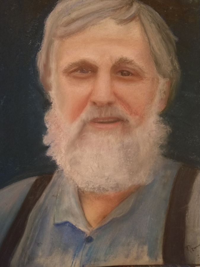
This painting is clearly done by someone who has a subtle and graceful way of painting. I commented that by the painting alone I can tell she is a careful and attentive painter and probably likes activities involving detail. Turns out that was true. Funny how a painting can tell us a lot about the creator.
This painting shows the face as very “real” – in other words, in trying so hard to create “real skin” it runs the risk of becoming boring or rather flat with only the oranges and peach colors that are seen in the photo reference. And there begins the trouble. Skin is complex. It is colorful and wonderful. Photos can not tell us the whole story so painting only what we see from photos can be a huge pitfall.
So my first gut reaction was to add more varying colors from different hue families. Contrary to what you may think, adding more “intuitive” colors can make a portrait more real along with more artistic. Which is what a painting needs to be after all- if a photos is copied so completely, then why bother at all? Just frame the photo.
By adding a few colors from other hue families, those low-chroma oranges and peaches in the face then become more energized. Colors relate to one another so they then affect each other. Make sense? So even a few hits of blueish lavender or olive green energizes the surface and actually makes the original orange and peach colors seem more “real.”
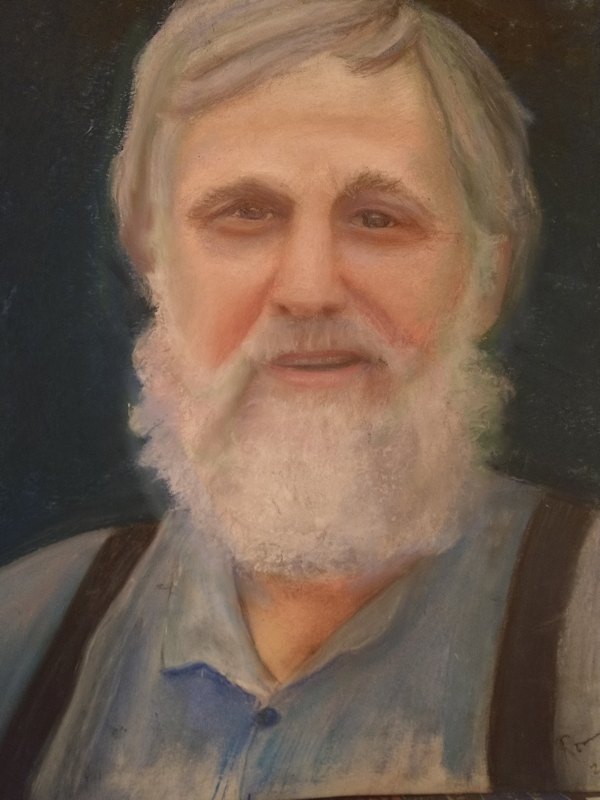
Here is the work with a few colors added in. It didn’t matter what colors really, unless you are trying to hit a color harmony. Painting this from life would have allowed the artist to see so many more colors, especially in the face, so even if I add in a few variations it helps….
Here I added olive green to the sides of his head and some blue bounced around gathered from his shirt. Even into his beard. Colors need to be like spices- added together and mixed around for flavor. Having his skin tones and the shirt separate from each other leads to a rather harsh feeling that they are not linked. Remember, we are creating a painting and in a painting colors need to be linked to create harmony in the image.
Next, his eyes are not parallel. But that just may be the way he is though. The left eye is high and yet the left side of the mouth appears low. It gives him a bit of a wonky look. I told her to just check the drawing.
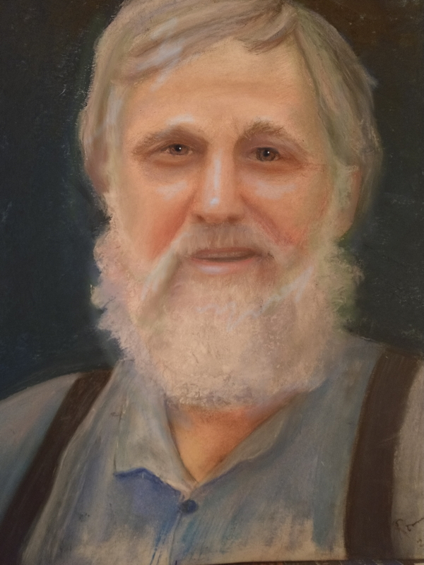
Next is crucial. I added “true black” into the pupils. Photos will tend to have the intense black we see in each others eyes as “washed out” and often a photo with bad lighting will have the highlights right in the middle of the the pupil nearly obscuring it. We believe that information in a photo, but this does not help for a painting. We want the viewer to look to the eyes, so it really needs to have a pop of darkness and a deliberate pure white highlight. Whether it is seen in a photo reference or not. It is always there when we look at another human. Go look at someone near you right now… highlights in the eyes are important. Both the dominant highlight and the waterline. (blog on that last week: https://swannportraits.com/the-waterline/)
Go back and compare this version to the original- see a huge difference? Now he’s looking at ya! And our brains register that human connection better now.

Next, a painting of a portrait is greatly enhanced 3-dimentionally if there are clear highlights on the forms of the head. This gives emphasis on the structures of the head. Photos tend to wash them out. Do this exercise: go to a window- put your hand in the light from the window- notice the clear highlights (and all those colors) then take a photo with your phone of your hand. Notice the differences between your hand and the photo? The highlights tend to get lost, and the color gets washed out. Then we paint that “lacking” of information. And then the painting is missing something.
Here is the work again with highlights added in- even though I didn’t have her reference, I can still know where they would be. The lighting on this painting is so very diffused as well so that is not helping. More contrast and one light source will help get that structure to pop forward more in space. See how it feels more real now? The nose comes forward in space now “breaking the picture plane.” The highlights I added are blue because in diffused light the temperature tends to be cooler, so I went with a blue since he is already in a blue shirt. Again, I want to get those colors mixed together more. Then the warm colors you already have in his face become even warmer by contrast. It is color theory.
Cool huh?
Voila! A very nice portrait. It was just missing a few elements.
If you are interested in a detailed critique of something you are working on send it to me! I’ll be happy to give you my feedback. I believe seeing adjustments right on an image while understanding the “why” is oh so helpful. Critiques through email are $35.
More adjusted images next week!
Thank you for this.
sure! 😊
This is excellent!! Outstanding adjustments to the original portrait!
😊
Are the videos of your upcoming portrait workshop available for purchase by those who can’t attend? This post was so helpful!!
yes! email me and I can send it to you! [email protected]
Good to know that you do on line critiques. That was an informative assessment of the original portrait.