To understand light is to understand Color.
All colors go toward either blue or yellow. Weird, but true. Even reds. All light sources have a color too. Warm or cool. Again, weird, but really fascinating.
A flag of a “learning/beginning ” artist is painting a red object red, and the object stays red in the highlights and then also gets painted darker red, (or worse) all black in the shadows. Nope. Reality doesn’t happen that way. A red object as it gets closer to the light source will “rotate” around other colors until reaching the color of the light. So that red apple (sitting in the warm, yellow-y sun) will become more orange-red, then orange, then yellow-orange and then yellow in the highlights. Because that is the color of the light. What does this look like? Study the apple in the photo above. It shows this concept pretty well. It can be better seen in real life. As the apple gets lighter, it is no longer red, but more orange and then more yellow- because the light source is yellow. Squint. You will see it. Cool huh?
Great paintings typically have a clear color to the light source and it is interesting to study how those colors on the objects/models rotate “toward the light”. (I love this phrase)
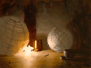
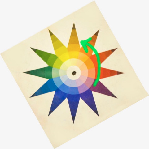
I recently came across these 2 paintings below by artist Rob Rey and they are great examples of light source color and how color rotates out from the source as the light drops off. They are appropriately called “Bioluminescence” I and II. The mouse is clearly the source for the warm light and it is so beautiful the way the light hits the lanterns. Very warm color as everything gets closer to the mouse, and getting cooler and bluer (yes, blue-er as well as darker) as it goes away from him and hits the lamp on the right. (it is subtle– look hard) The light is yellow-orange for sure. Everything is kept very warm and as the lanterns get more “lit” (closer to the source- the mouse) the surfaces get more yellow-orange as it “goes to the light… Think of the lanterns as going through these jumps through color until it gets to the light source. It helps to look at the color wheel below it.


So as the light across the floor gets darker and further away from the source, not only does it get darker in value, but it also gets redder. Then more violet.
Looking at the color wheel above to understand what is going on, the hue family of yellow-orange is rotated to the “top” of the wheel. This is the color of the light- the mouse. Now look at the painting above again and see how all objects “go to the light” moving through these colors. I often put a color wheel next to me while I am painting with the color of the light at the “top” of the wheel (like above) to remind myself that a particular color represents the color of the light and everything else needs to fall away from the source.
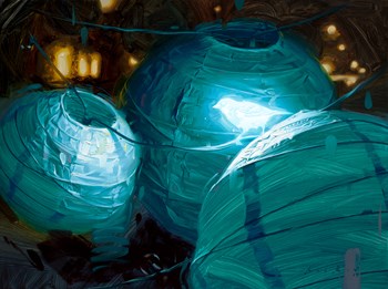
The next painting below has a bird as the source of the light and it is clearly now a cool light. So the color wheel gets rotated – blue-green would now go on “top” of the wheel this time. As everything moves away from the bird, more blue then green appears.

Notice the closest lantern in the foreground, ….see how the form rotates toward more greenish as it goes into the shadows? So as the lantern gets darker, its color rotates toward green which is warmer than the source…. (got more yellow in it…so yes, green in this case acts warm.)
This is a bit of a deep dive into color and light this week, but it can be very helpful to understand how the local color of an object is not fixed. It is always affected by light.
I will be posting an upcoming online workshop on Color and Light this Spring- be on the lookout for it!
If you have questions, let me know and keep those color wheels handy while you paint….

Thank you! Love this. something I’ve noticed but never had it in words.
Sure! It is something that makes painting color and light difficult sometimes, but once you see it you know….
Great article once again.
Did you make your color wheel or is it available for purchase?
This wheel is just an old one that is not made anymore, but any 12-hue wheel will work.
Hi Christine, Thanks for this excellent tip on color/light theory. I had heard the adage that warm light has cool shadows (ie rotates towards blue) but I had not thought that the opposite is true; cool light has warm shadows (ie rotates towards yellow). This becomes a game-changer for some of my future paintings.
Right? It changed my work too when I really understood it and started applying it. It is easy to get off track sometimes- just blindly painting “things” (I am guilty of it) Slowing down and watching for those subtle transitions will make the work richer and more realistic.
Hi
I ALWAYS get so much clearer on this topic when I read your explanation.
Warm regards, Eve Miller
Sure! This stuff doesn’t have to be hard. And fancy lectures or big words don’t help. Just a new way of seeing.
Wow! I did not know about how color changes towards the light!!! Thank you so much.
Sure! It is so important. Watch for it everywhere and you will see it!
Thank you for your informative blog! You are the best!!
😊
Brava! You made a complex concept clear. I love color. Thank you.
me too!
Excellent analysis, Christine. (Love the photo of the apple, btw..!) Question: I know you did not keep statistics on this, but with all these years of lecturing/teaching, have you found that MOST students, especially beginners, have almost exclusively worked from photos, and not from life? I have taught in various capacities as well as conducting demos/lectures, and I found this to be true–probably now more than ever. Due to the “crabgrass of the computer,” as Frank Webb put it, the color range in their mind became limited, as compared to painting from life. Thoughts? Thanks.
Yes I would agree with that. The subtle nuances are lost on a lot of beginners when sitting in front of a model or even a real apple. It becomes harder to see and appreciate how low-chroma and yet how rich in color shadows are for example. Most photos just can’t pick that information up.
As an example of using a computer or photo… I have always been disappointed with photos I have taken of a sunset. The camera is limited and simply can’t pick up what our eyes can see. Some of us artists, however, are limited to using photos from photographers for reference. Particularly for wildlife. Knowing color is very important.
Again….terrific explanation!
Perfect! Thank you Christine!