A good painting has a clearness of thought behind it.
When I was young, I was bewildered when a master artist could look at a work and say, change this, change that, and the painting would be stronger. I was fascinaed. It was like a hidden language to me. One I didn’t understand and lamented over- how was I to learn it? Like many, I was not lucky enough to go to an art school to learn this language early on.
Fast forward many years later and I am proud to say I am bilingual. I have learned to speak about how to strengthen a painting. I have also learned that the title of “teacher” means nothing if you can’t use effective language behind what you are suggesting. I have heard horror stories…”add purple to the shadows.” Why? “Well just do it and your shadows will be better”.
Grrr… Why?
I guess I am that little kid that was always asking why… and I am still that little kid.
I realize that I am actually pretty good at figuring out what will strenghten an image. I guess because I hold a hot torch to my own work over and over to scan for strengths and weaknesses. And have learned things the hard way. Now I can see those same issues in other artists paintings. And I can tell ya all about it. It is a passion of mine. Tweak a tiny thing….. create a new feeling. Change a shape….create a stronger composition. Change a color… strenthen all the others.
It is really fun.
This past June I started teaching a Color workshop. I have been teaching elements of this class for years, but now I have distilled it down to concentrated lessons piled on top of one another for a full day on zoom. (My next class is November 5th! Join me! ) Anyone in the last class? Can I get a shout-out of how it helped ya?
Color harmony to me has become important. And it was always one of those languages that I felt I couldn’t understand or control until now.
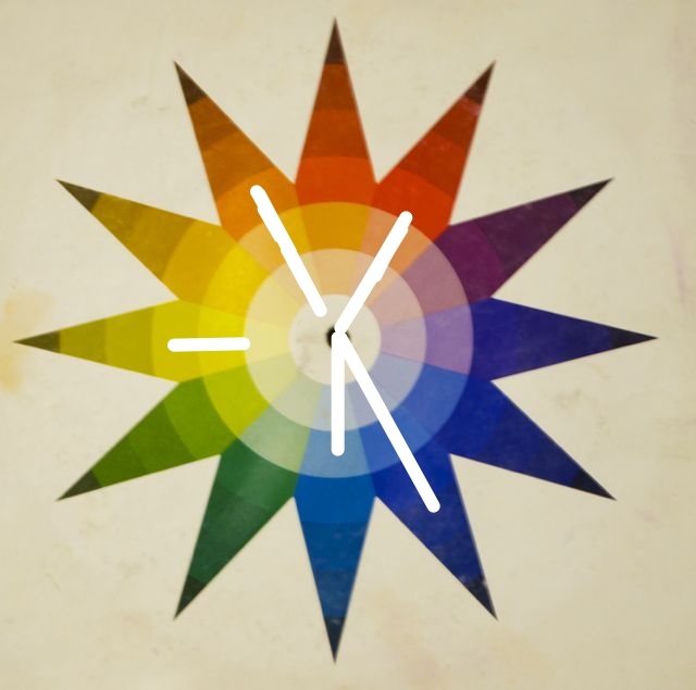
One of the best things that I think that came out of this class was that I asked every attendee to send me one image that I could then “knock into a harmony.” In other words, I took their images ahead of time and identified what colors were in each image and then “took the wheel to it” and then digitally adjusted each image and put the painting into a clear color harmony. We went over all of them in the class.
It is actually fun for me to do this. And my suggestions were only that- not every painting needs to be in a clear color harmony to be successful and many artists refuse to use it in their work. And there are many ways to skin a cat- or use a color harmony. For me, I find it comforting, like a fuzzy blanket on a cold night. I know I can create balance with color and if done right, the colors will “talk” to each other and the image will be stronger.
For the next few weeks, (with the artist’s permission of course) I will show you a few paintings that were adjusted for the class and most importantly, the reasons Why I made those suggestions. I find it really helps to see a before an after image- we are such visual creatures after all, and seeing colors change with a comparison to the before and after is very helpful. The goal was to tweak the painting only a tiny bit to keep what was created.
Here we go…
This is a lovely little landscape.
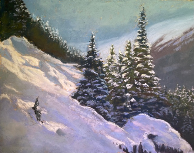
And here are the colors in the piece- these 5 colors below. You many say, I dont see any orange or red in this painting… look closely,.. you will see it in the treeline and in the trees themselves. See the red color in the snow? (“Pink” is not a color either) A color can be faint or low chroma and still be part of that hue family.
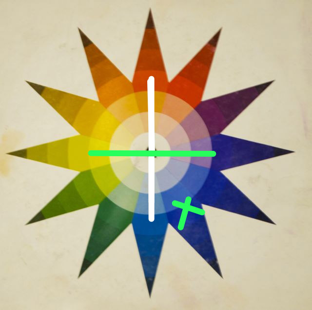
So what I suggested was this- eliminate the true blue hue and move it over to violet. Move the red and orange colors to only red-orange. Keep blue-green and yellow. This will then put the painting into a “Quad” chord – 4 colors, each color across from its compliment.
By putting violet along the treeline and it resting up against the very lit snow with the lovely yellow light on it, that area now glows because of the way the colors react againt each other. I did not add any color to the snow. I took out any area that seemed blue (isn’t blue overdone in snow scenes?) and shoved it to be violet or in the red family. The trees were rotated to be more in the yellow family- again – look hard – think dirty, dark yellow. (Again, isn’t green overdone in landscapes?) A dirty yellow up against that violet color is much more interesting and the low-chroma yellow in the trees is now linked to the yellow in the snow.
The “pink” in the snow was shifted to be more red-orange. Subtle, but effective. The image is more harmonious as a whole now.
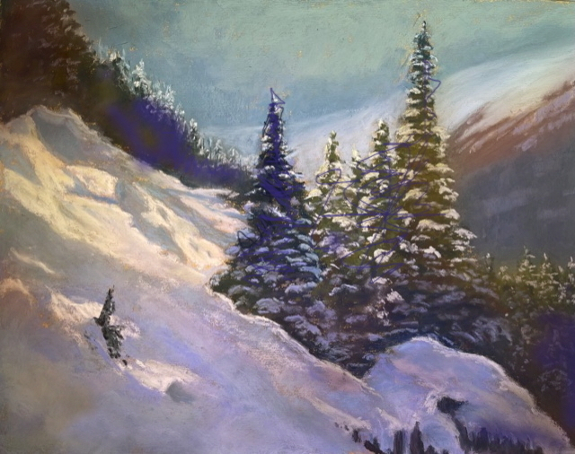
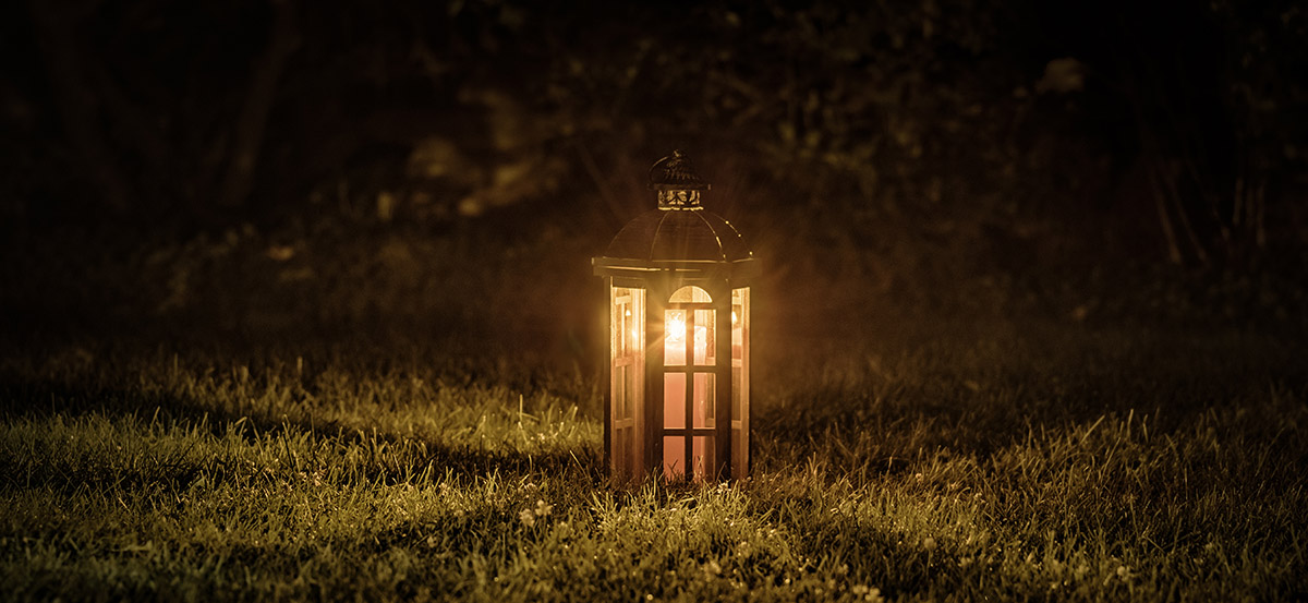
These 4 colors are now working together. Can you feel a richness to the image? I can. Each color an exact 4th jump around the wheel effectively dividing the wheel into fourths. Ah… there is that ‘math thing’ again. It brings balance. That bright area in the snow now screams look at me! Look at how cool I am! It is clear that this area is important to the piece. (That intention thing again too.) And everything else in the painting takes a back seat. This is so important. It shines out from the rest of the painting like a lantern in the dark whispering… “Look here.. look at what I want to show you.”
More on that next week.
And if you want to join me for the next Color workshop let me know!! November 12th!
I took the color workshop and it was FANTASTIC. I applied what Christine taught to a painting I hung in my salon and my clients made comments like “wow, you’ve really upped your game” and “that’s a painting?”
Christine has a clear articulate approach without frustrating or confusing ambiguity…easy to apply.
Much gratitude for her sharing and can’t wait for more!
Thanks Lezli! Gots lots to share!
Thanks for sharing. This color harmony is such a difficult concept for me. I have to reference the color wheel more closely in my next piece.
Thanks again.
Thanks. Christine. That was very helpful. Love your blogs!
Wow! Amazing! Opening my eyes to what “Color”can do. —– I am looking forward to your workshop on the 22nd and 25th of September. Will you be emailing a list of materials we will need? See you soon. Barbara H.
hi- you should have gotten that yesterday- let me know if you did not.
Hey Christine!
Wow, this is a great article and am looking forward to the others (also passing it around to other painting buddies). I was just wondering if there was a way to show the painting and adjustments side by side? When scrolling to look at the adjustments, it gets disorienting. Thanks!
yes! I can do that…..thanks!😊
Beautiful job and explanation!
What are the details about the November 5 workshop? times and cost? Prep ahead of time. I am definitely interested.
Click on my workshop page on my site. All info is there. Then email me back with your registration!
Count me in for the Nov 5 color workshop! Sounds great!
you got it! C