Another way to add “wow” to a painting is through effective use of color harmonies. They can give big impact to a painting with just a little bit of planning…
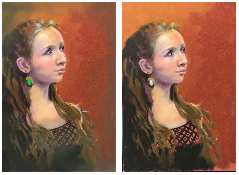
Here is the original from another lovely artist. The thing that is fighting for attention the most here is the use of all that high-chroma orange. Orange has such an addictive “pull” to the eye, so taming that color is key. A few touches are fun and lush, but if some of the high chroma in the background were modified and then the very harsh, black details in the shirt were softened, then the viewer will be left with a very lovely portrait to appreciate.

In this version below her hair color (a very dirty, low-chroma yellow-green) is tied into the background and the orange is tamed down. Then the darkest and most hard-edged areas of her shirt are knocked back with the same color. Now you can focus on her gaze.

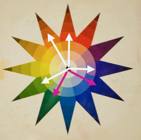
In the color wheel below, the white arrows show the main colors that are currently in the painting. It is a long story, but basically color harmonies work because they are based on math – yup, math – just like chords on a piano. So if the colors of true green and blue violet were added to the painting (pink arrows below) then a 6-chord color harmony will make all the colors sing together nicely. Mainly because as the colors go around the wheel, 2 colors are used and 2 colors are ignored in between each set. This then is using colors in every third and fourth hue (out of the 12 color families) and then the pattern is repeated. Instant harmony.

So below I added the true-green with a bit of high-chroma in her earring (a fun accent) and a tiny bit of low-chroma, blue-violet to the highlights on her face and hair. Now the painting is in a clear 6-chord harmony… it could have been done backwards too – blue-violet in the earring and green accents on the skin… or the colors could even have been introduced into the background. It doesn’t matter, as long as they are all there. Now the colors are happily playing off of each other and together! The image is now rich and wowsy!!!

Original and altered versions below. There is something so harmonious to a clear color harmony being used in this way. Graceful and beautiful, just like this painting!


This is fascinating with such a wonderful example! So does this colour theory mean that this pattern (use two, omit two) can be used with any colours for a harmony as long as the colours are neighbours?
yes for this “chord”, any colors as long as you skip 2. Then there is another 6-chord version that skips every other color. Still uses 6 colors. There are 8 “chords” all together that can ne used aroudnthe wheel. 2 6-chords, a 5-chord, 2 different quad chords, 2 3-color chords and of course the easy compliment “chord” which uses only 2 colors directly across from each other on the wheel. This is what most artists are familiar with but there are so many options!
Thanks! Knowledge really is power!
you bet!
Could you possibly show us pics of all the “chords”.
I can, but I figured it was confusing to do them all at once. This week I will show the 4-color chords and how they work and why. Then next week the 5-chord. If you want to learn all about them, get the book by Johannes Itten. He was a pretty famous colorist and his book will break them down. He had this wheel called the “color star”. That is the one I am showing. They don’t make them anymore and the book is not in print, but you can find them sometimes online or make your own by printing out copies of the “star”. Other colorists have slightly different systems, but this one works the best for me and I feel, is the easiest to learn.
This was so helpful! Please do more on color harmony! Lovely portrait!
will do! 🙂
Sorry, but I like the original best. It is brighter and more intense. I like the deep black of the dress in the original–looks like velvet. I do like the green in the earring as a special highlight.
Of course, I am an amateur and a spectator.
great thing about art!
Wow! Christine, thank you so much for this lessons and all your lessons. They are so clear and helpful!
🙂
Christine, I really appreciate these blog reports. (just what I call them) But they are beginning to get me into trouble. I’ve been instructing an Oil Pastel class and throwing in some extras with the techniques we have been using. I have been sharing your blogs with my students. Now they want an explanation of “What”. They want more of the information on chords, so I now need to really study it. I’m confuggled too. One comment though. I love the changes you made to the face, background colors etc. All of it but the earrings. They take over the focus for me. I can’t seem to take my eyes to her eyes. Buggers.
yes, there is so much to learn. It is good to fully understand certain elements before teaching them because so many questions will pop up. Like your issue with the earring. I agree it is a bit brash, but the lesson here was to clearly represent all 6 colors. That green doesn’t have to be that saturated, I just made a point of it here. Lowering it a bit can bring you back to her eyes. Another artist may find sentimentality in the earring and want to exaggerate them. There are no clear answers here. We artists are decision-makers, and in the end it is a constant quest for better and better decisions. There are many theories around color harmonies, so I would try a book by Itten or Munsell. Knowledge is power!
Thank you, dear Christine, for including the original alongside the finished painting at the end of this blog page. It helps to see them together like this instead of having to scroll up and down the page.
trying to make improvements! :). hope you are well.
Terribly confusing for me an beginning artist…I will go !back to my colorwheel
sorry if you are confused. This has all been about find the relationships of the colors around the wheel. Complements are just simply colors across from each other on the wheel. 3 color harmonies are just 2 types of triangles around the wheel. 4-colors are straight across from each other and a 5-color chord is any one color and then the 4 colors across from it- but not the complement. If you are just beginning, just realizing that there are complex relationships of color in paintings is a good place to start. Then as you get more comfortable with your own work and studies you can learn more at your own pace. good luck!